Unlock a world of possibilities! Login now and discover the exclusive benefits awaiting you.
- Qlik Community
- :
- All Forums
- :
- QlikView App Dev
- :
- Qlikview gant bar chart not lining up
- Subscribe to RSS Feed
- Mark Topic as New
- Mark Topic as Read
- Float this Topic for Current User
- Bookmark
- Subscribe
- Mute
- Printer Friendly Page
- Mark as New
- Bookmark
- Subscribe
- Mute
- Subscribe to RSS Feed
- Permalink
- Report Inappropriate Content
Qlikview gant bar chart not lining up
I have a small sample of data:
| product | start | end |
| 10000 | 29/01/2016 | 29/01/2016 |
| 10000 | 16/02/2016 | 16/02/2016 |
| 10000 | 10/03/2016 | 10/03/2016 |
| 10000 | 06/05/2016 | 06/05/2016 |
| 10000 | 12/05/2016 | 12/05/2016 |
| 10000 | 31/05/2016 | 31/05/2016 |
| 10000 | 06/06/2016 | 09/06/2016 |
| 10000 | 24/06/2016 | 24/06/2016 |
| 10000 | 08/08/2016 | 19/08/2016 |
| 10004 | 25/04/2016 | 26/04/2016 |
| 10004 | 28/04/2016 | 29/04/2016 |
| 10005 | 04/01/2016 | 04/01/2016 |
| 10005 | 08/02/2016 | 09/02/2016 |
| 10005 | 12/02/2016 | 12/02/2016 |
| 10005 | 15/02/2016 | 15/02/2016 |
| 10005 | 01/04/2016 | 01/04/2016 |
| 10005 | 31/05/2016 | 31/05/2016 |
| 10005 | 15/06/2016 | 16/06/2016 |
| 10005 | 03/10/2016 | 07/10/2016 |
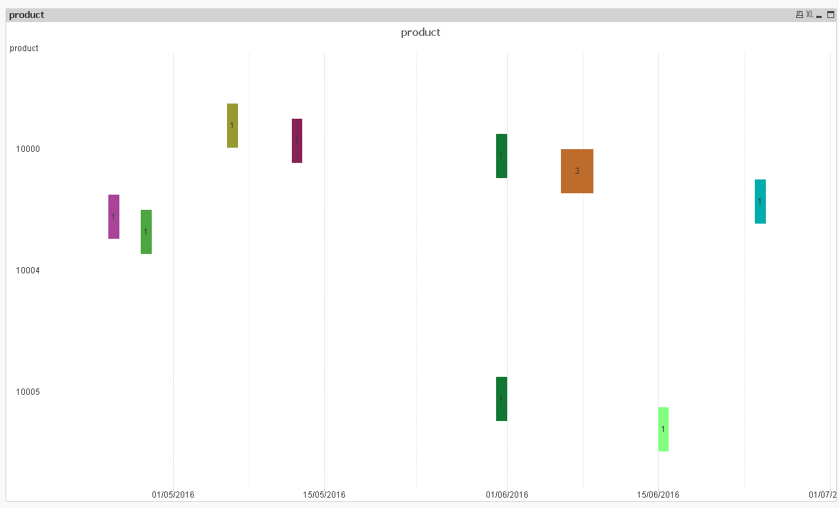
and i want to display it in a bar (gant) chart, but what is happening is each start and end section is getting its own line rather than being all on one line per project:
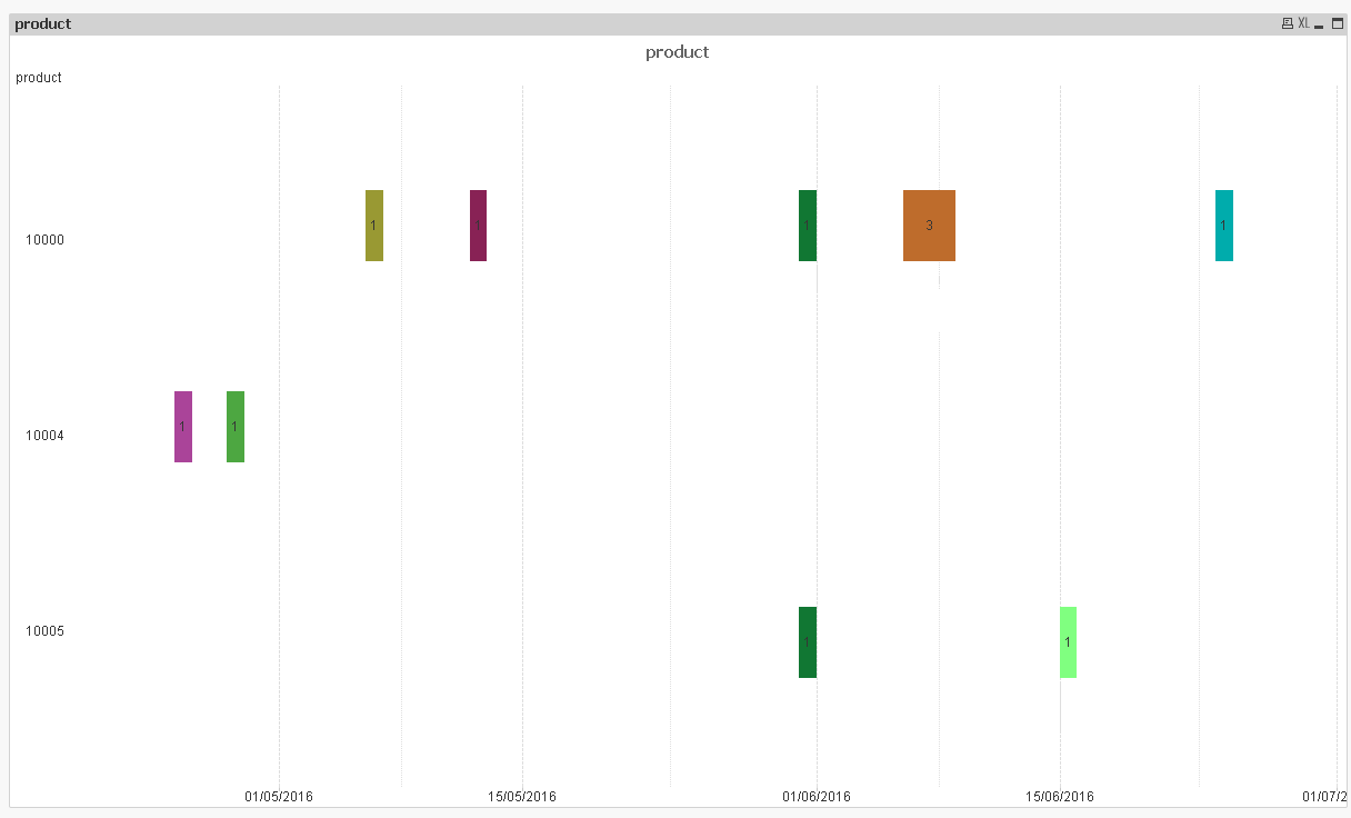
But i want it like this:
- Mark as New
- Bookmark
- Subscribe
- Mute
- Subscribe to RSS Feed
- Permalink
- Report Inappropriate Content
anyone?
- Mark as New
- Bookmark
- Subscribe
- Mute
- Subscribe to RSS Feed
- Permalink
- Report Inappropriate Content
Do you have the qar of Gant Chat? I mean extension
- Mark as New
- Bookmark
- Subscribe
- Mute
- Subscribe to RSS Feed
- Permalink
- Report Inappropriate Content
what is a qar?
- Mark as New
- Bookmark
- Subscribe
- Mute
- Subscribe to RSS Feed
- Permalink
- Report Inappropriate Content
Might be you don't require any Extension. This is simple Combo Chart. What is the Diff b/w two graphs / Images. Can you please explain more? And let me know expected image
- Mark as New
- Bookmark
- Subscribe
- Mute
- Subscribe to RSS Feed
- Permalink
- Report Inappropriate Content
the first image is what it is currently doing
the second image is what i want to to do
in the second image the values for each of the 3 projects are all i one line rather than staggered as they are in the current image.