Unlock a world of possibilities! Login now and discover the exclusive benefits awaiting you.
- Qlik Community
- :
- All Forums
- :
- QlikView App Dev
- :
- Question about using Aggr with Combo chart
- Subscribe to RSS Feed
- Mark Topic as New
- Mark Topic as Read
- Float this Topic for Current User
- Bookmark
- Subscribe
- Mute
- Printer Friendly Page
- Mark as New
- Bookmark
- Subscribe
- Mute
- Subscribe to RSS Feed
- Permalink
- Report Inappropriate Content
Question about using Aggr with Combo chart
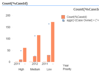
I am trying to create this combo chart. For the symbols I would like them to line up with the correct year.
I am using an aggr expression for the symbol.
aggr({<[Case Owner] = {"=Rank(sum(%CaseId))<=50"}>}count(%CaseId),Year,Priority)
- Mark as New
- Bookmark
- Subscribe
- Mute
- Subscribe to RSS Feed
- Permalink
- Report Inappropriate Content
@datagrrl what is the expected output with number?
- Mark as New
- Bookmark
- Subscribe
- Mute
- Subscribe to RSS Feed
- Permalink
- Report Inappropriate Content
Only thing I have to add is the following Design Blog that might help a little:
https://community.qlik.com/t5/Qlik-Design-Blog/Set-Analysis-in-the-Aggr-function/ba-p/1463822
I am with Kush though, not exactly sure to what you are referring, so maybe pointing out exactly the piece you need help with via some arrows or something would help, as I am not quite sure myself.
Regards,
Brett
I now work a compressed schedule, Tuesday, Wednesday and Thursday, so those will be the days I will reply to any follow-up posts.
- Mark as New
- Bookmark
- Subscribe
- Mute
- Subscribe to RSS Feed
- Permalink
- Report Inappropriate Content
I think the problem goes back to you can't have two dimensions and two measures in a combo chart.
- Mark as New
- Bookmark
- Subscribe
- Mute
- Subscribe to RSS Feed
- Permalink
- Report Inappropriate Content
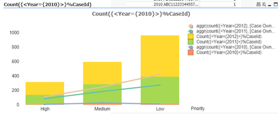
You can have multiple dimensions and multiple measures. attached is a view of your chart with years stacked instead
but for your specific case, you need to be clear what you want. also, you do have a year that is null - this is due to the synthetic keys in you data model.
- Mark as New
- Bookmark
- Subscribe
- Mute
- Subscribe to RSS Feed
- Permalink
- Report Inappropriate Content
This is data from a sample document. I can clean it up, but I don't think that will change what I am asking for.
I remember this being something I could not do in the past. I don't think a stacked chart would work in this situation. I don't think it visualizes this well.
I want the symbols to line up with the correct year, not all in the center.
- Mark as New
- Bookmark
- Subscribe
- Mute
- Subscribe to RSS Feed
- Permalink
- Report Inappropriate Content
I want the symbols on the correct year. Currently all of them end up on the middle year.
- Mark as New
- Bookmark
- Subscribe
- Mute
- Subscribe to RSS Feed
- Permalink
- Report Inappropriate Content
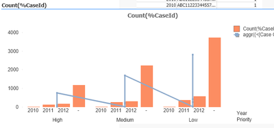
I didnt think that was possible bec the grouping is a visualization of the BARs not really a data point for the line chart. your line chart can only have one dimension - the first dimension. however, if you combine both dimensions then you will have all the data points (dimension wise) that you need:


