Unlock a world of possibilities! Login now and discover the exclusive benefits awaiting you.
- Qlik Community
- :
- All Forums
- :
- QlikView App Dev
- :
- Re: Record evolution analysis
- Subscribe to RSS Feed
- Mark Topic as New
- Mark Topic as Read
- Float this Topic for Current User
- Bookmark
- Subscribe
- Mute
- Printer Friendly Page
- Mark as New
- Bookmark
- Subscribe
- Mute
- Subscribe to RSS Feed
- Permalink
- Report Inappropriate Content
Record evolution analysis
Dear QVers,
I need to create a chart to show how opportunities have changed from one period to another (i.e week 30 against week 32). For example, if a record moved from Sept to July it will be flag as “Move In” or if the value of a record in week 30 was 150 and then 100 in week 32 then a “Value adjustment” category will be assigned to this record.
In the data we have all the records with a Date of Extraction field. The challenge is that I cannot do the above logic in the script because the user selects the periods of data extraction (i.e. from week 30 to week 32 or from week 20 to week 24) to compare the records. The questions are how can I:
- Check if the record in start week (i.e. week 30) exists in end week (i.e. week 32). I am using p() function now, but I dont know if this is the best solution.
- Check how the records have changed (i.e if the order date moved from Sept in week 30 to July in week 32 or if the sales stage changed from Prospect to Order, etc)
- Assign its value to the specific category (i.e. Move in, Move out, Value adjustment, Hit)
Please help!
Accepted Solutions
- Mark as New
- Bookmark
- Subscribe
- Mute
- Subscribe to RSS Feed
- Permalink
- Report Inappropriate Content
See the attached qvw for a first try. I'm pretty sure you'll find things wrong with it, which will give you an opportunity to make the business logic more explicit.
talk is cheap, supply exceeds demand
- Mark as New
- Bookmark
- Subscribe
- Mute
- Subscribe to RSS Feed
- Permalink
- Report Inappropriate Content
Hi Gysbert,
Thanks for the hint. I will check it and read more about Alternate States since I am not too familiar.
BR,
AD
- Mark as New
- Bookmark
- Subscribe
- Mute
- Subscribe to RSS Feed
- Permalink
- Report Inappropriate Content
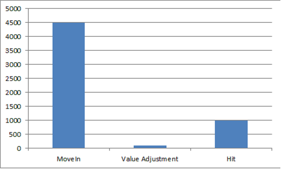
Hi Gysbert,
How could I translate it to a bar chart like this?
BR,
AD
- Mark as New
- Bookmark
- Subscribe
- Mute
- Subscribe to RSS Feed
- Permalink
- Report Inappropriate Content
Hi,
I wrote an expression like:
Sum(aggr(if(only({AS1}[Date Expected])>only({AS2}[Date Expected]),sum({AS1}Value)),RecordID))
And I got the chart 
Tks!