Unlock a world of possibilities! Login now and discover the exclusive benefits awaiting you.
- Qlik Community
- :
- All Forums
- :
- QlikView App Dev
- :
- Re: Representing a nested stacked bar chart
- Subscribe to RSS Feed
- Mark Topic as New
- Mark Topic as Read
- Float this Topic for Current User
- Bookmark
- Subscribe
- Mute
- Printer Friendly Page
- Mark as New
- Bookmark
- Subscribe
- Mute
- Subscribe to RSS Feed
- Permalink
- Report Inappropriate Content
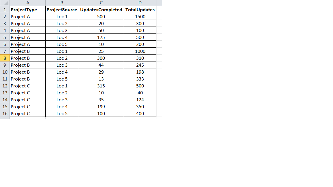
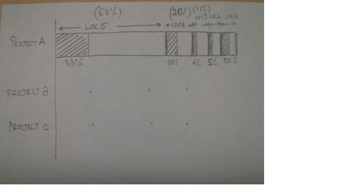
Representing a nested stacked bar chart
I'm a QlikView beginner and I'm working with a piece of data; trying to visualize it as a bar chart.
More specifically, I need to develop a nested stacked bar chart as shown in the image. At a top level, for every project, I need to have the length of the stacks of the bar chart proportional to "TotalUpdates" for the 5 different project locations. (Loc 1 to Loc 5)
At a second level, within each one of the stacks that I described above, I need to be able to represent the percentage of completion. Which is UpdatesCompleted/TotalUpdates. (Shaded or colored differently)
I tried using the crosstable, but it did not work. Since I'm trying to work with three dimensions, I'm unable to find a suitable solution to handle this. The input spreadsheet and a snapshot of the desired representation is attached.
Accepted Solutions
- Mark as New
- Bookmark
- Subscribe
- Mute
- Subscribe to RSS Feed
- Permalink
- Report Inappropriate Content
- Mark as New
- Bookmark
- Subscribe
- Mute
- Subscribe to RSS Feed
- Permalink
- Report Inappropriate Content
Hi,
I don't understand your sorting of Loc
Why the order is Loc 5, Loc 4, Loc 1, Loc 2, Loc 3
Is it always or are there some hidden rules?
Regards,
Sergey
Sergey
- Mark as New
- Bookmark
- Subscribe
- Mute
- Subscribe to RSS Feed
- Permalink
- Report Inappropriate Content
PFA an example
Regards,
Sergey
Sergey
- Mark as New
- Bookmark
- Subscribe
- Mute
- Subscribe to RSS Feed
- Permalink
- Report Inappropriate Content
Thank you very much Sergey! Works like a charm 🙂