Unlock a world of possibilities! Login now and discover the exclusive benefits awaiting you.
- Qlik Community
- :
- All Forums
- :
- QlikView App Dev
- :
- Re: Reverse chart bar
- Subscribe to RSS Feed
- Mark Topic as New
- Mark Topic as Read
- Float this Topic for Current User
- Bookmark
- Subscribe
- Mute
- Printer Friendly Page
- Mark as New
- Bookmark
- Subscribe
- Mute
- Subscribe to RSS Feed
- Permalink
- Report Inappropriate Content
Reverse chart bar
Hi everyone,
I'm looking for a method to reverse a chart bar meaning that if I have a linear gauge chart that fills to value I want that my bar starts at the variable value and goes to 100%.
I attached a document which explains in more detail what I try to do.
Thanks a lot.
- Mark as New
- Bookmark
- Subscribe
- Mute
- Subscribe to RSS Feed
- Permalink
- Report Inappropriate Content
Hi One solution would be to cover everything up to the variable value with use of a white gauge, and have a condition set background color as background in the expression that would make it look like a linear gauge. Did you try this? /Marcus
- Mark as New
- Bookmark
- Subscribe
- Mute
- Subscribe to RSS Feed
- Permalink
- Report Inappropriate Content
Hi Marcus,
I try to do this exactly the other way around so that the white gauge chart covers the now uncovered part of the bar.
It is used to show the level of fulfiment, so if the value is 60% than only 60% of the bar should be filled with color.
I hope I made it clearer now, what I try to do?
- Mark as New
- Bookmark
- Subscribe
- Mute
- Subscribe to RSS Feed
- Permalink
- Report Inappropriate Content
Hi,
I did something ones with images that i named with numbers, something like the example i added here. Maybe it is something you can consider?
- Mark as New
- Bookmark
- Subscribe
- Mute
- Subscribe to RSS Feed
- Permalink
- Report Inappropriate Content
I cannot see the images  . So I don't know what you did there
It still has to be an interactie chart as the numbers will change.
- Mark as New
- Bookmark
- Subscribe
- Mute
- Subscribe to RSS Feed
- Permalink
- Report Inappropriate Content
Sorry, i forgot you need to have the images there also, hehe. Here you have the whole folder.
- Mark as New
- Bookmark
- Subscribe
- Mute
- Subscribe to RSS Feed
- Permalink
- Report Inappropriate Content
Still not working but I know what you did now.
It's an option but as I have 20steps this is a lot of work to format this.
But thanks!!
- Mark as New
- Bookmark
- Subscribe
- Mute
- Subscribe to RSS Feed
- Permalink
- Report Inappropriate Content
Strange, anyway this is how it would look.
- Mark as New
- Bookmark
- Subscribe
- Mute
- Subscribe to RSS Feed
- Permalink
- Report Inappropriate Content
Thanks!
- Mark as New
- Bookmark
- Subscribe
- Mute
- Subscribe to RSS Feed
- Permalink
- Report Inappropriate Content
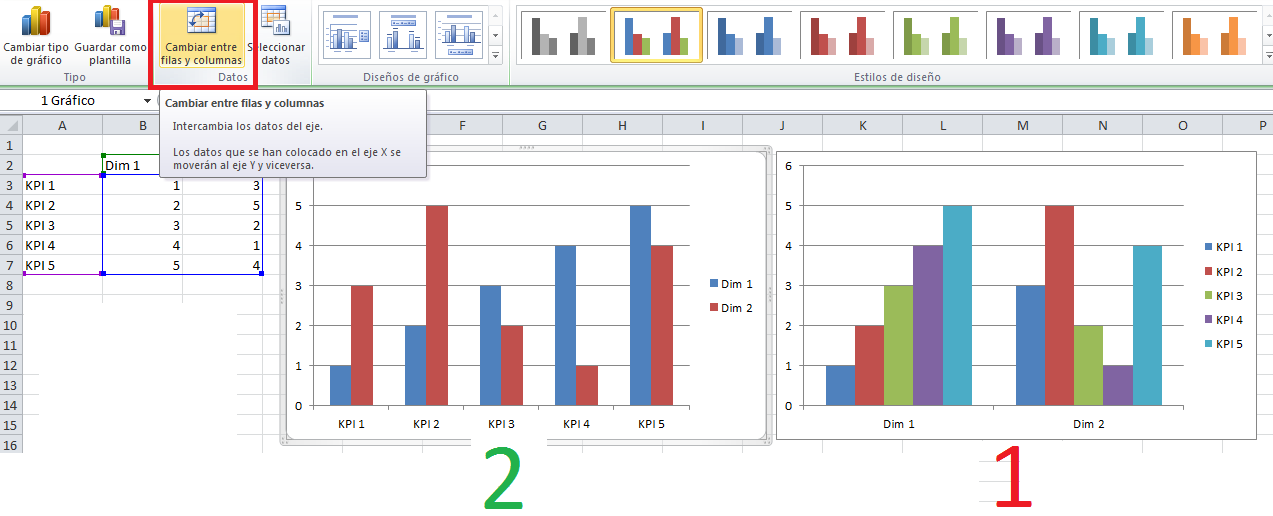
Hello,
I think I’m having the same problem, in QlikView I built a chart bar (like number 1) and I want transpose the chart like number 2, having the kip’s in the x axis and dimensions in the y axis . The image is an example from Excel; you can switch row/column.