Unlock a world of possibilities! Login now and discover the exclusive benefits awaiting you.
- Qlik Community
- :
- All Forums
- :
- QlikView App Dev
- :
- Rolling 13 month chart and table...why so difficul...
- Subscribe to RSS Feed
- Mark Topic as New
- Mark Topic as Read
- Float this Topic for Current User
- Bookmark
- Subscribe
- Mute
- Printer Friendly Page
- Mark as New
- Bookmark
- Subscribe
- Mute
- Subscribe to RSS Feed
- Permalink
- Report Inappropriate Content
Rolling 13 month chart and table...why so difficult?
So my customer comes to me and says: Hey I want to have a report that shows a chart of rolling 13 month sales data for my team, and I want a table showing the same data underneath it.
Me: Should be no problem
...
Me: Here you go customer:
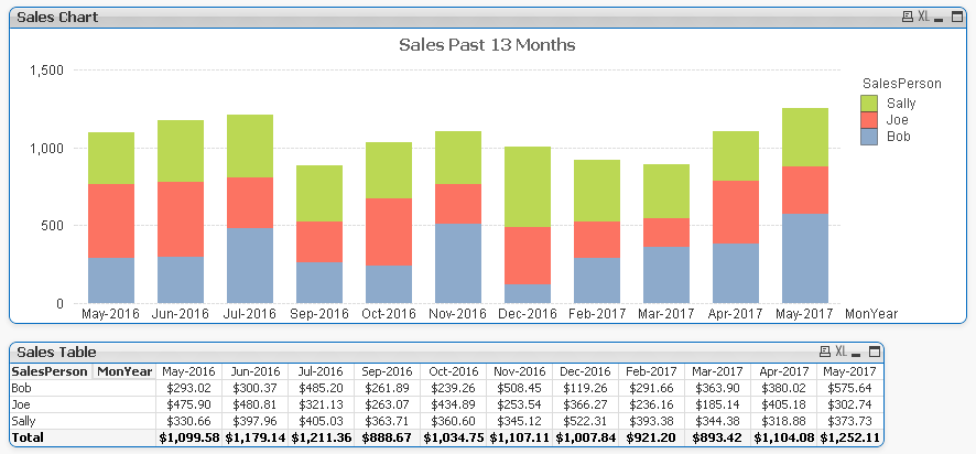
Customer: That looks pretty good, but where is August 2016 and January 2017?
Me: Your team didn't have any sales for those months.
Customer: So?! I still want to see the month! It isn't exactly a rolling 13 month report if it only shows 11 months!
Me: Hmm, good point, let me see what I can do
...
Me: Here you go customer:
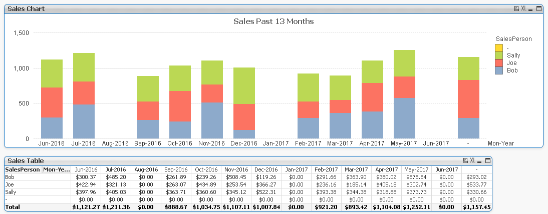
Customer: That's looking better, I see all the months...no wait...what is that extra month at the end?
Me: I don't know.
Customer: And who is that extra salesperson in yellow? Sales person "-"???
Me: I don't know.
Customer: Wait there are actual figures for that extra month in the table?! Where are those coming from??
Me: I don't know.
Customer: This is unacceptable.
Me: Let me see what I can do.
...
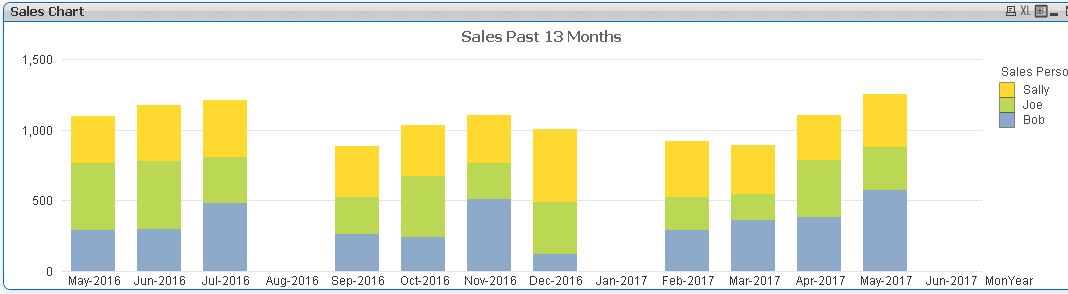
Me: Here you go customer.

Customer: Oh good the months look right now. Wait...that mystery Sales Person is still there.
Me: I know
Customer: What gives? I can't show my managers a report with that in there.
Me: QlikView appears to be unable to handle this particular situation adequately.
Customer: You know I could do this in about 30 minutes in Excel exactly the way I want it.
Me: Yes, I know, I could too.
Customer: The only reason I bought these expensive servers, software, and your time is so that I could have this automated.
Me: Yes, I understand.
Customer: I'm NOT happy.
---------------------------------------------------
So this was, of course, a fictional story, but situations like this seem to happen again and again.
I've attached the sample data as well as three QVWs that represent the three examples above. QlikView is an amazing tool and can do amazing things, but it is very difficult to explain to customers when something seemingly as simple as this causes issues.
For this particular Rolling 13 month scenario I have tried all of the following:
- An expression for the Date Dimension that limits it to the past 13 months
- Every combination of "Suppress When Value Is Null" and "Show All Values" that I can think of on both Dimensions
- Every combination of "Suppres Zero-Values", "Suppress Missing" and "Populate Missing Cells" I can think of
- ValueList based dynamic Dimensions for Date
- Simple if..then expressions for the sales amount
- Set Analysis based expressions for the sales amount
- Individual expressions for each month (works on the table, not on the chart)
The only thing I haven't tried, and seems like a real hack, would be to populate the data with a dummy record for each SalesPerson for each month with zero value so there is at least one entry each month for each person. I may try it just to see if it works, but in the real situation, where there are millions of rows in the source data, this would be very unpalatable.
I hope I am missing something obvious here, and I would be ecstatic to be told as much.
- Mark as New
- Bookmark
- Subscribe
- Mute
- Subscribe to RSS Feed
- Permalink
- Report Inappropriate Content
Can you try this? I am assuming this. I haven't check the file
=Sum({$<Mon-Year={'>=$(=MonthName(AddMonths(Max(Mon-Year),-13))) <=$(=MonthName(Max(Mon-Year)))'}>} Sales)
PS - Please UN-check the suppress from presentation tab and then same in Dimension for Mon-Year dimension
- Mark as New
- Bookmark
- Subscribe
- Mute
- Subscribe to RSS Feed
- Permalink
- Report Inappropriate Content
I liked your fictional story.  Have a look here: How to populate a sparsely populated field
- Mark as New
- Bookmark
- Subscribe
- Mute
- Subscribe to RSS Feed
- Permalink
- Report Inappropriate Content
Hi,
You already noticed the below points.
1. Sales person names are null in most of the months (but amount is there)
2. if we do suppress null, the month doesn't have amount will go off. (e.g Aug-2016)

3. Try to change the MonYear field as Proper field. It seems to be a text.
Like below
Dimension:_
MonYear
=Aggr(if(sum(TOTAL <MonYear> Amount)<>0,SalesPerson,''),MonYear,SalesPerson)
Expression
Sum({$<MonYear={'>=$(=AddMonths(Max(MonYear),-13)) <=$(=Max(MonYear))'}>} Amount)
Find the Attachment
- Mark as New
- Bookmark
- Subscribe
- Mute
- Subscribe to RSS Feed
- Permalink
- Report Inappropriate Content
Settu,
Thanks for the reply. I follow what you are doing here I think. In the Dimension you are elminating any SalesPerson who has never had any sales and thus eliminating the mystery "-" person.
With the expression you are limiting the data to the last 13 months.
Does that sound right?
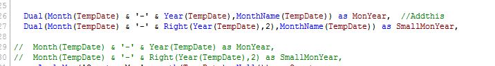
I don't quite follow the change to the fields in the Master Calendar. Is that just for easier sorting purposes?
I did notice one thing, and I know this isn't part of my original story, but when I select additional criteria from the List Boxes, such as "Product Category" it goes back to skipping months.
Many thanks!