Unlock a world of possibilities! Login now and discover the exclusive benefits awaiting you.
- Qlik Community
- :
- All Forums
- :
- QlikView App Dev
- :
- Re: Row data as column data showing a trend per fa...
- Subscribe to RSS Feed
- Mark Topic as New
- Mark Topic as Read
- Float this Topic for Current User
- Bookmark
- Subscribe
- Mute
- Printer Friendly Page
- Mark as New
- Bookmark
- Subscribe
- Mute
- Subscribe to RSS Feed
- Permalink
- Report Inappropriate Content
Row data as column data showing a trend per fact
Hello,
I was wondering if it is possible to create statistics where row-data becomes column data...
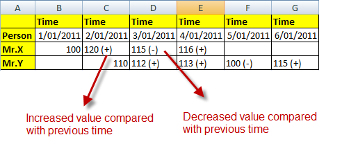
I enclosed an example which demonstrates the current sitation.
The 2B situation can be found in the attached screenshot.

As a general goal, I would like to see the evolution a fact (i.e. person X) goes through within a period of time...
The fact data is now stored as seperate rows, which now I would like to visualize as columns in a chart object.
Any help is highly appriciated.
Kind regards,
Maarten
Accepted Solutions
- Mark as New
- Bookmark
- Subscribe
- Mute
- Subscribe to RSS Feed
- Permalink
- Report Inappropriate Content
You may try a pivot table chart. An example is attached.
- Mark as New
- Bookmark
- Subscribe
- Mute
- Subscribe to RSS Feed
- Permalink
- Report Inappropriate Content
You may try a pivot table chart. An example is attached.
- Mark as New
- Bookmark
- Subscribe
- Mute
- Subscribe to RSS Feed
- Permalink
- Report Inappropriate Content
Hi,
this is exactly what I was trying to do myself too....
I'll have to figure out what you exactly did, because when I try to reproduce the pivot table myself, it remains empty 🙂
How did you define the blue and the red color? (I suppose it indicates the trend (up/down))
Thanks a lot!
Very fast, and straight to the point!
Regards,
Maarten
- Mark as New
- Bookmark
- Subscribe
- Mute
- Subscribe to RSS Feed
- Permalink
- Report Inappropriate Content
I also got an empty pivot table.
In order expand the pivot table, I selected a person and time
Then moved the time dimension to columns by dragging it above the result.
To set color, click on the ![]() sign near the Result in expressions tab, and set the Text color in the 'Definition' box on the right.
sign near the Result in expressions tab, and set the Text color in the 'Definition' box on the right.
Hope this helps.
- Mark as New
- Bookmark
- Subscribe
- Mute
- Subscribe to RSS Feed
- Permalink
- Report Inappropriate Content
Wow, that's a whole new world opening in front of me 🙂
In excel I knew how it works, but Qlikview ...
Anyway, excellent job in explaining this functionality! Thanks!