Unlock a world of possibilities! Login now and discover the exclusive benefits awaiting you.
- Qlik Community
- :
- All Forums
- :
- QlikView App Dev
- :
- Re: Sales By Country
- Subscribe to RSS Feed
- Mark Topic as New
- Mark Topic as Read
- Float this Topic for Current User
- Bookmark
- Subscribe
- Mute
- Printer Friendly Page
- Mark as New
- Bookmark
- Subscribe
- Mute
- Subscribe to RSS Feed
- Permalink
- Report Inappropriate Content
Sales By Country
Dear Sir/Madam
I try to present Products by Country but not sure all Products appear in each country, can someone kindly help to solve my problem ?..
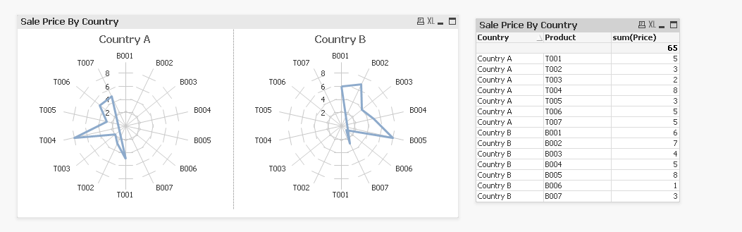
The correct answer should be Country A and B only show products with Prefix T and B respectively.
Thank you
Tracy
- « Previous Replies
-
- 1
- 2
- Next Replies »
- Mark as New
- Bookmark
- Subscribe
- Mute
- Subscribe to RSS Feed
- Permalink
- Report Inappropriate Content
It appears your data does show only T parts in country A and B parts in country B. The fact that you are using a Trellis chart insures all charts contained within have all the same dimensions, so dimensions B001-B007 and T001-T007 will appear in all countries, A, B, C... Scale will also be the same for all countries so a country with few sales may not show much compared to another country with high sales. For example, add another product and country then make the Price 100x smaller than the others, like .02 to .08. You will notice this data doesn't even register in the chart for that country.
Here's what I added to your data...
| X001 | C | 31/03/17 | $ 0.05 |
| X002 | C | 30/06/17 | $ 0.03 |
| X003 | C | 30/09/17 | $ 0.02 |
| X004 | C | 31/12/17 | $ 0.08 |
| X005 | C | 31/03/18 | $ 0.03 |
| X006 | C | 30/06/18 | $ 0.05 |
| X007 | C | 30/09/18 | $ 0.05 |
Maybe the Trellis isn't the proper chart to display this data?
Does that explanation help?
- Mark as New
- Bookmark
- Subscribe
- Mute
- Subscribe to RSS Feed
- Permalink
- Report Inappropriate Content
Dear Mr John Cavoulas
Thank you so much for your quick response.
I fully understand your explanation but it you had mistaken my request (nothing relating to the size of price).
I simply want to group Products by Country. For example, Product with prefix B (B1,B2....B7) should not appear in Country A and via versa. Please advise how to generate the same charts with correct answer below.

Regards
Tracy
- Mark as New
- Bookmark
- Subscribe
- Mute
- Subscribe to RSS Feed
- Permalink
- Report Inappropriate Content
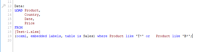
Hi,
Try like this.
This is the data.
| Product | Country | Date | Price |
| T001 | Country A | 31/03/17 | $ 5.00 |
| T002 | Country A | 30/06/17 | $ 3.00 |
| T003 | Country A | 30/09/17 | $ 2.00 |
| T004 | Country A | 31/12/17 | $ 8.00 |
| T005 | Country A | 31/03/18 | $ 3.00 |
| T006 | Country A | 30/06/18 | $ 5.00 |
| T007 | Country A | 30/09/18 | $ 5.00 |
| B001 | Country B | 31/03/17 | $ 6.00 |
| B002 | Country B | 30/06/17 | $ 7.00 |
| B003 | Country B | 30/09/17 | $ 4.00 |
| B004 | Country B | 31/12/17 | $ 5.00 |
| B005 | Country B | 31/03/18 | $ 8.00 |
| B006 | Country B | 30/06/18 | $ 1.00 |
| B007 | Country B | 30/09/18 | $ 3.00 |
| S001 | Country A | 31/03/17 | $ 6.00 |
| S002 | Country A | 30/06/17 | $ 4.00 |
| S003 | Country A | 30/09/17 | $ 3.00 |
| S004 | Country A | 31/12/17 | $ 9.00 |
| S005 | Country A | 31/03/18 | $ 4.00 |
| S006 | Country A | 30/06/18 | $ 6.00 |
| S007 | Country A | 30/09/18 | $ 6.00 |
| C001 | Country B | 31/03/17 | $ 7.00 |
| C002 | Country B | 30/06/17 | $ 8.00 |
| C003 | Country B | 30/09/17 | $ 5.00 |
| C004 | Country B | 31/12/17 | $ 6.00 |
| C005 | Country B | 31/03/18 | $ 9.00 |
| C006 | Country B | 30/06/18 | $ 2.00 |
| C007 | Country B | 30/09/18 | $ 4.00 |
- Mark as New
- Bookmark
- Subscribe
- Mute
- Subscribe to RSS Feed
- Permalink
- Report Inappropriate Content
Dear Mr Arjun Rao
Thanks for your quick reply.
It is not what I want because you have not excluded all Products with prefix B in Country A and via versa, please refer to my correct answer illustrated above.
Regards
Tracy
- Mark as New
- Bookmark
- Subscribe
- Mute
- Subscribe to RSS Feed
- Permalink
- Report Inappropriate Content
I got it now.
Just create two radar charts by using filters and show them side by side.
I think this will works.
But need to create no of charts based on Country count.
- Mark as New
- Bookmark
- Subscribe
- Mute
- Subscribe to RSS Feed
- Permalink
- Report Inappropriate Content
Dear Mr Arjun Rao
Create two charts manually is easy but is there a way to generate x number of charts automatically for all countries ?.
Regards
Tracy
- Mark as New
- Bookmark
- Subscribe
- Mute
- Subscribe to RSS Feed
- Permalink
- Report Inappropriate Content
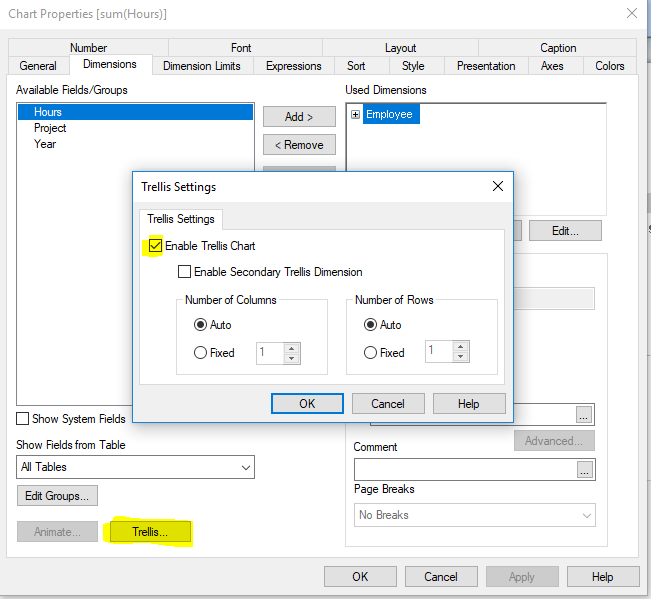
Hi Tracy,
But my reply was directly related to your request. as I alluded to with the Trellis chart being the wrong choice as it will display ALL dimension values (countries T, B, etc...). My explanation went further to explain that the scale would be the same regardless of values used so visually it would probably not show data for all countries related to the associated data, especially if the numbers were a fraction of the other countries.
There is no way to generate all charts based on country without the benefit of the Trellis model. (That's my understanding at least, but thought of an option below)
How many countries are you thinking will display data simultaneously? You could get creative and assign a value (1, 2, 3...) to countries (selected or associated) and those would display in separate charts with dynamic dimension and expression based on those country values. I'm thinking concatenating country field selections, then subfield(concatenated countries) to determine country values 1, 2, 3, etc. Make the charts hidden until the country value was active. As there are over 200 countries in the world this might not be best either as it would require the user to scroll, maybe a lot. I cannot think of an example to show you though, but I think you get my idea.
V/r,
John
- Mark as New
- Bookmark
- Subscribe
- Mute
- Subscribe to RSS Feed
- Permalink
- Report Inappropriate Content
Did you able to get the solution?
- Mark as New
- Bookmark
- Subscribe
- Mute
- Subscribe to RSS Feed
- Permalink
- Report Inappropriate Content
Hi Tracy,
Are you looking for trellis option ?
KC
- « Previous Replies
-
- 1
- 2
- Next Replies »