Unlock a world of possibilities! Login now and discover the exclusive benefits awaiting you.
- Qlik Community
- :
- All Forums
- :
- QlikView App Dev
- :
- Series Chart in Qlikview
- Subscribe to RSS Feed
- Mark Topic as New
- Mark Topic as Read
- Float this Topic for Current User
- Bookmark
- Subscribe
- Mute
- Printer Friendly Page
- Mark as New
- Bookmark
- Subscribe
- Mute
- Subscribe to RSS Feed
- Permalink
- Report Inappropriate Content
Series Chart in Qlikview
Hello,
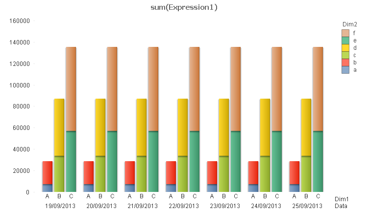
I am trying to create a chart like the screen shot attached.
In the chart, I want the x axis to be the Publication date, with the grouping done by publication. The Y axis will have results for # of Primary and Secondary stops, # of mins for Primary and Secondary Stops, and a total
Is this possible in Qlikview?
I am able to get all of the data into list boxes to validate it, but I am lost as to how to display this properly.
- Mark as New
- Bookmark
- Subscribe
- Mute
- Subscribe to RSS Feed
- Permalink
- Report Inappropriate Content
Similar, check if fits

- Mark as New
- Bookmark
- Subscribe
- Mute
- Subscribe to RSS Feed
- Permalink
- Report Inappropriate Content
I can get it to show that way, but that is not the way my user wants it presented. Is there a way to display it like the screen shot I provided?
- Mark as New
- Bookmark
- Subscribe
- Mute
- Subscribe to RSS Feed
- Permalink
- Report Inappropriate Content
I dont see a way to do it pixel by pixel
- Mark as New
- Bookmark
- Subscribe
- Mute
- Subscribe to RSS Feed
- Permalink
- Report Inappropriate Content
The rule for having a grouped bar chart is that it must be two dimensions and one expression. So the trick here is to limit your chart to two dimensions. You can do that by combining Date & Pub together in a Calculated Dimension.
=Pub & ' ' & Date
You can make it multi-line by
=Pub & chr(10) & Date
However, multiple lines will only display on the axis if you choose the slanted or vertical orientation.
See attached.
-Rob