Unlock a world of possibilities! Login now and discover the exclusive benefits awaiting you.
- Qlik Community
- :
- All Forums
- :
- QlikView App Dev
- :
- Re: Show all labels on the X-axis
- Subscribe to RSS Feed
- Mark Topic as New
- Mark Topic as Read
- Float this Topic for Current User
- Bookmark
- Subscribe
- Mute
- Printer Friendly Page
- Mark as New
- Bookmark
- Subscribe
- Mute
- Subscribe to RSS Feed
- Permalink
- Report Inappropriate Content
Show all labels on the X-axis
I have a line chart which has a dimension with about 200 values. I'd like to see the labels for all 200 shown on the axis, but it looks like it's limiting the number of labels at about 100. I don't have the Max Values Shown box checked. Any idea how I can get it to show all the labels?
- Mark as New
- Bookmark
- Subscribe
- Mute
- Subscribe to RSS Feed
- Permalink
- Report Inappropriate Content
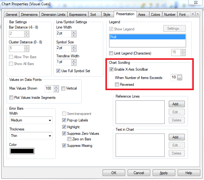
If there's not enough room, it won't show them all. You need to either make the chart larger, or enable x axis scrollbar so a smaller number of them are shown at a time:

- Mark as New
- Bookmark
- Subscribe
- Mute
- Subscribe to RSS Feed
- Permalink
- Report Inappropriate Content
I tried making it bigger. I just end up with blank space on each side of the chart (after the labels on the Y axis there's a large space, then the line begins). I don't want a scroll bar because I need to print this off, and the scroll bar cuts off a lot of the chart.
- Mark as New
- Bookmark
- Subscribe
- Mute
- Subscribe to RSS Feed
- Permalink
- Report Inappropriate Content
You can make the size of the actual chart larger by holding CTRL+Shift and moving the red lines that appear.
- Mark as New
- Bookmark
- Subscribe
- Mute
- Subscribe to RSS Feed
- Permalink
- Report Inappropriate Content
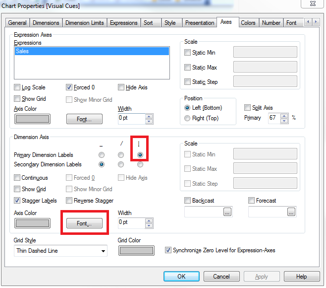
To create more room, you can also try to make the text on the axis smaller as well as using vertical labels:

- Mark as New
- Bookmark
- Subscribe
- Mute
- Subscribe to RSS Feed
- Permalink
- Report Inappropriate Content
I already tried that. The blank space is within the red lines, and the lines already go all the way to the edge of the graph. Stretching them further only makes the blank space bigger.
- Mark as New
- Bookmark
- Subscribe
- Mute
- Subscribe to RSS Feed
- Permalink
- Report Inappropriate Content
I'm already doing vertical labels. I tried shrinking the font size. It made the text smaller, but didn't add in more labels.
- Mark as New
- Bookmark
- Subscribe
- Mute
- Subscribe to RSS Feed
- Permalink
- Report Inappropriate Content
I'm not sure what you mean. Can you post an example or a screenshot?
- Mark as New
- Bookmark
- Subscribe
- Mute
- Subscribe to RSS Feed
- Permalink
- Report Inappropriate Content
200 values is a lot. It may be impossible to get them all to display on a single screen as the chart may need to be huge in order to display them all.
- Mark as New
- Bookmark
- Subscribe
- Mute
- Subscribe to RSS Feed
- Permalink
- Report Inappropriate Content
Some things you can try:
Make the chart wider.
Set the axis font to a smaller size.
Change the orientation on the Style tab.
Final suggestion: post the offending document or an example that demonstrates the problem.
talk is cheap, supply exceeds demand