Unlock a world of possibilities! Login now and discover the exclusive benefits awaiting you.
- Qlik Community
- :
- All Forums
- :
- QlikView App Dev
- :
- Stacked Bar chart showing top 10 Categories over t...
- Subscribe to RSS Feed
- Mark Topic as New
- Mark Topic as Read
- Float this Topic for Current User
- Bookmark
- Subscribe
- Mute
- Printer Friendly Page
- Mark as New
- Bookmark
- Subscribe
- Mute
- Subscribe to RSS Feed
- Permalink
- Report Inappropriate Content
Stacked Bar chart showing top 10 Categories over time
Guys,
I have a support group that wants a chart that shows the top 10 support categories in a bar chart by week. In other words for each week there would be a bar with 10 segments with a count of the top 10 categories for that week. On the on-site I thought this would be pretty straight forward, but as I get into it, I'm not sure how to produce a chart like that.
They are looking for some to replace this excel file.
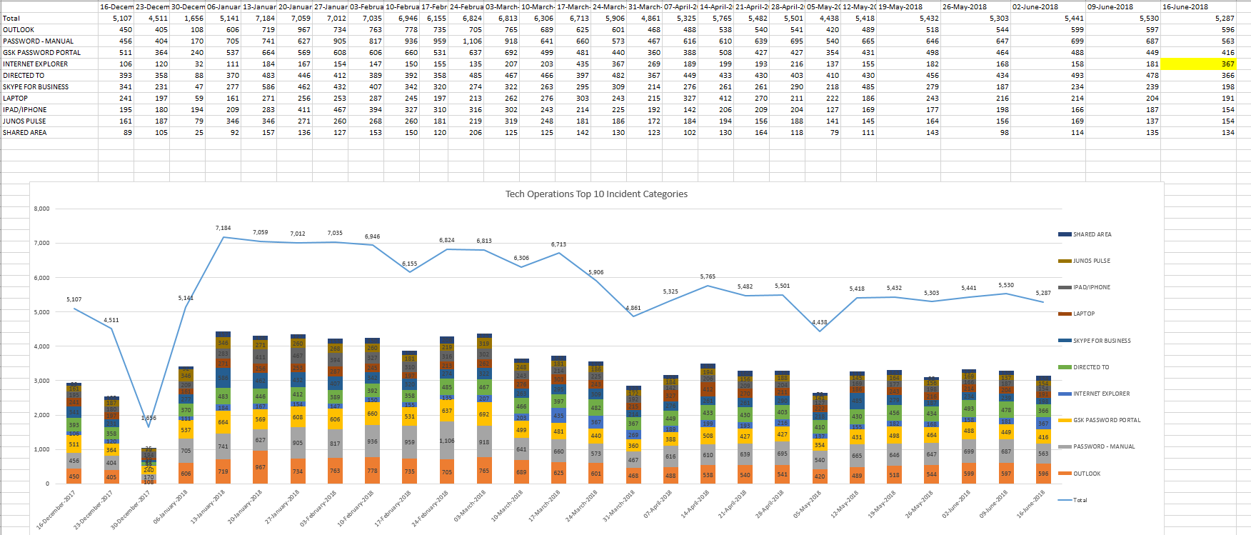
Thoughts?
Accepted Solutions
- Mark as New
- Bookmark
- Subscribe
- Mute
- Subscribe to RSS Feed
- Permalink
- Report Inappropriate Content
Please share some sample data to work with.
- Mark as New
- Bookmark
- Subscribe
- Mute
- Subscribe to RSS Feed
- Permalink
- Report Inappropriate Content
Please share some sample data to work with.
- Mark as New
- Bookmark
- Subscribe
- Mute
- Subscribe to RSS Feed
- Permalink
- Report Inappropriate Content
Thanks Marco. I managed to work out the chart. However, I'm now struggling with a table.
I am trying to replicate this Excel table. In my chart the Date and Category is the dimension and the count is the expression.
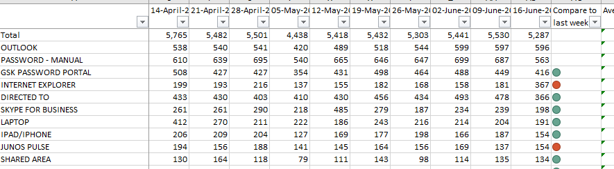
Here is what I have so far in the table work. Any Ideas how to format a table like the one above from Excel?
- Mark as New
- Bookmark
- Subscribe
- Mute
- Subscribe to RSS Feed
- Permalink
- Report Inappropriate Content
Glad it worked out for you.
Please close this thread and open a new one for your new question (so it matches the thread title).
thanks
regards
Marco