Unlock a world of possibilities! Login now and discover the exclusive benefits awaiting you.
- Qlik Community
- :
- All Forums
- :
- QlikView App Dev
- :
- Stacked bar chart
- Subscribe to RSS Feed
- Mark Topic as New
- Mark Topic as Read
- Float this Topic for Current User
- Bookmark
- Subscribe
- Mute
- Printer Friendly Page
- Mark as New
- Bookmark
- Subscribe
- Mute
- Subscribe to RSS Feed
- Permalink
- Report Inappropriate Content
Stacked bar chart
Hi,
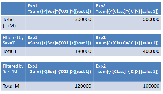
I have the tables attached ( where for clarity I have deleted the dimension rows as they are not useful for the chart I want to create).
The first table has the total, while the second is filtered by the value Sex='F' and the third one by the value Sex='M'
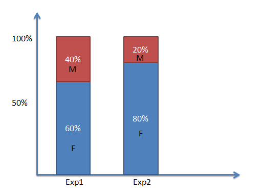
From that table/data I want to create a chart with stacked bars as the one I have attached.
However I cannot create that, as the dimensions I want to put on x axis are, in reality, expressions:
Exp1 =Sum ({<[Soc]={'001'}>}[cost 1])
Exp2 =sum({<[Class]={'C'}>} [sales 1])
Is there a way to achive that?
many thanks in advance,
- Mark as New
- Bookmark
- Subscribe
- Mute
- Subscribe to RSS Feed
- Permalink
- Report Inappropriate Content
Hi,
Maybe this can help because I'm not sure if you can see what you want.
- Mark as New
- Bookmark
- Subscribe
- Mute
- Subscribe to RSS Feed
- Permalink
- Report Inappropriate Content
Hi Rebeca,
unfortunatelly, the graph you posted is not what I want. Each bar should show the percentage of male and female, so for Exp1 it's the first bar and then for Exp2 the second bar in the chart I attached.
Hope now it's more clear, otherwise I have no problems to provide more examples if needed.
thanks,
- Mark as New
- Bookmark
- Subscribe
- Mute
- Subscribe to RSS Feed
- Permalink
- Report Inappropriate Content
Hagakure, did you ever figure this out? I'm trying to do the exact same thing. Thanks!
- Mark as New
- Bookmark
- Subscribe
- Mute
- Subscribe to RSS Feed
- Permalink
- Report Inappropriate Content
Here is an example of a stacked bar chart using multiple expression.
To create this I've added an inline table with the values I wish to display as my X axis labels and used that field as my primary dimension. Secondary dimension is Sex to create the stacked bars.
The expression uses conditional logic to match the dimension with the expression I want to calculate.
- Mark as New
- Bookmark
- Subscribe
- Mute
- Subscribe to RSS Feed
- Permalink
- Report Inappropriate Content
Thanks!