Unlock a world of possibilities! Login now and discover the exclusive benefits awaiting you.
- Qlik Community
- :
- All Forums
- :
- QlikView App Dev
- :
- Still Can't figure out QlikSense Histogram
- Subscribe to RSS Feed
- Mark Topic as New
- Mark Topic as Read
- Float this Topic for Current User
- Bookmark
- Subscribe
- Mute
- Printer Friendly Page
- Mark as New
- Bookmark
- Subscribe
- Mute
- Subscribe to RSS Feed
- Permalink
- Report Inappropriate Content
Still Can't figure out QlikSense Histogram
I have done everything I can possibly find on the forums to try and use the QilkSense Histograms, but for some reason I cannot get it to work.
I have Data like this:
Project ID Year Quarter Expense
1 2018 1 4
1 2018 2 3
1 2018 3 1
1 2018 4 1
1 2017 1 5
1 2017 2 2
1 2017 3 1
1 2017 4 5
2 2018 1 4
2 2018 2 3
2 2018 3 1
2 2018 4 1
2 2017 1 5
2 2017 2 2
2 2017 3 1
2 2017 4 5
I want a histogram of total Expense by project for just the year 2018.
This was my best guess for a dimension
aggr(Sum( {$<[Year]=2018>}[Expense]), Project ID)
But I get a "This Chart is not displayed because it contains only undefined values"
Any ideas why this is not working?
- « Previous Replies
-
- 1
- 2
- Next Replies »
- Mark as New
- Bookmark
- Subscribe
- Mute
- Subscribe to RSS Feed
- Permalink
- Report Inappropriate Content
Try
Sum(1{<Year = 2018>} Expense) as the measure and Project ID as the dimension
- Mark as New
- Bookmark
- Subscribe
- Mute
- Subscribe to RSS Feed
- Permalink
- Report Inappropriate Content
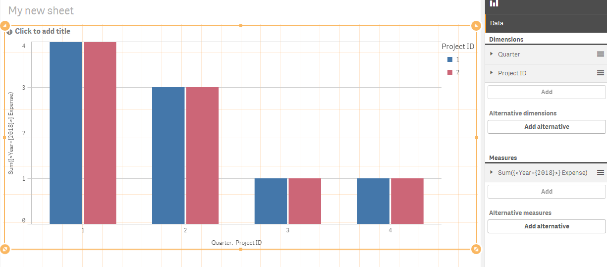
Are you sure it is a histogram you should use? From the data and what you explain it seems to me that a bar chart is the right chart type.
A histogram have intervals/bins and frequencies/frequency densities - and your data is summing up expenses not about frequencies.
Do you want to display the sum per quarter for each project for the year of 2018?
Then a bar chart could be made like this:
- Mark as New
- Bookmark
- Subscribe
- Mute
- Subscribe to RSS Feed
- Permalink
- Report Inappropriate Content
Yes, Although I only show 2 projects above, I have hundreds. And I want to show the frequency of different projects bucketed by the amount they are spending. So how many projects are spending 0-1, 1-2, 2-3, 3-4, 4-5 etc. Thanks for the quick response though.
- Mark as New
- Bookmark
- Subscribe
- Mute
- Subscribe to RSS Feed
- Permalink
- Report Inappropriate Content
There is no measure in a histogram, only a dimension. This is another reason I am so confused.
- Mark as New
- Bookmark
- Subscribe
- Mute
- Subscribe to RSS Feed
- Permalink
- Report Inappropriate Content
William,
I have given it another shot. Please see the attached QVF
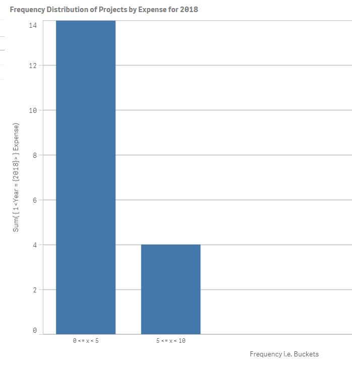
I have bucketed the expenses for the year 2018 in a class interval of 5. The class interval size can be controlled by the parameter of the class function.
The implementation is based on aaroncouran method at You Have No Class: The Coolest Qlik Function You Aren’t Using
- Mark as New
- Bookmark
- Subscribe
- Mute
- Subscribe to RSS Feed
- Permalink
- Report Inappropriate Content
Since the Field is not an aggregate you can't use a set expression. The alternative would be to use an if:
=IF(Year=2017,Expense)
- Mark as New
- Bookmark
- Subscribe
- Mute
- Subscribe to RSS Feed
- Permalink
- Report Inappropriate Content
This is close, but the goal was to aggregate all of the all of the quarters from each year into a total from the year. Hence the aggregation in what I tested above. I keep reading about the class function and some people say it is needed and other say it is now. I am just very confused at what it does.
- Mark as New
- Bookmark
- Subscribe
- Mute
- Subscribe to RSS Feed
- Permalink
- Report Inappropriate Content
This is still not it. I am looking for a Histogram (Frequency on the Y axis).
According to the test data above, Project ID 1 spent 9 in 2018 and Project ID 2 spent 9 in 2018. If the buckets were in increments of 1. The histogram would have 2 projects in the '9' bucket.
Also, you are still trying to show a histogram using the barchart in QlikSense. I know that a histogram can be built using a bar chart, but how do you do it with the actual histogram chart?
- Mark as New
- Bookmark
- Subscribe
- Mute
- Subscribe to RSS Feed
- Permalink
- Report Inappropriate Content
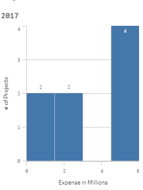
The Histogram Chart in Qlik Sense does not allow to aggregate in any way. It is always locked to the granularity of the Field you select. So the only way of getting it to work as far as I know is to create an aggregated table in you load script.
With the sample data that you provided it would look like this:
[PROJECT HISTOGRAM]:
LOAD
[Project ID],
Year AS HistYear,
Sum(Expense) AS YearlyExpensePerProject
RESIDENT
DATA
GROUP BY
Year, [Project ID];
The you select YearlyExpensePerProject as Field or rather =If( HistYear=2018 , YearlyExpensePerProject )
Then a single bar with the frequency of 2 and expense of 13 for both will show up for 2017. For 2018 it will also be a single bar with a frequency of 2 with expense of 9.
So with the added aggregated table it will work for you.
- « Previous Replies
-
- 1
- 2
- Next Replies »