Unlock a world of possibilities! Login now and discover the exclusive benefits awaiting you.
- Qlik Community
- :
- All Forums
- :
- QlikView App Dev
- :
- Re: Table with conditional data bars
- Subscribe to RSS Feed
- Mark Topic as New
- Mark Topic as Read
- Float this Topic for Current User
- Bookmark
- Subscribe
- Mute
- Printer Friendly Page
- Mark as New
- Bookmark
- Subscribe
- Mute
- Subscribe to RSS Feed
- Permalink
- Report Inappropriate Content
Table with conditional data bars
Hi,
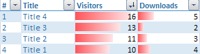
I'm trying to recreate the very same table in QlikView:
and this is what I've got so far:
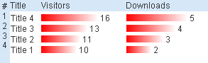
These are 2 overlaying bar charts with different layer settings and 2 text boxes on top of them. The Pyjama Blue style as a background is missing and the values are not aligned to the right. How can I fix these issues?
Regards,
Ivelin
Accepted Solutions
- Mark as New
- Bookmark
- Subscribe
- Mute
- Subscribe to RSS Feed
- Permalink
- Report Inappropriate Content
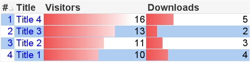
Here's fairly close using just a single chart. I couldn't fix the title line colors because doing a custom format cell on that row was crashing my QlikView. I wasn't sure if you wanted the size of the download bars to be on the same exact scale as the visitors bars, so that they would be visually comparable, but that's what I did. If you want a separate scale for the downloads bars, edit the max expression in the gauge properties and replace Visitors with Downloads.
- Mark as New
- Bookmark
- Subscribe
- Mute
- Subscribe to RSS Feed
- Permalink
- Report Inappropriate Content
Hi ,
How about plotting the datapoints inside the bar, may be that can align the values exactly..
- Mark as New
- Bookmark
- Subscribe
- Mute
- Subscribe to RSS Feed
- Permalink
- Report Inappropriate Content
Hi,
I tried that but it just moves the values a little to the left and I want them all aligned to the right, as they are in the excel.
- Mark as New
- Bookmark
- Subscribe
- Mute
- Subscribe to RSS Feed
- Permalink
- Report Inappropriate Content
HI
It display the data above the top of the bar only..We can't able to align the values in the right side
Please close the thread by marking correct answer & give likes if you like the post.
- Mark as New
- Bookmark
- Subscribe
- Mute
- Subscribe to RSS Feed
- Permalink
- Report Inappropriate Content
Here's fairly close using just a single chart. I couldn't fix the title line colors because doing a custom format cell on that row was crashing my QlikView. I wasn't sure if you wanted the size of the download bars to be on the same exact scale as the visitors bars, so that they would be visually comparable, but that's what I did. If you want a separate scale for the downloads bars, edit the max expression in the gauge properties and replace Visitors with Downloads.
- Mark as New
- Bookmark
- Subscribe
- Mute
- Subscribe to RSS Feed
- Permalink
- Report Inappropriate Content
Thanks John!