Unlock a world of possibilities! Login now and discover the exclusive benefits awaiting you.
- Qlik Community
- :
- All Forums
- :
- QlikView App Dev
- :
- Re: Trying to create a chart in QV - help!
- Subscribe to RSS Feed
- Mark Topic as New
- Mark Topic as Read
- Float this Topic for Current User
- Bookmark
- Subscribe
- Mute
- Printer Friendly Page
- Mark as New
- Bookmark
- Subscribe
- Mute
- Subscribe to RSS Feed
- Permalink
- Report Inappropriate Content
Trying to create a chart in QV - help!
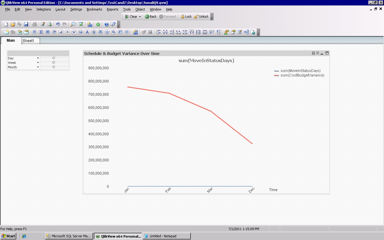
I have created tried to create chart in QV to show budget and schedule variance over time. Also, I've tried to add a control to this time to show the information by day, week and month. I also have to show the variance by time with a specific project manager - I haven't done this yet, but I'm assuming I'll have to put it on another sheet?
But with regards to the below chart - have I done the task I set out to do or show? I think I have, but it's my first day on QV and I have no idea! 
 Any help would be so much appreciated.Thank you!
Also, to show the variance for each project as of today can I do it on this or create another chart/sheet for that? I have attached the details of the task. Thanks.
- Tags:
- new_to_qlikview
- « Previous Replies
-
- 1
- 2
- Next Replies »
- Mark as New
- Bookmark
- Subscribe
- Mute
- Subscribe to RSS Feed
- Permalink
- Report Inappropriate Content
Looks pretty good so far.
"Add a control to the time axis allowing the user to show this information by day, week or month."
This sounds like a request for something that I typically add to charts like this - a cyclic group as the dimension. Do this:
settings -> document properties -> groups -> new -> Group Name = Period -> checkmark Cyclic Group -> add Month, Week and Day -> OK -> OK
Now in your chart, remove the Month dimension and add the Period dimension. The default view will be by month, but by clicking on the little circular arrow, you can cycle between the Month, Week and Day.
- Mark as New
- Bookmark
- Subscribe
- Mute
- Subscribe to RSS Feed
- Permalink
- Report Inappropriate Content
John, I did that and it worked brilliantly! Thank you so much! The cyclic
thing worked well. I noticed that my schedule variance is kinda flat
lining...how would I change that?
On Fri, Jul 1, 2011 at 3:44 PM, John Witherspoon <
- Mark as New
- Bookmark
- Subscribe
- Mute
- Subscribe to RSS Feed
- Permalink
- Report Inappropriate Content
I'm not sure what you mean by "flat lining".
- Mark as New
- Bookmark
- Subscribe
- Mute
- Subscribe to RSS Feed
- Permalink
- Report Inappropriate Content
Oh, I just meant that's it just keep showing the line as flat or horizontal
- thus not giving any information about the schedule variance. I'm assuming
it's something to do with changing the axis numbers? But I'm not sure how to
do this.
- Mark as New
- Bookmark
- Subscribe
- Mute
- Subscribe to RSS Feed
- Permalink
- Report Inappropriate Content
I have no idea why the line would be flat/horizontal. Can you post the application?
- Mark as New
- Bookmark
- Subscribe
- Mute
- Subscribe to RSS Feed
- Permalink
- Report Inappropriate Content
I attached it. Let me know if it worked. Thanks
- Mark as New
- Bookmark
- Subscribe
- Mute
- Subscribe to RSS Feed
- Permalink
- Report Inappropriate Content
Well, the sum(CostBudgetVariance) line seems to vary plenty. So it's the sum(MoveInStatusDays) that is the problem? If so it's because it has a drastically different scale than the other. The way to display them both in a single chart is to give the second expression its own scale:
chart properties -> axes -> select sum(MoveInStatusDays) -> Position = right(Top) -> OK
Then they'll both have displayable values.
The next problem I see is that you can't see one line because the other is on top of it. I recommend using transparent colors for that.
chart properties -> colors -> click on the first color -> select "calculated" -> type argb(130,0,0,130) in the box -> OK -> click on the second color -> select calculated -> type argb(130,130,0,0) in the box -> OK -> OK
I think that makes it easier to see crossing and overlapping lines.
Ah, I see another problem. I really wouldn't define Month and Week and Day the way you have. I'd define them like this:
,date(monthstart(SnapshotDate),'MMM YYYY') as Month
,date(weekstart(SnapshotDate)) as Week
,date(SnapshotDate) as Date
The problem with what you have now is that multiple years, months and weeks will all sort of intermingle in your chart. Day 15 of every month will just show up as 15. That's probably not what you want. The code above will make sure that everything is in the right sequence and not combined on your axis.
- Mark as New
- Bookmark
- Subscribe
- Mute
- Subscribe to RSS Feed
- Permalink
- Report Inappropriate Content
I made all the changes you suggested and it looks a lot better - esp the
axis and the variance lines. Thanks so much! I never would have been able to
figure it out. I just realised my instructions also tell me to look at
variance for each project as of today - do you know what would mean?
On Fri, Jul 1, 2011 at 5:25 PM, John Witherspoon <
- Mark as New
- Bookmark
- Subscribe
- Mute
- Subscribe to RSS Feed
- Permalink
- Report Inappropriate Content
Maybe some chart that specifically just always shows today's variance? So assuming that today is one of the days in your data set, just show the variance for that day? Like this?
Dimension = project
Expression = sum(if(Date=today(),CostBudgetVariance))
Or the higher-performance alternative (look up "Set Analysis" in the help text index if you REALLY want to dive into the deep end of QlikView):
sum({<Date={'$(=today())'}>} CostBudgetVariance)
That's assuming you define the date like I mentioned, so that it's actually a date, so that it can be compared to today(). Hmmm, a particularly low performance version would be like this:
Dimension 1 = project
Dimension 2 = if(Date=today(),Date)
Expression = sum(CostBudgetVariance)
OK, seriously, I'm going home now.
- « Previous Replies
-
- 1
- 2
- Next Replies »