Unlock a world of possibilities! Login now and discover the exclusive benefits awaiting you.
- Qlik Community
- :
- All Forums
- :
- QlikView App Dev
- :
- Re: Wallpaper Displays In Wrong Location In Ajax
- Subscribe to RSS Feed
- Mark Topic as New
- Mark Topic as Read
- Float this Topic for Current User
- Bookmark
- Subscribe
- Mute
- Printer Friendly Page
- Mark as New
- Bookmark
- Subscribe
- Mute
- Subscribe to RSS Feed
- Permalink
- Report Inappropriate Content
Wallpaper Displays In Wrong Location In Ajax
Hi,
There is a very annoying 'feature' in QlikView where the wallpaper appears lower on the sheet than it should, leaving a gap at the top. This is particularly problematic as I tend to use the wall paper to define the location of parts of my sheets.
This happens opens a document in IE plugin and more than one row of tabs is required, and then changes the size of their window so fewer rows of tabs is required. It can also happen in the Ajax client, despite that only ever having one tab row.
Has anyone else experienced this, and is anyone aware of a fix for it?
I'm thinking it may be a browser issue, but I have seen it at many different companies with may different browsers.
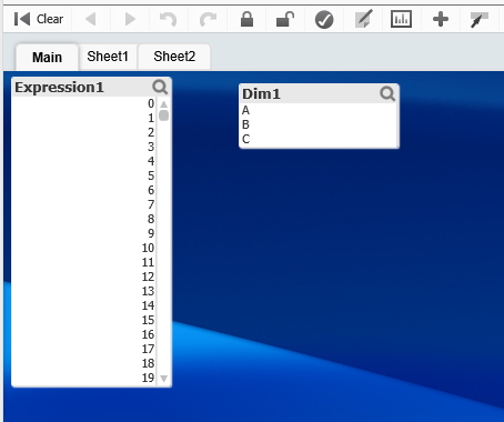
See this image as an example:
The blue header bar should appear directly under the tabs, but instead there is a gap showing the background colour.
Any thoughts gratefully received.
Thanks,
Steve
- Mark as New
- Bookmark
- Subscribe
- Mute
- Subscribe to RSS Feed
- Permalink
- Report Inappropriate Content
Hi,
I have the exact same problem at one of my customers. Or almost, there are two users that have this problem, and for them it occurs in Qlikview Desktop as well. All other users do not have this problem. I have not found a solution yet. Also tried to reinstall the desktop client.
Would love it if somebody has a solution for this!
- Mark as New
- Bookmark
- Subscribe
- Mute
- Subscribe to RSS Feed
- Permalink
- Report Inappropriate Content
Steve,
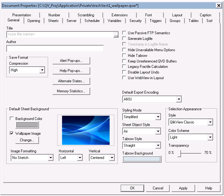
It worked ok for me, however I tested on 11.20.12235 on IE. What are the dimensions/resolution of your image? Mine was a large image file (2800x1705). Also, What are your settings in Default Sheet Background? Attached is what I have.
Please let me know when you end up finding the culprit. Good luck.
Gus


- Mark as New
- Bookmark
- Subscribe
- Mute
- Subscribe to RSS Feed
- Permalink
- Report Inappropriate Content
Hi Filip,
That's interesting that it affects some users and not others at your site. Most places I have seen this it does not happen frequently, and I just advise people to press F5 when it occurs. One person at one of my customers frequently docs and un-docks their laptop from a docking station, and this causes it to go wrong every time.
I thought a magic fix was unlikely, but there is never any harm in asking!
If I find out more I will certainly report back.
Cheers,
Steve
- Mark as New
- Bookmark
- Subscribe
- Mute
- Subscribe to RSS Feed
- Permalink
- Report Inappropriate Content
Hi Gustavo,
The image is simply a banner, to keep global search, current selections and a few multiboxes in. It is 3200x60.
I have seen the issue when the tabs wrap on the IE plugin version. This is happening in the Ajax version though, so I am wondering if the Ajax buttons are wrapping onto two rows on the users low-res laptop screen.
Not been able to get onto the users machine who is having the issue, and typically I can not recreate the issue when I try to.
Cheers,
Steve
- Mark as New
- Bookmark
- Subscribe
- Mute
- Subscribe to RSS Feed
- Permalink
- Report Inappropriate Content
There is no reliable fixes, AFAIK. The result depends on screen resolution and the browser, hence it depends on user.
Another good reason against using wallpaper... Go plain white ![]()
- Mark as New
- Bookmark
- Subscribe
- Mute
- Subscribe to RSS Feed
- Permalink
- Report Inappropriate Content
Whilst I can definitely see the merits of plain white, having a way of putting a dividing line between selections and visualisations that can not accidentally be clicked on is reason enough for me to go for a wallpaper.
Is it too much to expect it to stay where I put it? ![]()
Steve
- Mark as New
- Bookmark
- Subscribe
- Mute
- Subscribe to RSS Feed
- Permalink
- Report Inappropriate Content
Strange, we haven't seen anything similar in our demos which uses wallpapers extensively.
No stretch and top align usually does the trick for us, the tabs should not wrap to rows unless they are running a very old version of IE.
Can't remember in which SR of QV11 we introduced scroll/drop-down tabs but check which version they are running on QV also.
- Mark as New
- Bookmark
- Subscribe
- Mute
- Subscribe to RSS Feed
- Permalink
- Report Inappropriate Content
No, it's not to much to expect, if you can enforce the same screen resolution and same browser for all users ![]()
- Mark as New
- Bookmark
- Subscribe
- Mute
- Subscribe to RSS Feed
- Permalink
- Report Inappropriate Content
I've seen this sort of behavior. Virtually every time when background image is used (luckily not too often).