Unlock a world of possibilities! Login now and discover the exclusive benefits awaiting you.
- Qlik Community
- :
- All Forums
- :
- QlikView App Dev
- :
- Waterfall chart using a stacked bar chart
- Subscribe to RSS Feed
- Mark Topic as New
- Mark Topic as Read
- Float this Topic for Current User
- Bookmark
- Subscribe
- Mute
- Printer Friendly Page
- Mark as New
- Bookmark
- Subscribe
- Mute
- Subscribe to RSS Feed
- Permalink
- Report Inappropriate Content
Waterfall chart using a stacked bar chart
Hi,
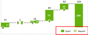
I need to build a waterfall chart using a stacked bar chart that shows me the evolution of two categories of sales of the last 5 months until the YTD for the qualified and requalified categories. The objective is to achieve a result like showed in the image below.
I’m trying to use the offset option with a stacked bar chart but I’m not getting any results. I have two expressions one for each category of sales and a offset expression based on something I read in Qlik Community.
I’m using as calculated dimension the following:
=Pick(Type, Month, 'Total')
The Type value is a table I have in load script:
Table:
LOAD * Inline [
Type
1
2
];
The formulas I’m using are:
=If(Pick(Type, Month, 'Total') = 'Total', Sum(total Value), Sum({$<CategoryType={'Qualified'}>} Value))
=If(Pick(Type, Month, 'Total') = 'Total', Sum(total Value), Sum({$<CategoryType={'Requalified'}>} Value))
The offset expression is:
=If(RowNo() = 1, 0, Sum(Total Value) - RangeSum(Above(If(Pick(Type, Month, 'Total') = 'Total', 0, Sum({$<CategoryType ={'Qualified'}>} Value)), 0, RowNo())))
Could anyone help me with this, please?
Thanks in advance
Regards
Paulo
- « Previous Replies
- Next Replies »
- Mark as New
- Bookmark
- Subscribe
- Mute
- Subscribe to RSS Feed
- Permalink
- Report Inappropriate Content
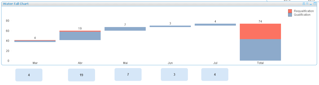
Something like this?
- Mark as New
- Bookmark
- Subscribe
- Mute
- Subscribe to RSS Feed
- Permalink
- Report Inappropriate Content
Yes something like this...but I think the values are not being calculated correctly. If I make a selection the values seems to be incorrect.They should be the same as showed in the graph,right?
I also need to put the month description that will change according to the month selected.
Thanks
Paulo
- Mark as New
- Bookmark
- Subscribe
- Mute
- Subscribe to RSS Feed
- Permalink
- Report Inappropriate Content
Like what selections have you made? Can you give screenshot of where it isn't working?
- Mark as New
- Bookmark
- Subscribe
- Mute
- Subscribe to RSS Feed
- Permalink
- Report Inappropriate Content
Hi Sunny,
I’ve looked more closely to the results and I think the values are correct. If needed I will come back here.
Many thanks
Paulo
- Mark as New
- Bookmark
- Subscribe
- Mute
- Subscribe to RSS Feed
- Permalink
- Report Inappropriate Content
Sounds like a plan 
- « Previous Replies
- Next Replies »