Unlock a world of possibilities! Login now and discover the exclusive benefits awaiting you.
Announcements
Customer Spotlight: Discover what’s possible with embedded analytics Oct. 16 at 10:00 AM ET:
REGISTER NOW
- Qlik Community
- :
- All Forums
- :
- QlikView App Dev
- :
- Re: Why the dot in my combo chart is shown as a li...
Options
- Subscribe to RSS Feed
- Mark Topic as New
- Mark Topic as Read
- Float this Topic for Current User
- Bookmark
- Subscribe
- Mute
- Printer Friendly Page
Turn on suggestions
Auto-suggest helps you quickly narrow down your search results by suggesting possible matches as you type.
Showing results for
Not applicable
2017-08-01
05:05 AM
- Mark as New
- Bookmark
- Subscribe
- Mute
- Subscribe to RSS Feed
- Permalink
- Report Inappropriate Content
Why the dot in my combo chart is shown as a line chart???
Why the dots in my combo chart are shown as a line chart???
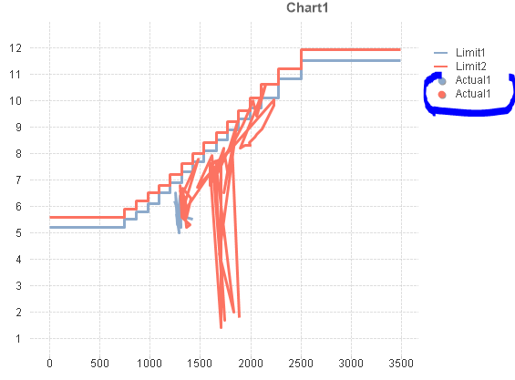
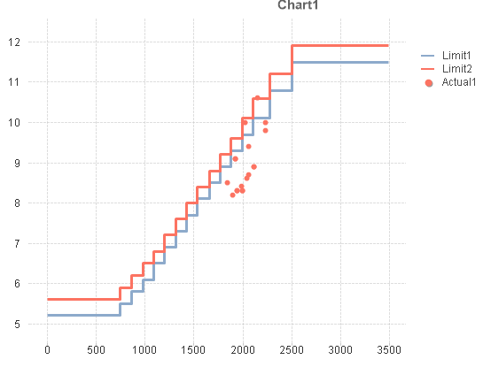
But when I chose one filter this chart can show correct.
541 Views
2 Replies
Master III
2017-08-01
05:28 AM
- Mark as New
- Bookmark
- Subscribe
- Mute
- Subscribe to RSS Feed
- Permalink
- Report Inappropriate Content
Please check this.
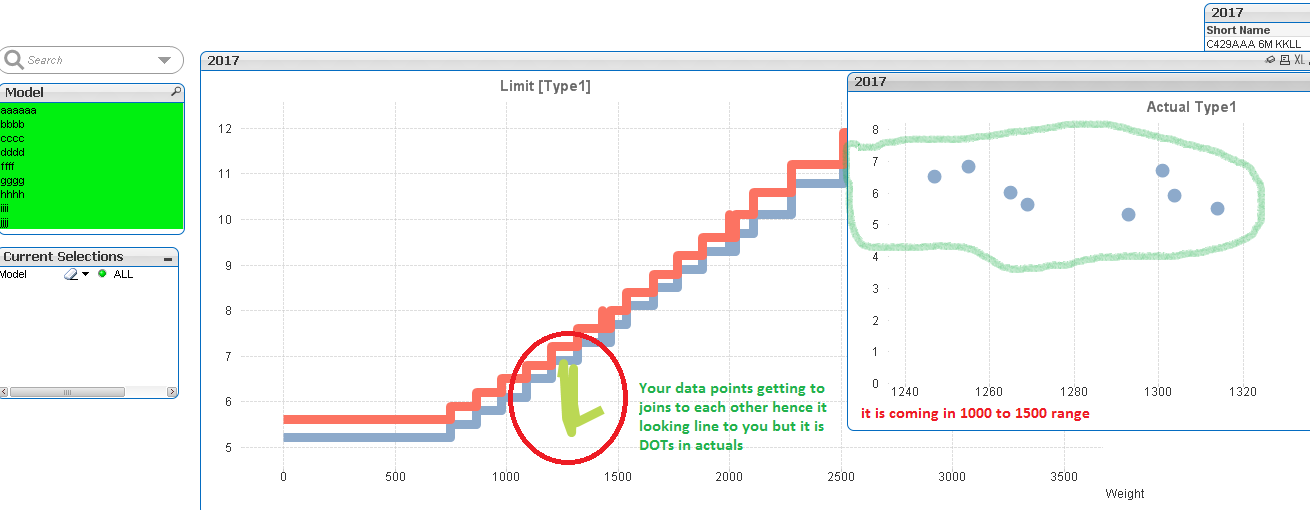
In your chart data point (dots) are connecting to each other due to axis range when you take single expression you will see the difference.
436 Views
Not applicable
2017-08-01
05:38 AM
Author
- Mark as New
- Bookmark
- Subscribe
- Mute
- Subscribe to RSS Feed
- Permalink
- Report Inappropriate Content
Hi P M,
Do you know how to solve this problem??? Cause I cannot change the raw data, but I have to show this chart correctly.
Thanks in advance!
436 Views