Unlock a world of possibilities! Login now and discover the exclusive benefits awaiting you.
- Qlik Community
- :
- All Forums
- :
- QlikView App Dev
- :
- Re: Wrong Values displayed in the Grid Chart
- Subscribe to RSS Feed
- Mark Topic as New
- Mark Topic as Read
- Float this Topic for Current User
- Bookmark
- Subscribe
- Mute
- Printer Friendly Page
- Mark as New
- Bookmark
- Subscribe
- Mute
- Subscribe to RSS Feed
- Permalink
- Report Inappropriate Content
Wrong Values displayed in the Grid Chart
Dear Community,
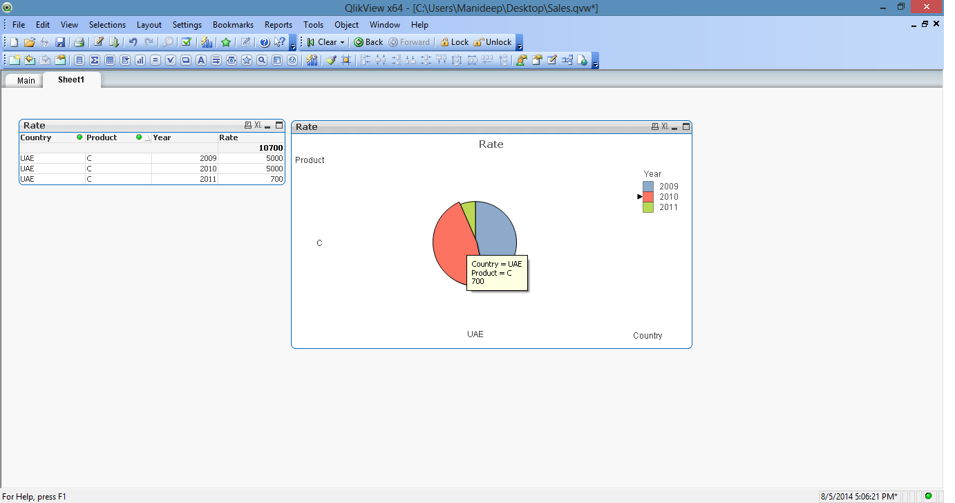
I have an issue with the Grid Chart.
Dimensions:
Country
Year
Product
Expression =Sum(Sales).
As you can see in the below Grid Chart, the plot is splitting according to the values. But When I placing the cursor on any partition it showing 700 instead of corresponding values. When I place cursor on red it should display 5000, green =700, blue=500. But for every partition it is displaying 700.
Can you please help me where I am going wrong.

Thanks & Regards
Manideep
- Tags:
- gridchart
- show_values
- « Previous Replies
-
- 1
- 2
- Next Replies »
- Mark as New
- Bookmark
- Subscribe
- Mute
- Subscribe to RSS Feed
- Permalink
- Report Inappropriate Content
try to recreate your chart again, you might missed something.
- Mark as New
- Bookmark
- Subscribe
- Mute
- Subscribe to RSS Feed
- Permalink
- Report Inappropriate Content
Hi Yousef,
Thanks for the response. I tried it again but I got the same problem.
Regards
Manideep
- Mark as New
- Bookmark
- Subscribe
- Mute
- Subscribe to RSS Feed
- Permalink
- Report Inappropriate Content
Hi,
Can you share sample app.
Regards
ASHFAQ
- Mark as New
- Bookmark
- Subscribe
- Mute
- Subscribe to RSS Feed
- Permalink
- Report Inappropriate Content
Please share an example
- Mark as New
- Bookmark
- Subscribe
- Mute
- Subscribe to RSS Feed
- Permalink
- Report Inappropriate Content
Hi Manideep,
Could you attach a sample of your app?
Also, just to check: your expression says sum(Sales) and on the chart you are showing values for [Rates] instead of [Sales]. Is this correct? Maybe the sum is of a different field?
- Mark as New
- Bookmark
- Subscribe
- Mute
- Subscribe to RSS Feed
- Permalink
- Report Inappropriate Content
Attached sample application
- Mark as New
- Bookmark
- Subscribe
- Mute
- Subscribe to RSS Feed
- Permalink
- Report Inappropriate Content
Hi Jose,
Sum(Sales) is correct actually. Small misunderstanding in the expression title.
- Mark as New
- Bookmark
- Subscribe
- Mute
- Subscribe to RSS Feed
- Permalink
- Report Inappropriate Content
check how many dimension and expression you shold use in this type of charts and what is the purpose to use it, try to play with the dimension order, there is something wrong in the report itself
- Mark as New
- Bookmark
- Subscribe
- Mute
- Subscribe to RSS Feed
- Permalink
- Report Inappropriate Content
It looks like a bug. I created the same chart from the same sample data and I noticed that the checkbox "Text as popup" is deactivated. Maybe to avoid the confusion of the displayed values...

I whould check with Qlik's support team.
- « Previous Replies
-
- 1
- 2
- Next Replies »