Unlock a world of possibilities! Login now and discover the exclusive benefits awaiting you.
- Qlik Community
- :
- All Forums
- :
- QlikView App Dev
- :
- Re: YoY (Year over year growth) by month
- Subscribe to RSS Feed
- Mark Topic as New
- Mark Topic as Read
- Float this Topic for Current User
- Bookmark
- Subscribe
- Mute
- Printer Friendly Page
- Mark as New
- Bookmark
- Subscribe
- Mute
- Subscribe to RSS Feed
- Permalink
- Report Inappropriate Content
YoY (Year over year growth) by month
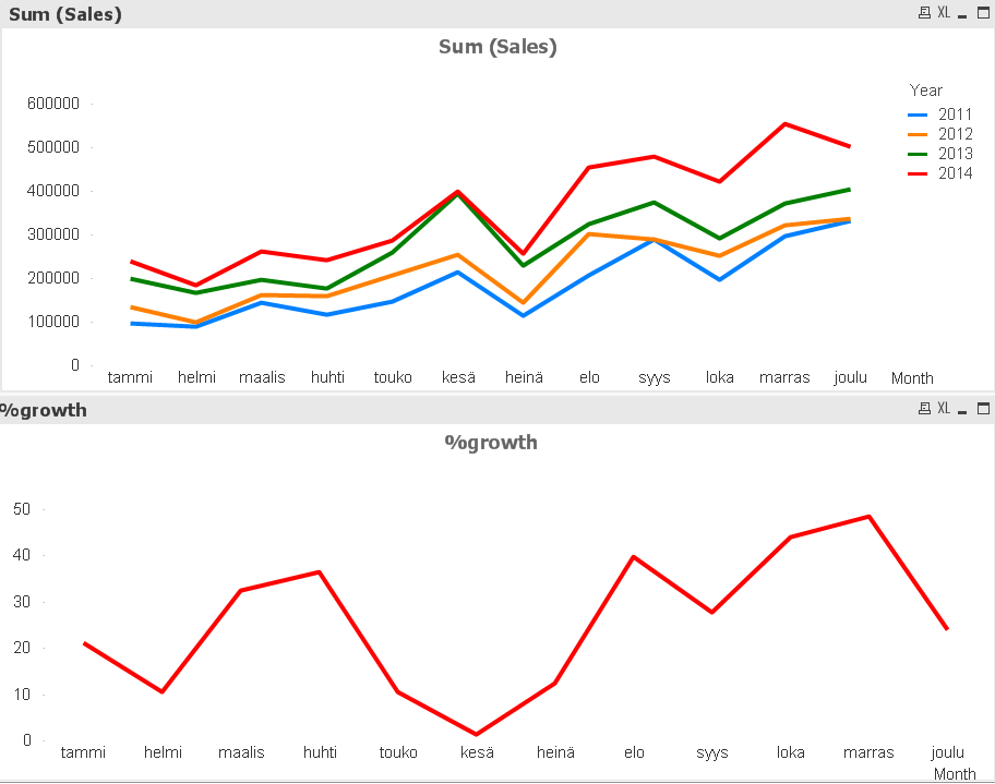
I'm trying to accomplish calculating and visualizing YoY growth. I can get the growth from the previous year to the max year (eg 2013 -> 2014, bottom graph) with this:
=((sum({$<Year = {$(=max(Year))}>}Sales) - sum({$<Year ={$(=max(Year)-1)}>}Sales))/ sum({$<Year = {$(=max(Year)-1)}>}Sales)) * 100
...but what would be the function to get it for all the years in the past (here: 2011 -> 2012 & 2012 -> 2013)?
- Mark as New
- Bookmark
- Subscribe
- Mute
- Subscribe to RSS Feed
- Permalink
- Report Inappropriate Content
Script:
Table:
LOAD *,
Year([Order Date]) as Year,
Month([Order Date]) as Month,
MonthName([Order Date]) as MonthYear;
LOAD [Row ID],
[Order Priority],
Discount,
[Unit Price],
[Shipping Cost],
[Customer ID],
[Customer Name],
[Ship Mode],
[Customer Segment],
[Product Category],
[Product Sub-Category],
[Product Container],
[Product Name],
[Product Base Margin],
Region,
[State or Province],
City,
[Postal Code],
[Order Date],
[Ship Date],
Profit,
[Quantity ordered new],
Sales,
[Order ID]
FROM
[Sample - Superstore Subset (Excel).xlsx]
(ooxml, embedded labels, table is Orders);
FinalTable:
NoConcatenate
LOAD *
Resident Table
Order By Month, Year;
DROP Table Table;
Expression: =Aggr(((Sum(Sales)/Above(Sum(Sales))) - 1) * 100, Year, Month)
- Mark as New
- Bookmark
- Subscribe
- Mute
- Subscribe to RSS Feed
- Permalink
- Report Inappropriate Content
Thank you Sonny and Settu for your thoughts, I'm afraid something is not going right in the solutions.
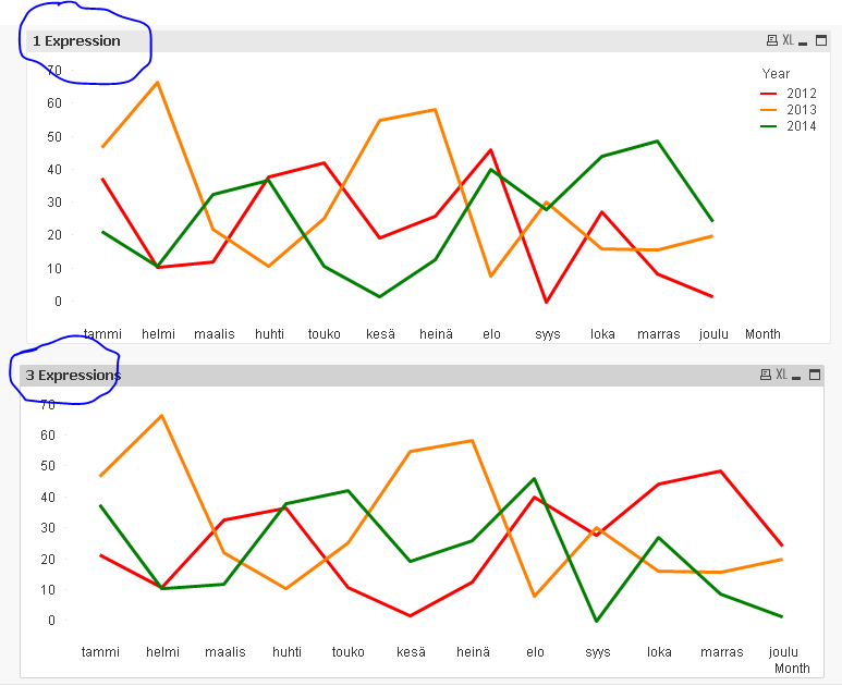
I would need to show a line per year with the monthly change (for example in February (helmi) the change from 2012 => 2013 is about 67% like shown by the yellow line in the lower graph below).
The previous proposals (for example by Devanand) accomplish this, but in that solution a separate line of code is needed for each year. I was looking for a "one liner" to accomplish the same.
The correct graph will look like this:
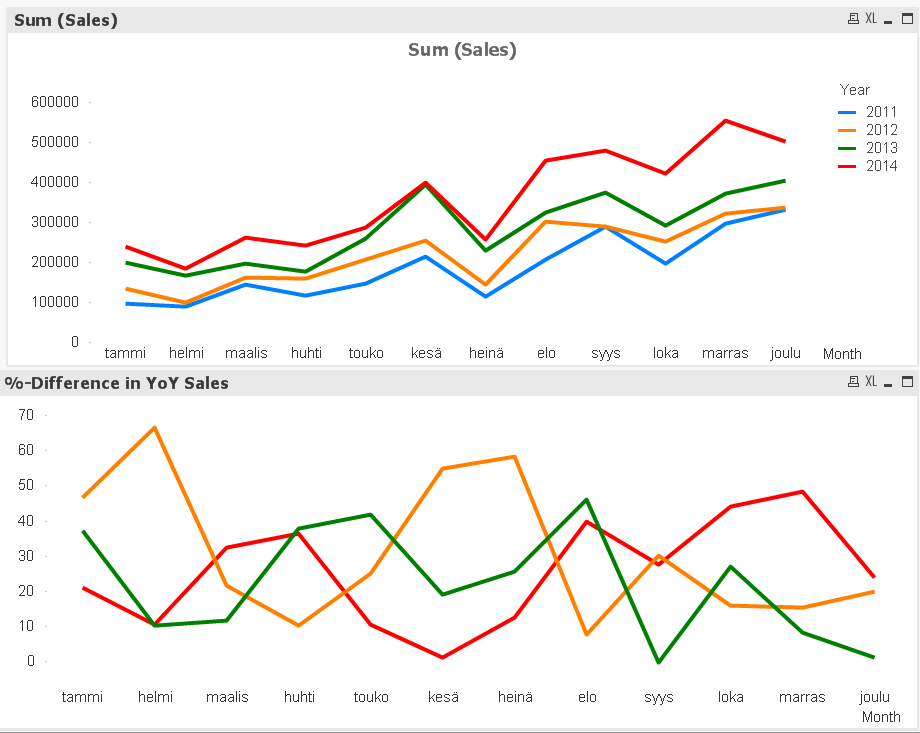
Any idea in how to get the lower graph with out making a script for each individual line in the graph?
- Mark as New
- Bookmark
- Subscribe
- Mute
- Subscribe to RSS Feed
- Permalink
- Report Inappropriate Content
Would you be able to share the qvw file you are working with, it seems the data you shared is giving different charts then the one with your data. It would be difficult to verify why the results are different because both will give different numbers. Can you share your qvw or the data you are using to create the two charts?
- Mark as New
- Bookmark
- Subscribe
- Mute
- Subscribe to RSS Feed
- Permalink
- Report Inappropriate Content
Good idea 
- Mark as New
- Bookmark
- Subscribe
- Mute
- Subscribe to RSS Feed
- Permalink
- Report Inappropriate Content
Hi ,
Check this ,
I hope this what you required,
Data:
LOAD * INLINE [
    Month, Year, Sales
    Jan, 2012, 10
    Feb, 2012, 20
    Mar, 2012, 19
    Apr, 2012, 40
    Jan, 2013, 35
    Feb, 2013, 31
    Mar, 2013, 50
    Apr, 2013, 45
    Jan, 2014, 50
    Feb, 2014, 47
    Mar, 2014, 70
    Apr, 2014, 65
    Jan, 2015, 70
    Feb, 2015, 65
    Mar, 2015, 90
    Apr, 2015, 83
];
Output:
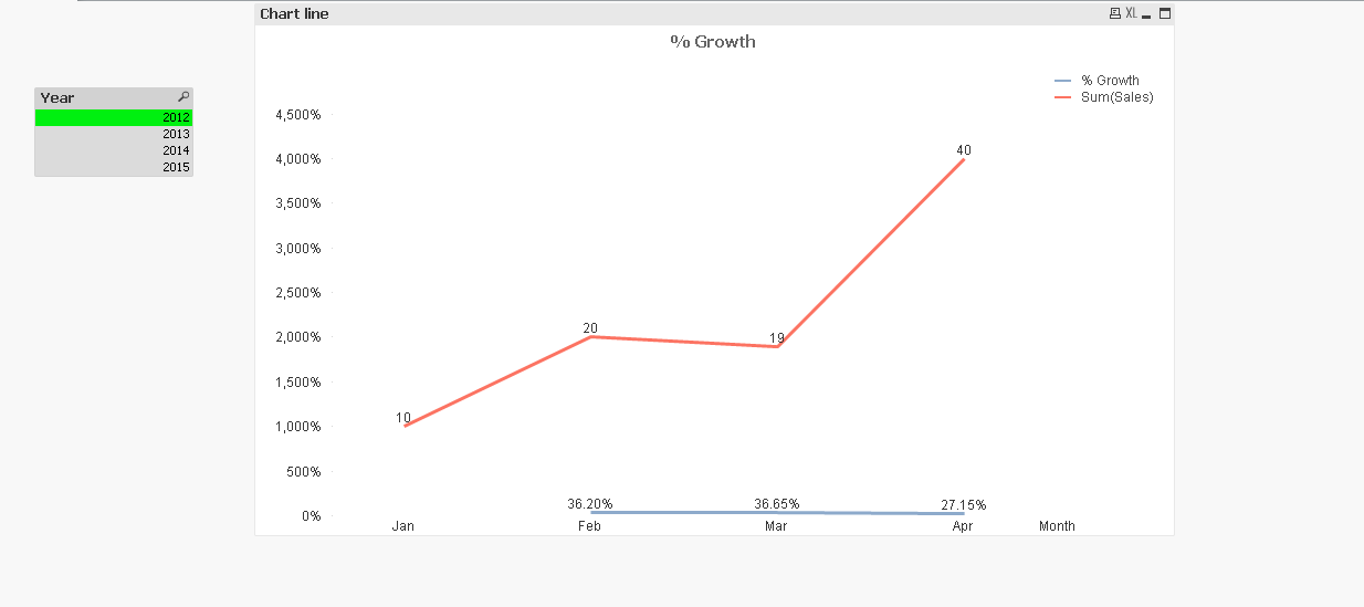
HTH,
-Hirish
“Aspire to Inspire before we Expire!”
- Mark as New
- Bookmark
- Subscribe
- Mute
- Subscribe to RSS Feed
- Permalink
- Report Inappropriate Content
Hi Elina,
As already mentioned by sunindia, and me, One expression will give your expected resut.
i.e =(sum(Sales)/Above(sum(Sales))-1)
(format should be Fixed to : 2 and Checked the Shown in Percent (%) in Number Tab
Dimensions: Month and Year
Sort : Month and Year as Ascending
Check the Attachment...
- Mark as New
- Bookmark
- Subscribe
- Mute
- Subscribe to RSS Feed
- Permalink
- Report Inappropriate Content
as per suggested by sunindia & settu_periasamy it's working fine but this is alternative to understand the expression like
(current-previous)/previous format
=((sum(Sales) - above(sum(Sales)))/ above(sum(Sales)))
- Mark as New
- Bookmark
- Subscribe
- Mute
- Subscribe to RSS Feed
- Permalink
- Report Inappropriate Content
Script change:
Sales:
LOAD [Row ID],
subfield([Order ID],'-',1) as [Distribution Center],
[Order ID],
Year([Order Date]) as YearTemp,
QuarterName([Order Date]) as Quarter,
Month([Order Date]) as Month,
Num(Month([Order Date])) as NumMonthTemp,
[Order Date],
[Ship Date],
[Ship Mode],
[Customer ID],
[Customer Name],
Segment,
City,
State,
Country,
[Postal Code],
Market,
Region,
[Product ID],
Category,
[Sub-Category],
[Product Name],
Sales,
Quantity,
Discount,
Profit,
[Shipping Cost],
[Order Priority]
FROM
YoY.xlsx
(ooxml, embedded labels, table is Sheet1);
FinalTable:
NoConcatenate
LOAD *,
NumMonthTemp as NumMonth,
YearTemp as Year
Resident Sales
Order By NumMonthTemp, YearTemp;
DROP Table Sales;
Line Chart:
Dimesnions
1) Month
2) Year
Expression: =Aggr(((Sum(Sales)/Above(Sum(Sales))) - 1) * 100, NumMonth, Year)
- Mark as New
- Bookmark
- Subscribe
- Mute
- Subscribe to RSS Feed
- Permalink
- Report Inappropriate Content
Works like a charm. The simplest solution, and no script changes required. You only need to apply settu's expression on your own data to get the 66.3% difference between Feb 2013 and Feb 2012.
- Mark as New
- Bookmark
- Subscribe
- Mute
- Subscribe to RSS Feed
- Permalink
- Report Inappropriate Content
It is difficult to give any recommendation without looking at data, but may be add Year as a dimension and use above function to achieve what you are looking for.