Unlock a world of possibilities! Login now and discover the exclusive benefits awaiting you.
- Qlik Community
- :
- All Forums
- :
- QlikView App Dev
- :
- Re: creating benchmark graph
- Subscribe to RSS Feed
- Mark Topic as New
- Mark Topic as Read
- Float this Topic for Current User
- Bookmark
- Subscribe
- Mute
- Printer Friendly Page
- Mark as New
- Bookmark
- Subscribe
- Mute
- Subscribe to RSS Feed
- Permalink
- Report Inappropriate Content
creating benchmark graph
Dear community,
I have been puzzling like crazy, but I can't find the solution to my problem. Therefore I would like to ask for your help.
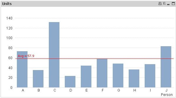
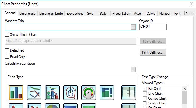
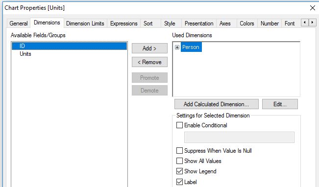
I am trying to create a benchmark graph, similar to the one that can be found in the attachment.
In short: It is a bar chart where I would like to compare the value of 1 person to the mean value of the whole group of people. Very simply put. Person A has sold 10 units, Person B has sold 2 units. The mean value of the whole group is 5 units. Therefore Person A has a positive value of +5 and Person B a negative value of -3. I would like to visualize this in a bar chart with positive and negative values.
I someone will be able to explain me how to create such chart.
Thank you very much in advance for your help!
Accepted Solutions
- Mark as New
- Bookmark
- Subscribe
- Mute
- Subscribe to RSS Feed
- Permalink
- Report Inappropriate Content
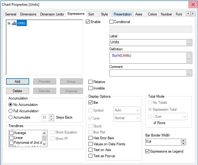
Hi,
one solution might be also:
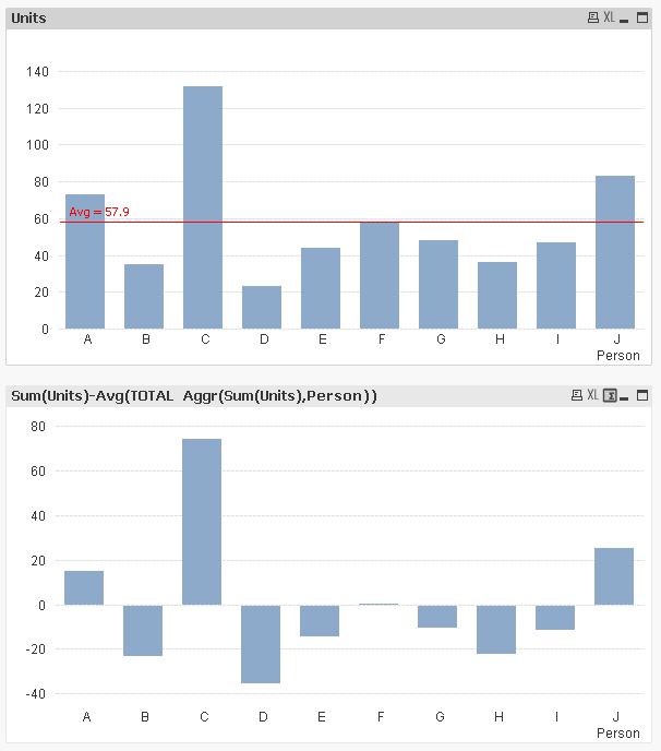
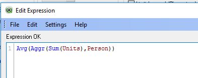
Sum(Units)-Avg(TOTAL Aggr(Sum(Units),Person))
hope this helps
regards
Marco
- Mark as New
- Bookmark
- Subscribe
- Mute
- Subscribe to RSS Feed
- Permalink
- Report Inappropriate Content
Something like this: sum(total units)/count(distinct total person) - sum(units)
talk is cheap, supply exceeds demand
- Mark as New
- Bookmark
- Subscribe
- Mute
- Subscribe to RSS Feed
- Permalink
- Report Inappropriate Content
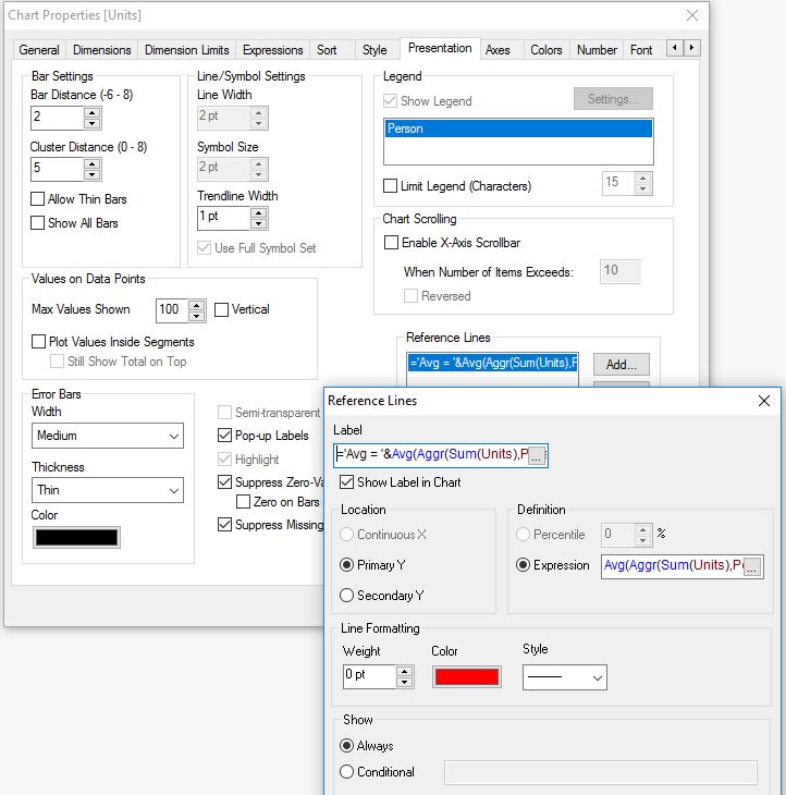
Hi Gijs,
PFA..
- Mark as New
- Bookmark
- Subscribe
- Mute
- Subscribe to RSS Feed
- Permalink
- Report Inappropriate Content
Hi,
one solution might be also:
Sum(Units)-Avg(TOTAL Aggr(Sum(Units),Person))
hope this helps
regards
Marco
- Mark as New
- Bookmark
- Subscribe
- Mute
- Subscribe to RSS Feed
- Permalink
- Report Inappropriate Content
Thank you all so much for your wonderful and fast help!
It worked, thanks to your incredible support!
massive thanks to you all 
- Mark as New
- Bookmark
- Subscribe
- Mute
- Subscribe to RSS Feed
- Permalink
- Report Inappropriate Content
Hello marcowedel
Could you tell the few more steps to do that one,
I just need the below one only.
Thank you.
- Mark as New
- Bookmark
- Subscribe
- Mute
- Subscribe to RSS Feed
- Permalink
- Report Inappropriate Content
Hi,
hope this helps
regards
Marco
- Mark as New
- Bookmark
- Subscribe
- Mute
- Subscribe to RSS Feed
- Permalink
- Report Inappropriate Content
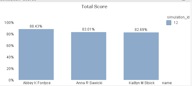
Thank you for the information. But mine is some different case, could you help me on this
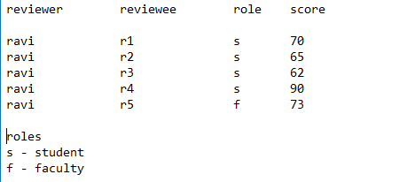
Scenario (Creating benchmark based on particular user score):
For one particular presentation, the reviewers(including faculty) gave the marks to reviewees (more than one for one particular presentation).
Now I want to create a benchmark (horizontal reference line) for this chart, based on the faculty score only. (i.e a horizontal line at 73% value of y axis)
Could you help me in this case. I am not sure how can I get that faculty score while creating benchmark.
Attached the bar chart and table of data screenshots.
I want to know how do I use the faculty score to draw the bench mark.
Thank you.