Unlock a world of possibilities! Login now and discover the exclusive benefits awaiting you.
- Qlik Community
- :
- All Forums
- :
- QlikView App Dev
- :
- Re: how to calculate average time for time values ...
- Subscribe to RSS Feed
- Mark Topic as New
- Mark Topic as Read
- Float this Topic for Current User
- Bookmark
- Subscribe
- Mute
- Printer Friendly Page
- Mark as New
- Bookmark
- Subscribe
- Mute
- Subscribe to RSS Feed
- Permalink
- Report Inappropriate Content
how to calculate average time for time values in mm:ss ?
i have a column 'baggage time' having values like,
01:23
06:16
01:50
00:28
etc.
i need to plot average baggage time on y axis of a chart, any idea how to do it ?
thanks.
- « Previous Replies
-
- 1
- 2
- Next Replies »
- Mark as New
- Bookmark
- Subscribe
- Mute
- Subscribe to RSS Feed
- Permalink
- Report Inappropriate Content
You could transform your time into a numerical rapresentation so mm*60 + ss so for example
06:16 become 6*60 + 16 -> 376
Then you have only to do Avg(myNewField) to have numerical representation.
The result can be divided by 60 to find minutes num and the remainder are the seconds
It's an idea ...hope tjis helps
- Mark as New
- Bookmark
- Subscribe
- Mute
- Subscribe to RSS Feed
- Permalink
- Report Inappropriate Content
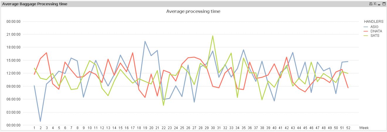
yes i converted mm:ss format into seconds i.e ss in a new column but avg function for that column is giving me strange values.
see the y axis of chart in attached image
- Mark as New
- Bookmark
- Subscribe
- Mute
- Subscribe to RSS Feed
- Permalink
- Report Inappropriate Content
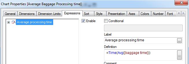
Time(Avg([baggage time])
- Mark as New
- Bookmark
- Subscribe
- Mute
- Subscribe to RSS Feed
- Permalink
- Report Inappropriate Content
its not working
- Mark as New
- Bookmark
- Subscribe
- Mute
- Subscribe to RSS Feed
- Permalink
- Report Inappropriate Content
i have converted all column values in seconds, so the expression avg([baggage time in seconds]) is giving me wrong values on y axis
- Mark as New
- Bookmark
- Subscribe
- Mute
- Subscribe to RSS Feed
- Permalink
- Report Inappropriate Content
Ajinkya Pujari wrote:
its not working
Well if you want useful input, you'll have to give us more than that...
- Mark as New
- Bookmark
- Subscribe
- Mute
- Subscribe to RSS Feed
- Permalink
- Report Inappropriate Content
seems to work for me
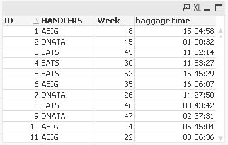
tabBagProcTime:
LOAD RecNo() as ID,
    Ceil(Rand()*52) as Week,
    Pick(Ceil(Rand()*3),'ASIG','DNATA','SATS') as HANDLERS,
    Time(Rand()) as [baggage time]
AutoGenerate 1000;
hope this helps
regards
Marco
- Mark as New
- Bookmark
- Subscribe
- Mute
- Subscribe to RSS Feed
- Permalink
- Report Inappropriate Content
@Marco Wedel Here is the sample data, in the chart 'Average baggage time' i am getting strange values.
- Mark as New
- Bookmark
- Subscribe
- Mute
- Subscribe to RSS Feed
- Permalink
- Report Inappropriate Content
Helllo Ajinkya,
Try using the Time#() and specify the format string as 'mm:ss' on your field, i.e.,baggage time.
And then try finding the average.. I guess you will get the correct result. To verify the average time you can also use this link--> Time Calculator
I have also attached my sample qvw.
Thanks
- « Previous Replies
-
- 1
- 2
- Next Replies »