Unlock a world of possibilities! Login now and discover the exclusive benefits awaiting you.
- Qlik Community
- :
- All Forums
- :
- QlikView App Dev
- :
- Re: randomness to color assignment in charts with ...
- Subscribe to RSS Feed
- Mark Topic as New
- Mark Topic as Read
- Float this Topic for Current User
- Bookmark
- Subscribe
- Mute
- Printer Friendly Page
- Mark as New
- Bookmark
- Subscribe
- Mute
- Subscribe to RSS Feed
- Permalink
- Report Inappropriate Content
randomness to color assignment in charts with field of many values?
Hi All,
I have some fields with many possible values and am noticing in a 100% stacked bar chart, that often the same color is repeated twice in a row... for fields with many possible values in this type of chart, does the designer have any more control over this happening? Currently, I am using the 18 colors on the colors tab with persistent colors checked. Due to the # of values in the field, I do not want to assign colors on the Expression.
Thanks!
Kristina
- Mark as New
- Bookmark
- Subscribe
- Mute
- Subscribe to RSS Feed
- Permalink
- Report Inappropriate Content
Maybe have a look into
- Mark as New
- Bookmark
- Subscribe
- Mute
- Subscribe to RSS Feed
- Permalink
- Report Inappropriate Content
Another option might be using a color expression like ColorMix1 and a expression that maps your dimension to a range between 0 and 1:
=ColorMix1(
FieldIndex('YourDimensionField',YourDimensionField) / FieldValueCount('YourDimensionField'),
Red(),
Blue()
)
Adjust the base colors to get a better color range.
- Mark as New
- Bookmark
- Subscribe
- Mute
- Subscribe to RSS Feed
- Permalink
- Report Inappropriate Content
Hi,
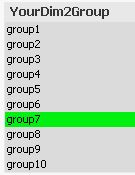
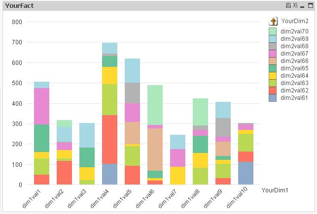
I guess the reason for the default colour palette being restricted to 18 colours is that using more colours would make your chart difficult to read. So the best solution IMO would be a drill down group as second dimension:
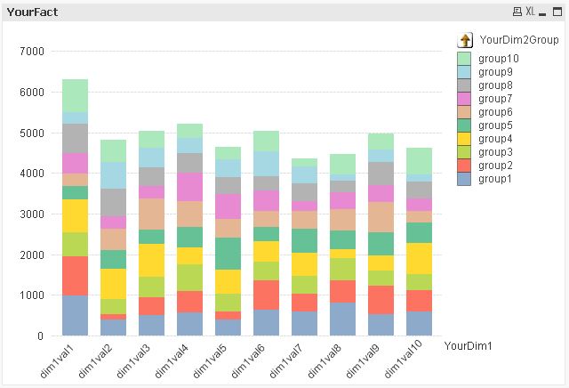
A (hard to read) solution using precalculated distinct colours however could be:
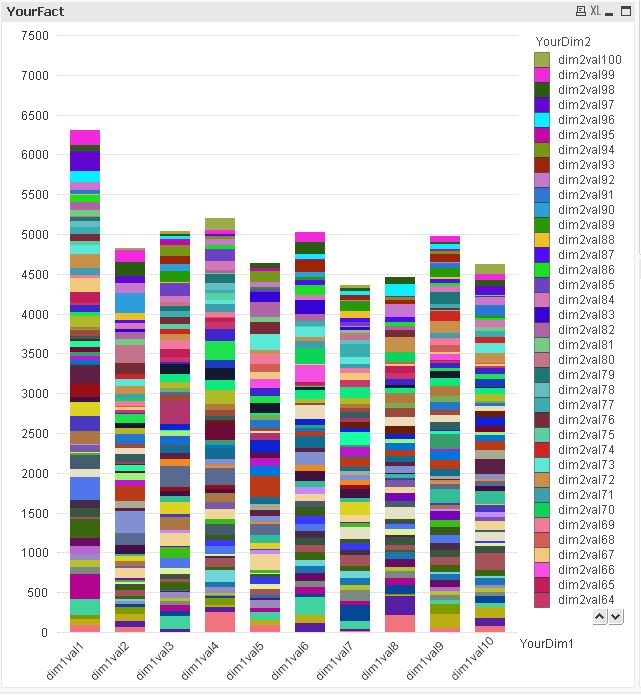

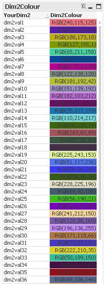
table1:
LOAD *,
    'group'&(Div(Mid(YourDim2,8)-1,10)+1) as YourDim2Group;
LOAD RecNo() as ID,
    'dim1val'&Ceil(Rand()*10) as YourDim1,
    'dim2val'&Ceil(Rand()*100) as YourDim2,
    Ceil(Rand()*100) as YourFact
AutoGenerate 1000;

tabTemp:
LOAD Distinct
    YourDim2
Resident table1;

tabColours:
LOAD YourDim2,
    RGB(Rand()*256,Rand()*256,Rand()*256) as Dim2Colour
Resident tabTemp;

DROP Table tabTemp;
hope this helps
regards
Marco