Unlock a world of possibilities! Login now and discover the exclusive benefits awaiting you.
- Qlik Community
- :
- All Forums
- :
- QlikView App Dev
- :
- Re: regd bar chart and its dimension values
- Subscribe to RSS Feed
- Mark Topic as New
- Mark Topic as Read
- Float this Topic for Current User
- Bookmark
- Subscribe
- Mute
- Printer Friendly Page
- Mark as New
- Bookmark
- Subscribe
- Mute
- Subscribe to RSS Feed
- Permalink
- Report Inappropriate Content
regd bar chart and its dimension values
Hi All,
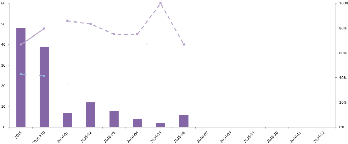
The above chart has been generated in MS Excel. The same need to be implemented in Qlikview. Here I would like your help with how to plot dimension values on X-axis.
To be more clear, I have 2015 & 2016-YTD as "Year" but also followed by each Month(for e.g 2016-01) of the YTD year. In QV is it possible to plot on x-axis as single dimension with values of "Year" and "Month". I do not want to use multi dimension to achieve the same.
Please assist me with any sample qvw file so that it would be easy for me to understand the properties of the chart you develop.
Regards,
SV
Message was edited by: Sabareesh Vysyaraju
- Mark as New
- Bookmark
- Subscribe
- Mute
- Subscribe to RSS Feed
- Permalink
- Report Inappropriate Content
May be you can use this to create and Month's on the same dimension
Period Presets: Compare Periods on the fly
For a better help, please provide a sample to work with.
Best,
Sunny
- Mark as New
- Bookmark
- Subscribe
- Mute
- Subscribe to RSS Feed
- Permalink
- Report Inappropriate Content
Hi SV,
I have designed a way around for showing the chart you need
I may not be the best solutions but will work for your requirement.
PFA application.
Thanks
Murali !
- Mark as New
- Bookmark
- Subscribe
- Mute
- Subscribe to RSS Feed
- Permalink
- Report Inappropriate Content
Hi Sunny,
Thank you very much for the reference. As I work on Clients data I could not able to share the same over here. I referred to the link you have mentioned above. I am looking into it to modify accordingly to my requirement.
Regards,
SV.
- Mark as New
- Bookmark
- Subscribe
- Mute
- Subscribe to RSS Feed
- Permalink
- Report Inappropriate Content
You just have two years? what if data is for 3 years, how dimension should look like?
- Mark as New
- Bookmark
- Subscribe
- Mute
- Subscribe to RSS Feed
- Permalink
- Report Inappropriate Content
Hi Kushal,
I just specified a sample view of the chart.The requirement is to consider only the last 24 months of data.
Anyhow, if it is for 3 years, the dimensions should be like CurrentYear-2(aggregated) value, CurrentYear-1(aggregated) value, CurrentYear-YTD(aggregated value), followed by Month wise data for the current year,
Regards,
SV
- Mark as New
- Bookmark
- Subscribe
- Mute
- Subscribe to RSS Feed
- Permalink
- Report Inappropriate Content
if you just want to compare Current Vs Previous in above format then follow below steps
Create variable on front end
vCurretYear =max(Year)
vPreviousYear =max(Year)-1
Data:
LOAD date(MakeDate('2014')+IterNo()-1) as Date,
ceil(Rand()*100)+1000 as Sales
AutoGenerate 1
While MakeDate('2014')+IterNo()-1 <=Today();
Calendar:
LOAD Date,
Year(Date) as Year,
YeartoDate(Date)*-1 as CurYTDFlag,
dual(Year(Date)&'-'& num(month(Date),00),Year(Date)&num(month(Date),00)) as Month
Resident Data;
Sort:
LOAD * Inline [
Order
1
2
3 ];
Create Bar chart
Dimension:
=Pick(Order,$(vPreviousYear),$(vCurretYear)&'-YTD',Month)
Expression:
=Pick(Order,
sum({<Year={"$(vPreviousYear)"}>}Sales),
sum({<CurYTDFlag={1}>}Sales),
sum({<Year={"$(vCurretYear)"}>}Sales))
