Unlock a world of possibilities! Login now and discover the exclusive benefits awaiting you.
- Qlik Community
- :
- All Forums
- :
- QlikView App Dev
- :
- Interesting Group as Percentage
- Subscribe to RSS Feed
- Mark Topic as New
- Mark Topic as Read
- Float this Topic for Current User
- Bookmark
- Subscribe
- Mute
- Printer Friendly Page
- Mark as New
- Bookmark
- Subscribe
- Mute
- Subscribe to RSS Feed
- Permalink
- Report Inappropriate Content
Interesting Group as Percentage
I have an interesting problem. I would like to convert this chart's X axis into a percentage instead of the absolute number:
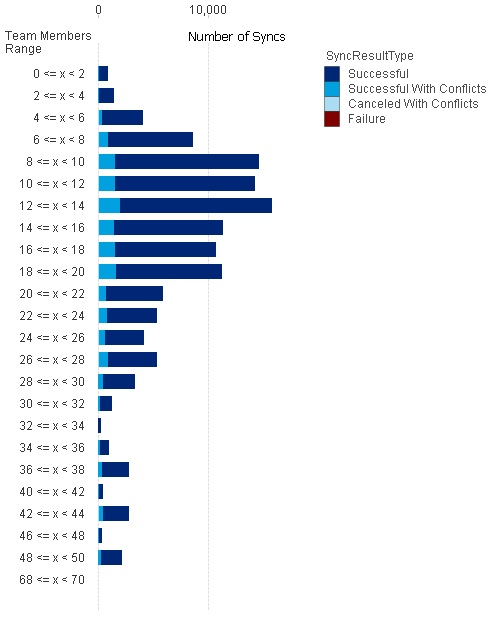
So each bar really should extend fully to 100%, and then I would just see the ratio of the sync results within each bar. I've done this successfully before, but never when using the "class" function.
I can't post the QV file due to proprietary information contained, but here is what I have as the dimensions and expression:
Two Dimensions:
=class(aggr(UserCount,EngagementFileKey),2)
=SyncResultType
One Expression:
=Count(SyncResultType)
//I think this should be something like this, but it doesn't work since UserCount needs to be considered in the class group:
//Count(SyncResultType)/count(TOTAL <UserCount> SyncResultType)
Can anyone suggest how I can get this converted into a percentage bar?
Thanks!