Unlock a world of possibilities! Login now and discover the exclusive benefits awaiting you.
- Qlik Community
- :
- All Forums
- :
- QlikView App Dev
- :
- Creating a Graph?
- Subscribe to RSS Feed
- Mark Topic as New
- Mark Topic as Read
- Float this Topic for Current User
- Bookmark
- Subscribe
- Mute
- Printer Friendly Page
- Mark as New
- Bookmark
- Subscribe
- Mute
- Subscribe to RSS Feed
- Permalink
- Report Inappropriate Content
Creating a Graph?
Can Qlikview create a graph like this one? I have the boxed look, the two bar colors, and the grid box color but it is the angle and depth that I am having trouble with. Any help would be awesome.

- Mark as New
- Bookmark
- Subscribe
- Mute
- Subscribe to RSS Feed
- Permalink
- Report Inappropriate Content
You can send a example to data, *.xls, *.csv or *.xlsx
Thanks.
- Mark as New
- Bookmark
- Subscribe
- Mute
- Subscribe to RSS Feed
- Permalink
- Report Inappropriate Content
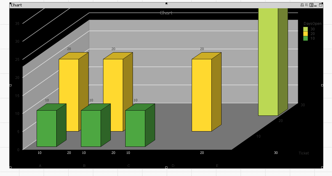
You need two Dimensions and one expression, some like this.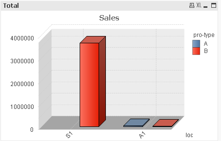
- Mark as New
- Bookmark
- Subscribe
- Mute
- Subscribe to RSS Feed
- Permalink
- Report Inappropriate Content
While this can be achieved in qlikview 3D graphs are notoriously difficult to read and therefore not data visualisation good practice. You may wish to think about whether you really want to do this.
- Mark as New
- Bookmark
- Subscribe
- Mute
- Subscribe to RSS Feed
- Permalink
- Report Inappropriate Content
In Chart Properties->Style you can select the 3D-look you prefer. IMHO the angles cannot be adjusted, but may change when scaling the graph component of the object. Press Ctrl-Shift to tweak the placement and graph size.
And some real nitpicking  : it's kWh, not Kwh. The unit is watt hour and in ISO/SI the unit is capitalized. The k from kilo- is just a multiplication factor.
- Mark as New
- Bookmark
- Subscribe
- Mute
- Subscribe to RSS Feed
- Permalink
- Report Inappropriate Content
Hi ,
Check this,
Hope this helps,
PFA,
Hirish
“Aspire to Inspire before we Expire!”