Unlock a world of possibilities! Login now and discover the exclusive benefits awaiting you.
- Qlik Community
- :
- All Forums
- :
- QlikView App Dev
- :
- Re: I want to change y axis value as dimension
- Subscribe to RSS Feed
- Mark Topic as New
- Mark Topic as Read
- Float this Topic for Current User
- Bookmark
- Subscribe
- Mute
- Printer Friendly Page
- Mark as New
- Bookmark
- Subscribe
- Mute
- Subscribe to RSS Feed
- Permalink
- Report Inappropriate Content
I want to change y axis value as dimension
 Hi friends,
I want to show the bar chart in y axis 've a date values and x axis 've a country value. pls any one tell this.....
- Mark as New
- Bookmark
- Subscribe
- Mute
- Subscribe to RSS Feed
- Permalink
- Report Inappropriate Content
Hi Abinesh,
change the order that your dimension are listed in , promote the 'date' value so that it's above 'Country'
HTH Andy
- Mark as New
- Bookmark
- Subscribe
- Mute
- Subscribe to RSS Feed
- Permalink
- Report Inappropriate Content
yeah I tried that already but it automatically replace date into country and vice versa. but I didn't took the date as y axis value..........
- Mark as New
- Bookmark
- Subscribe
- Mute
- Subscribe to RSS Feed
- Permalink
- Report Inappropriate Content
hi,
You can try to change orientation in style if it suits your requirement.
thanks
Khushboo
- Mark as New
- Bookmark
- Subscribe
- Mute
- Subscribe to RSS Feed
- Permalink
- Report Inappropriate Content
I am not sure I follow on what you are trying to do. Can you provide a sample QVW and any screenshot of what you are trying to accomplish?
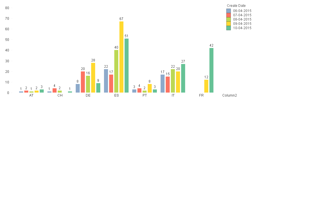
Y-axis int his bar chart are the aggregation results, meaning a value range between 0-80. You can not have a non-numeric value as the Y-axis, or do you have a suggestion on what that chart should look like?
For the X-axis values and legend values, you control that with the order of the dimensions in the chart.
- Mark as New
- Bookmark
- Subscribe
- Mute
- Subscribe to RSS Feed
- Permalink
- Report Inappropriate Content
Toni Thanks to your response. I don't need y axis as a int value ie> 0-80, Instead of that I need date should be there. is it possible.........? then how......?
- Mark as New
- Bookmark
- Subscribe
- Mute
- Subscribe to RSS Feed
- Permalink
- Report Inappropriate Content
I do not understand what you intend the chart to look like. Do you have any example image of a similar chart from some other program or webpage as reference?
If you have country as X-axis it means that you have your aggregation result scale on the Y-axis. What is your expression if dates become the Y-axis?
- Mark as New
- Bookmark
- Subscribe
- Mute
- Subscribe to RSS Feed
- Permalink
- Report Inappropriate Content
How about transforming this into a Grid Chart? That chart type allows you to put a dimension on either axis, and show the result of the expression as a circular area that grows with the expression value.
Peter
- Mark as New
- Bookmark
- Subscribe
- Mute
- Subscribe to RSS Feed
- Permalink
- Report Inappropriate Content
Or as a bunch of pies in a bakery 
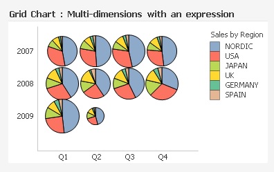
This screenshot is from the document "Data Visualization.qvw" that is included with every QV Desktop Installation. It shows you how it's done.
Best,
Peter