Unlock a world of possibilities! Login now and discover the exclusive benefits awaiting you.
- Qlik Community
- :
- All Forums
- :
- QlikView App Dev
- :
- Re: Stacked Bar Chart
- Subscribe to RSS Feed
- Mark Topic as New
- Mark Topic as Read
- Float this Topic for Current User
- Bookmark
- Subscribe
- Mute
- Printer Friendly Page
- Mark as New
- Bookmark
- Subscribe
- Mute
- Subscribe to RSS Feed
- Permalink
- Report Inappropriate Content
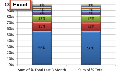
Stacked Bar Chart
I am having trouble with displaying my bar chart at 100%. I was able to accomplish this in esxcell but i can't get it to work in QV.
Dimension:
- Product Name
Measure:
- % of Total (=SUM({<month_offset={[>=-1<0]}>}price)/100000
- %of Last 3 Month (=SUM({<month_offset={[>=-1<0]}>}price)+SUM({<month_offset={[>=-2<0]}>}price)+SUM({<month_offset={[>=-3<0]}>}price)/1000000
Please help!

- Mark as New
- Bookmark
- Subscribe
- Mute
- Subscribe to RSS Feed
- Permalink
- Report Inappropriate Content
Hi,
Click on Relative check box from Expression table.
Regards
Please appreciate our Qlik community members by giving Kudos for sharing their time for your query. If your query is answered, please mark the topic as resolved 🙂
- Mark as New
- Bookmark
- Subscribe
- Mute
- Subscribe to RSS Feed
- Permalink
- Report Inappropriate Content
Thank you!
I am almost there.Here is what my chart looks like now
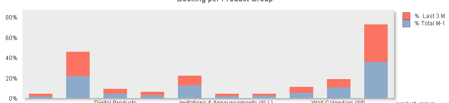
And i am looking to do something like this:

- Mark as New
- Bookmark
- Subscribe
- Mute
- Subscribe to RSS Feed
- Permalink
- Report Inappropriate Content
Any suggestions on this one?
- Mark as New
- Bookmark
- Subscribe
- Mute
- Subscribe to RSS Feed
- Permalink
- Report Inappropriate Content
I think it has to do with dimensions. Now, your expressions are presented per dimension. For each dimension, there is a Last(?) and Total expression. I can imagine that you can achieve the excel layout by using a dimension that contains all your previous dimension units.
Did it help? With a sample qvw I could give you a better answer.
Best,
T
- Mark as New
- Bookmark
- Subscribe
- Mute
- Subscribe to RSS Feed
- Permalink
- Report Inappropriate Content
Hi Zhenya,
I think what you need here is a handy thing called ValueList(). This allows you to create a synthetic dimension which you can then use to define two different expressions on the same axis. Here is my example built using ValueList().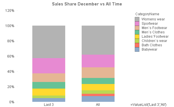
More info on ValueList can be seen at: ValueList() – For those tricky situations
As we are creating a synthetic dimension the "Relative" tickbox won't quite work right so you will need to use a bit of set analysis to define the total sales to compare against and give you a nice percentage. The dimensions and expression I used are:
Dimensions: =ValueList('Last 3', 'All'); CategoryName
Expression: =If(ValueList('Last 3','All')='Last 3',Sum({<Month={'Dec'}>}Sales)/Sum(TOTAL {<Month={'Dec'}>} Sales),Sum(Sales)/Sum(TOTAL Sales))
I have attached my example app so you can see what I have done and have a play with it. You will need to tweak it to your own fields but this should be fairly simple.
Hope that helps.
Adam