Unlock a world of possibilities! Login now and discover the exclusive benefits awaiting you.

- Qlik Community
- :
- Forums
- :
- Analytics & AI
- :
- Products & Topics
- :
- Visualization and Usability
- :
- Re: ABC-Analysis / pareto diagramm
- Subscribe to RSS Feed
- Mark Topic as New
- Mark Topic as Read
- Float this Topic for Current User
- Bookmark
- Subscribe
- Mute
- Printer Friendly Page

 Oberpfälzer
- Mark as New
- Bookmark
- Subscribe
- Mute
- Subscribe to RSS Feed
- Permalink
- Report Inappropriate Content
ABC-Analysis / pareto diagramm
Hi,
I'm doing an ABC-analysis at the moment with Qlik Sense . I already have a pivot-table with the values I need.

If I try to make an diagramm to the table, the best i could get until now was something like this:
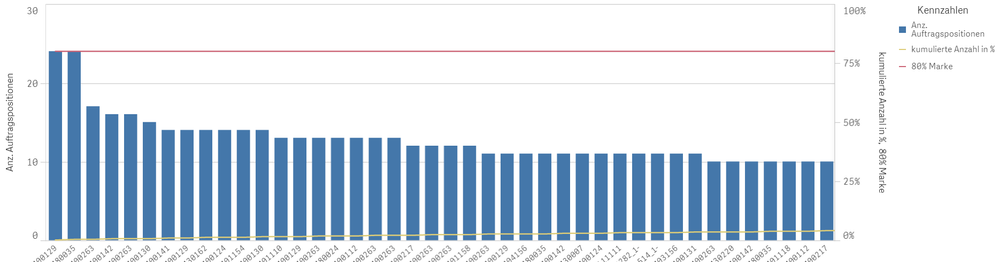
But ideally I want something like the following excel diagramm.
So row 5 of the table should be the x-axis and row 3 the y-axis.
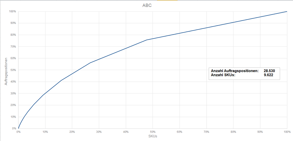
Any idea what kind of diagramm, extension, ... would get me closest to the excel example?
(Edited)

 ecolomer
- Mark as New
- Bookmark
- Subscribe
- Mute
- Subscribe to RSS Feed
- Permalink
- Report Inappropriate Content
I've some files in QV for this.
I send you
BR
Oberpfälzer
- Mark as New
- Bookmark
- Subscribe
- Mute
- Subscribe to RSS Feed
- Permalink
- Report Inappropriate Content
Thanks for your fast answer.
Unfortunately I don't use Qlik view but Qlik Sense Desktop. And if I try opening them nonetheless I don't see anything.
ecolomer
- Mark as New
- Bookmark
- Subscribe
- Mute
- Subscribe to RSS Feed
- Permalink
- Report Inappropriate Content
Take a look here: Recipe for an ABC Analysis.
ecolomer
- Mark as New
- Bookmark
- Subscribe
- Mute
- Subscribe to RSS Feed
- Permalink
- Report Inappropriate Content
