Unlock a world of possibilities! Login now and discover the exclusive benefits awaiting you.
Announcements
Qlik and ServiceNow Partner to Bring Trusted Enterprise Context into AI-Powered Workflows. Learn More!
- Qlik Community
- :
- Forums
- :
- Analytics & AI
- :
- Products & Topics
- :
- Visualization and Usability
- :
- Re: Assistance needed in re-creating Chart (Donut?...
Options
- Subscribe to RSS Feed
- Mark Topic as New
- Mark Topic as Read
- Float this Topic for Current User
- Bookmark
- Subscribe
- Mute
- Printer Friendly Page
Turn on suggestions
Auto-suggest helps you quickly narrow down your search results by suggesting possible matches as you type.
Showing results for
Anonymous
Not applicable
2017-11-02
03:31 PM
- Mark as New
- Bookmark
- Subscribe
- Mute
- Subscribe to RSS Feed
- Permalink
- Report Inappropriate Content
Assistance needed in re-creating Chart (Donut?)
Hello all,
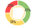
I am trying to create a chart that looks like this in QlikSense. It would just need the measure and basically showing a percentage of scores. So like 41% is above 4, 34% is between 3 and 4 and 25% is below 3. I am kind of lost on which chart or graphic I should be using to recreate this.
Any guidance would be appreciated.
Thanks,
Jordan
1,988 Views
- « Previous Replies
-
- 1
- 2
- Next Replies »
10 Replies
Anonymous
Not applicable
2017-11-03
10:21 AM
Author
- Mark as New
- Bookmark
- Subscribe
- Mute
- Subscribe to RSS Feed
- Permalink
- Report Inappropriate Content
Thank you my friend. That appears to have worked. I appreciate you very much.
241 Views
- « Previous Replies
-
- 1
- 2
- Next Replies »