Unlock a world of possibilities! Login now and discover the exclusive benefits awaiting you.

- Qlik Community
- :
- Forums
- :
- Analytics & AI
- :
- Products & Topics
- :
- Visualization and Usability
- :
- Box plot of a grouped dataset
- Subscribe to RSS Feed
- Mark Topic as New
- Mark Topic as Read
- Float this Topic for Current User
- Bookmark
- Subscribe
- Mute
- Printer Friendly Page

- Mark as New
- Bookmark
- Subscribe
- Mute
- Subscribe to RSS Feed
- Permalink
- Report Inappropriate Content
Box plot of a grouped dataset
Hi I have a dataset like this
| Count | Age | Category |
|---|---|---|
| 3 | 18 | A |
| 300 | 19 | A |
| 100 | 20 | A |
| 56 | 21 | A |
| 4 | 17 | B |
| 10 | 18 | B |
| 35 | 19 | B |
| 20 | 20 | B |
| 97 | 33 | C |
| 94 | 34 | C |
| 86 | 35 | C |
| 87 | 36 | C |
| 87 | 37 | C |
I want to plot the age distribution of each category which seems natural enough and in a boxplot format however its seems difficult to make it display what I want. Please help thanks!

 Qrishna
- Mark as New
- Bookmark
- Subscribe
- Mute
- Subscribe to RSS Feed
- Permalink
- Report Inappropriate Content
This way?
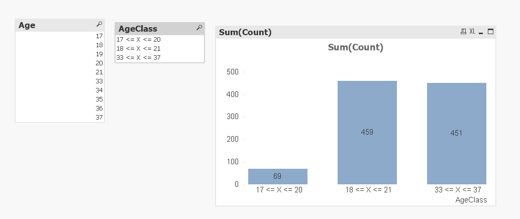
- Mark as New
- Bookmark
- Subscribe
- Mute
- Subscribe to RSS Feed
- Permalink
- Report Inappropriate Content
I was thinking more of a box and whisker plot where each plot is a category showing the median max and min age for that category.

 Lisa_P
- Mark as New
- Bookmark
- Subscribe
- Mute
- Subscribe to RSS Feed
- Permalink
- Report Inappropriate Content
Hi Bob,
I took your data into Qlik Sense and simply created a box plot to show the count distribution using the standard settings with your two dimensions and it came out like this:
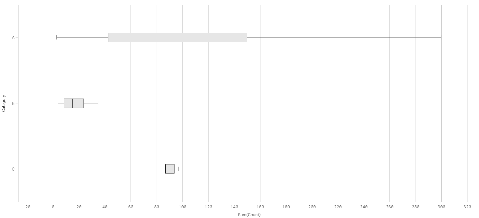
- Mark as New
- Bookmark
- Subscribe
- Mute
- Subscribe to RSS Feed
- Permalink
- Report Inappropriate Content
It should be more of a distribution of the age itself and not the distribution of the counts. So A has median first third quartile of 19. B has median 19 first quartile 18.xx third quartile 20. C has median of 35 first quartile 33.xx third quartile 36.xx
Lisa_P
- Mark as New
- Bookmark
- Subscribe
- Mute
- Subscribe to RSS Feed
- Permalink
- Report Inappropriate Content
Got it. Here is result and settings ..
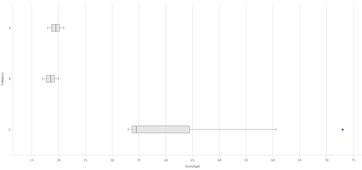
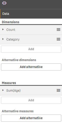
- Mark as New
- Bookmark
- Subscribe
- Mute
- Subscribe to RSS Feed
- Permalink
- Report Inappropriate Content
Thanks! It's a little .. Odd? Cat C has a max age of 37 but the max age shown in the graph is 70+?
- Mark as New
- Bookmark
- Subscribe
- Mute
- Subscribe to RSS Feed
- Permalink
- Report Inappropriate Content
Hi,
I guess the problem is that you first dimension should be age and the expression should be sum(count).
Regards,