- Mark as New
- Bookmark
- Subscribe
- Mute
- Subscribe to RSS Feed
- Permalink
- Report Inappropriate Content
Calculating a period-on-period change in a multi-dimension chart
Hello all,
I'm new to Qlik, and exploring its features at the moment. I wonder if the community might help solve a challenge I've encountered.
I'd like to create a dashboard to show sales and net change (additions) in sales over time.
Sales over time is straightforward. Dimension should be the time dimension (in my case 'Period'), while measure should be sum(Sales).
Net change (additions) in this case is also relatively straightforward: Sum(Sales)-above(sum(Sales)).
The challenge I've encountered is when I add another dimension to the mix (e.g. sales by product category). In this case, while the sales over time chart is easy to create (just adding an additional dimension), using the same "Sum(Sales)-above(sum(Sales))" measure to attempt to derive period-on-period net additions leads to nonsensical results (see bottom right chart in image).
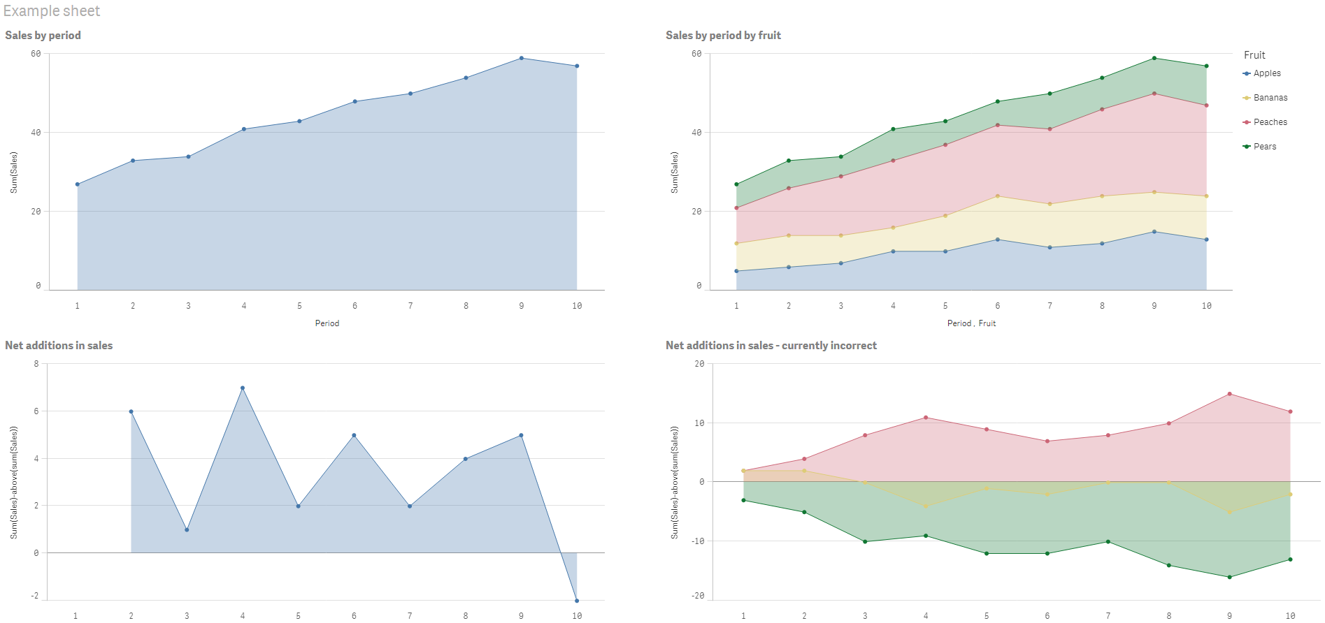
Has anyone encountered a similar issue before, and if so, do you know what the solution might be. Without being able to visualise what the chart is doing with the data behind the scenes, I'm finding it a challenge to work out how to adjust the expression. I've attached the example I've used above in a QVF if that would help.
Many thanks in advance!
Richard