Unlock a world of possibilities! Login now and discover the exclusive benefits awaiting you.
- Qlik Community
- :
- Forums
- :
- Analytics & AI
- :
- Products & Topics
- :
- Visualization and Usability
- :
- Dynamic Table Building and Plot
- Subscribe to RSS Feed
- Mark Topic as New
- Mark Topic as Read
- Float this Topic for Current User
- Bookmark
- Subscribe
- Mute
- Printer Friendly Page
- Mark as New
- Bookmark
- Subscribe
- Mute
- Subscribe to RSS Feed
- Permalink
- Report Inappropriate Content
Dynamic Table Building and Plot
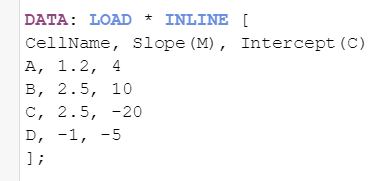
I have table where columns are CellName, Slope(M), Intercept(C). I want to add filter on the cell name and select one cell, then I want to build and plot a curve for this cell using the formula y=mx+c where x value is from 1 to 100. Please help. How to add the filter and build dynamically the curve in QlikSense?
Accepted Solutions
- Mark as New
- Bookmark
- Subscribe
- Mute
- Subscribe to RSS Feed
- Permalink
- Report Inappropriate Content
- Mark as New
- Bookmark
- Subscribe
- Mute
- Subscribe to RSS Feed
- Permalink
- Report Inappropriate Content
Here is one way of doing it:
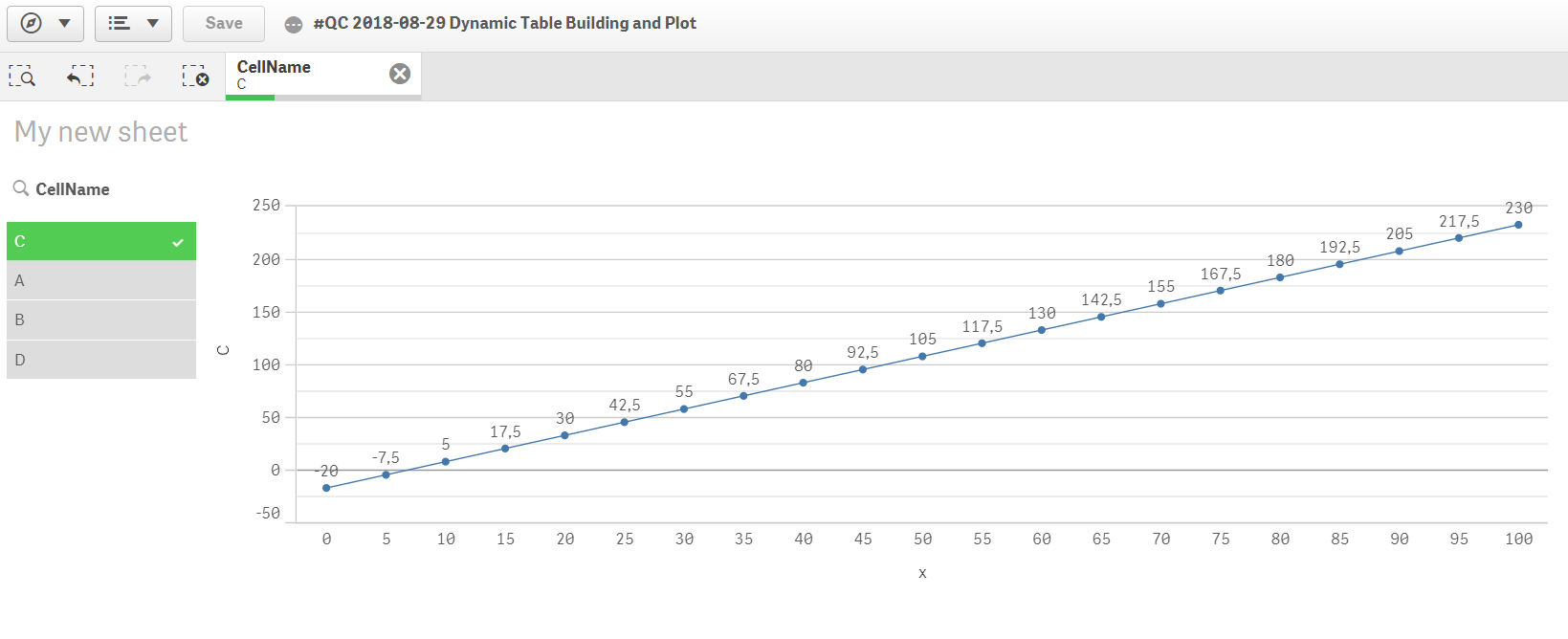
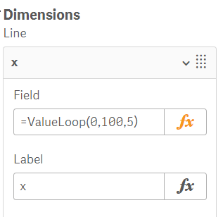
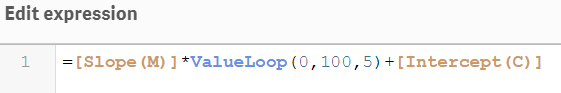
The Load Script:
- Mark as New
- Bookmark
- Subscribe
- Mute
- Subscribe to RSS Feed
- Permalink
- Report Inappropriate Content
This is what i was looking for.
One more help please. I have one more concern here-
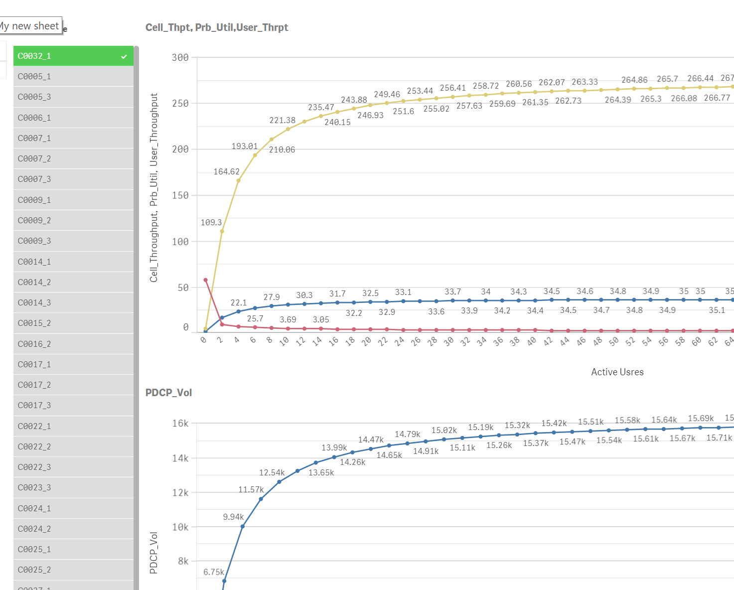
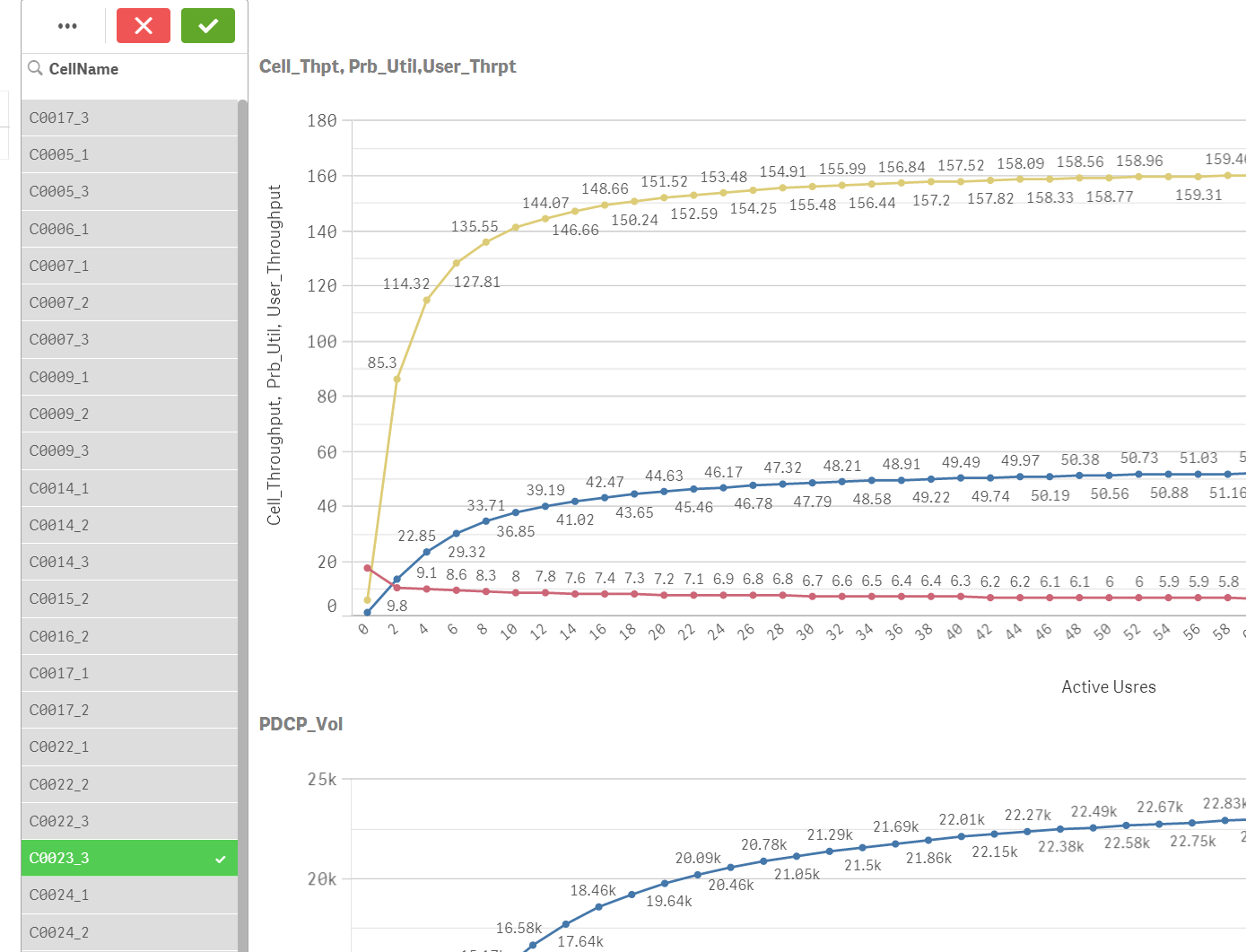
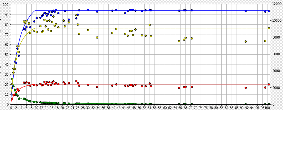
For every cell i have to plot 4 curves. 3 are of type y=mx+c type and fourth is of type y=mx*100+c
y=mx+c
y=m1x+c1
y=m2x+c2
y1=mx*100+c
so first three curves are plotted on x and y coordinates and fourth curve on x and y1 coordinates.
The output should be something like below.
- Mark as New
- Bookmark
- Subscribe
- Mute
- Subscribe to RSS Feed
- Permalink
- Report Inappropriate Content
Hi Petter,
So in the attached qvf I have plotted four curves with there expression with help from your qvf file. Basically I am looking for the below fixes in the attached qvf file,
- By default the plots are displayed but not sure for which cell.When i select a particular cell, the plots are not working.
- Should plot for every selected cell. Facing issue here on selecting a cell.
- Also would like to display the cell name for which the plot is drawn.
- I would like to merge both the line graph(one with 3 curves and another one curve), where y-axis for 3 curve will be on left hand side and y-axis for 4th curve is right hand side. X -axis is common for all 4 curves.
Please help. Thanks in advance
Regards,
Rohit
- Mark as New
- Bookmark
- Subscribe
- Mute
- Subscribe to RSS Feed
- Permalink
- Report Inappropriate Content
Hi Rohit,
You are very close to a working solution. Your expressions in the measures needed to be simplified slightly by removing the Min() function. The Calculation Condition had to be reversed too for the charts. I have attached a working solution for you:
BTW: if you hold down the CTRL-key while clicking a CellName you will select just that one overriding other selections. This is a handy shortcut....