Unlock a world of possibilities! Login now and discover the exclusive benefits awaiting you.
- Qlik Community
- :
- Forums
- :
- Analytics & AI
- :
- Products & Topics
- :
- Visualization and Usability
- :
- Re: Help with Date filter
- Subscribe to RSS Feed
- Mark Topic as New
- Mark Topic as Read
- Float this Topic for Current User
- Bookmark
- Subscribe
- Mute
- Printer Friendly Page
- Mark as New
- Bookmark
- Subscribe
- Mute
- Subscribe to RSS Feed
- Permalink
- Report Inappropriate Content
Help with Date filter
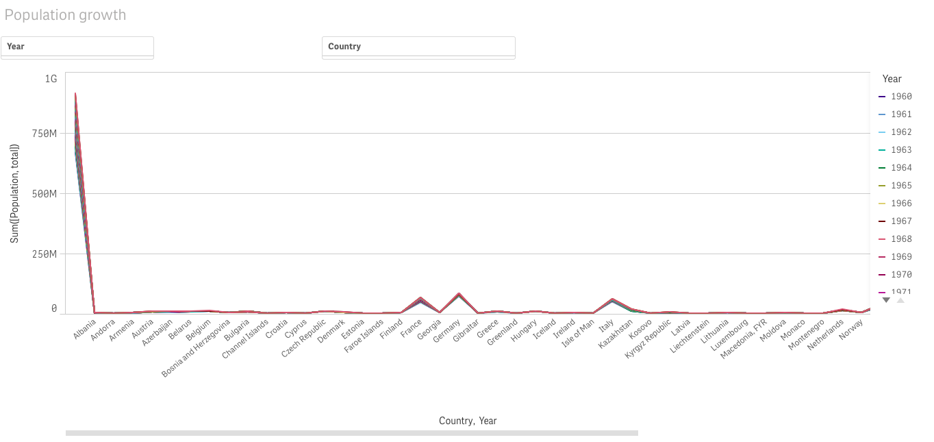
I would like to have a date filter that provides date ranges. so somebody can enter in the first filter the start year and the next the other other year that is to be compared. Really would appreciate that. The Date picker extension is not available in qlik sense cloud so i cant use it. But will highly appreciate.
- « Previous Replies
-
- 1
- 2
- Next Replies »
Accepted Solutions
- Mark as New
- Bookmark
- Subscribe
- Mute
- Subscribe to RSS Feed
- Permalink
- Report Inappropriate Content
in ur script;
Create 2 new tables as follow:
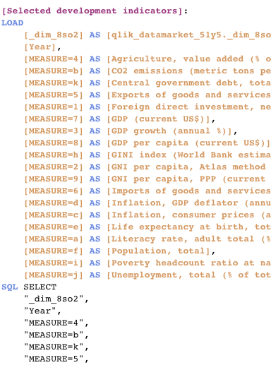
IslandTable1:
load
year as StartYear
resident YourTable; //the table that contains the year field
IslandTable2:
load
year as EndYear
resident YourTable
Now in your sheet, put the 2 new fields as filter and change the expression of ur chart from:
sum(YourMeasure)
to
sum({<year={">=$(=min(StartYear))<=$(=max(EndYear))"}>}YearMeasure)
- Mark as New
- Bookmark
- Subscribe
- Mute
- Subscribe to RSS Feed
- Permalink
- Report Inappropriate Content
- Mark as New
- Bookmark
- Subscribe
- Mute
- Subscribe to RSS Feed
- Permalink
- Report Inappropriate Content
Data just has year cell . No calendar values.
- Mark as New
- Bookmark
- Subscribe
- Mute
- Subscribe to RSS Feed
- Permalink
- Report Inappropriate Content
Let me check it out.. Thanks
- Mark as New
- Bookmark
- Subscribe
- Mute
- Subscribe to RSS Feed
- Permalink
- Report Inappropriate Content
I don't know but I cant really figure out how to start creating a data island or sort.. This is what the script is looking like. will really appreciate some extra guideance. The alternative tstate,, i tried looking through it and failing to undertsand it well ♂️
- Mark as New
- Bookmark
- Subscribe
- Mute
- Subscribe to RSS Feed
- Permalink
- Report Inappropriate Content
did you open the QVF example attached on the topic and take a look at the script and expressions to see how it works ?
- Mark as New
- Bookmark
- Subscribe
- Mute
- Subscribe to RSS Feed
- Permalink
- Report Inappropriate Content
in ur script;
Create 2 new tables as follow:
IslandTable1:
load
year as StartYear
resident YourTable; //the table that contains the year field
IslandTable2:
load
year as EndYear
resident YourTable
Now in your sheet, put the 2 new fields as filter and change the expression of ur chart from:
sum(YourMeasure)
to
sum({<year={">=$(=min(StartYear))<=$(=max(EndYear))"}>}YearMeasure)
- Mark as New
- Bookmark
- Subscribe
- Mute
- Subscribe to RSS Feed
- Permalink
- Report Inappropriate Content
I could not open the file neither convert it as am using cloud..and can't convert from QVF to QVD.
- Mark as New
- Bookmark
- Subscribe
- Mute
- Subscribe to RSS Feed
- Permalink
- Report Inappropriate Content
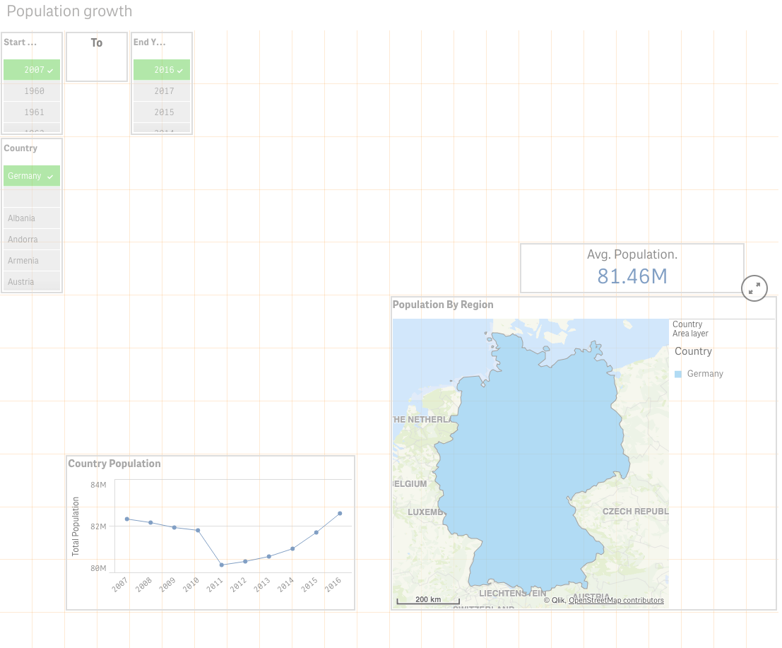
This is it and it works: sum({<Year={">=$(=min(StartYear))<=$(=max(EndYear))"}>}[Population, total])). Thanks a lot.
So just another one..
Am still on a learning curve in a away. I would like the Avg Population( KPI) showing on the map as values or shades..just to have some values on the map for each country unless i zoom in on a specific country... I only have Area Layer and Point Layer. Unfortunately Point layer is not working as I get some errors ..of some points missing..on the map .Any suggestions..?
- Mark as New
- Bookmark
- Subscribe
- Mute
- Subscribe to RSS Feed
- Permalink
- Report Inappropriate Content
Hi,
if you have some points missing it means that the coordinate of these points are missing or wrong in your table.. try to list the missing points and try to know what are the countries linked to these points, maybe they are not correctly written on your table ?
are the coordinates already stored in the loaded table or you're geo mapping the countries using Qlik ?
- « Previous Replies
-
- 1
- 2
- Next Replies »