Unlock a world of possibilities! Login now and discover the exclusive benefits awaiting you.
Announcements
Talend Cloud AWS EU Scheduled Outage: Starting Tues 26 May 21:00 CEST with expected completion Wed 27 May 01:00 CEST
- Qlik Community
- :
- Forums
- :
- Analytics & AI
- :
- Products & Topics
- :
- Visualization and Usability
- :
- Re: Line Chart - How to change Y Axis Intervals an...
Options
- Subscribe to RSS Feed
- Mark Topic as New
- Mark Topic as Read
- Float this Topic for Current User
- Bookmark
- Subscribe
- Mute
- Printer Friendly Page
Turn on suggestions
Auto-suggest helps you quickly narrow down your search results by suggesting possible matches as you type.
Showing results for
Anonymous
Not applicable
2018-01-24
04:44 PM
- Mark as New
- Bookmark
- Subscribe
- Mute
- Subscribe to RSS Feed
- Permalink
- Report Inappropriate Content
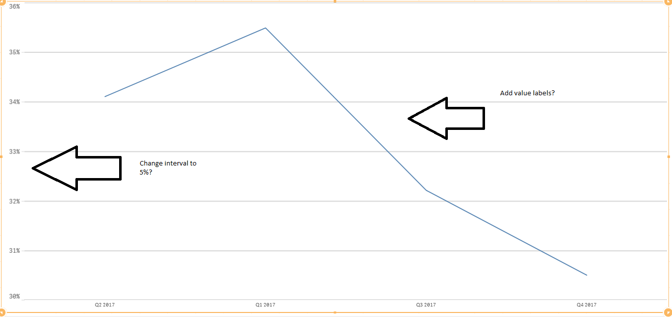
Line Chart - How to change Y Axis Intervals and how to add values to line on graph?
Hello,
I was wondering how I can change the Y Axis intervals to 5% and how I can add values to the line on the line graph?
1,457 Views
2 Replies
Partner - Champion II
2018-01-24
05:07 PM
- Mark as New
- Bookmark
- Subscribe
- Mute
- Subscribe to RSS Feed
- Permalink
- Report Inappropriate Content
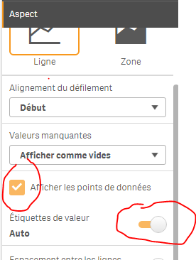
under aspect > presentation:
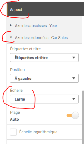
under aspect > y axis:
1,312 Views
Anonymous
Not applicable
2018-01-24
10:13 PM
Author
- Mark as New
- Bookmark
- Subscribe
- Mute
- Subscribe to RSS Feed
- Permalink
- Report Inappropriate Content
The value labels worked...but I am not sure this interval on y axis worked.
I was hoping to get all of the line graphs I have to all have an interval of 5. So 40 - 45 - 50 for example. Is there a way to set it to that?
1,312 Views