Unlock a world of possibilities! Login now and discover the exclusive benefits awaiting you.

- Qlik Community
- :
- Forums
- :
- Analytics & AI
- :
- Products & Topics
- :
- Visualization and Usability
- :
- Re: Line Chart
- Subscribe to RSS Feed
- Mark Topic as New
- Mark Topic as Read
- Float this Topic for Current User
- Bookmark
- Subscribe
- Mute
- Printer Friendly Page

- Mark as New
- Bookmark
- Subscribe
- Mute
- Subscribe to RSS Feed
- Permalink
- Report Inappropriate Content
Line Chart
Hello Expert!
my data
TransactionNumber Agency Amount
1 AA 500
2 BB 300
3 CC 466
4 GG 800
5 AA 300
6 DD 367
7 EE 999
8 EE 1035
9 FF 100
10 GG 200
11 BB 700
12 CC 1100
13 AA 300
I would like to create a line chart with X axis as Agency and Y axis as sum each agency spend.
How do I input my dimension and measure?
Thanks!
- Tags:
- line chart
Accepted Solutions

 surendraj
- Mark as New
- Bookmark
- Subscribe
- Mute
- Subscribe to RSS Feed
- Permalink
- Report Inappropriate Content
Take dimension as Agency and expression as a Sum(Amount)
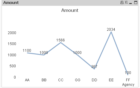
It will have x--axis as Agancy and Y-- axis as Amount.
surendraj
- Mark as New
- Bookmark
- Subscribe
- Mute
- Subscribe to RSS Feed
- Permalink
- Report Inappropriate Content
Take dimension as Agency and expression as a Sum(Amount)
It will have x--axis as Agancy and Y-- axis as Amount.

 vinieme12
- Mark as New
- Bookmark
- Subscribe
- Mute
- Subscribe to RSS Feed
- Permalink
- Report Inappropriate Content
You might want to do some reading and watch some tutorial videos on YouTube
If a post helps to resolve your issue, please accept it as a Solution.
- Mark as New
- Bookmark
- Subscribe
- Mute
- Subscribe to RSS Feed
- Permalink
- Report Inappropriate Content
Thanks!
Looks like is my data issue that cause my chart to look weird, wonder what is wrong.
But thks for the help!