Unlock a world of possibilities! Login now and discover the exclusive benefits awaiting you.
- Qlik Community
- :
- Forums
- :
- Analytics
- :
- Topics
- :
- Visualization and Usability
- :
- Log of counts day by day
- Subscribe to RSS Feed
- Mark Topic as New
- Mark Topic as Read
- Float this Topic for Current User
- Bookmark
- Subscribe
- Mute
- Printer Friendly Page
- Mark as New
- Bookmark
- Subscribe
- Mute
- Subscribe to RSS Feed
- Permalink
- Report Inappropriate Content
Log of counts day by day
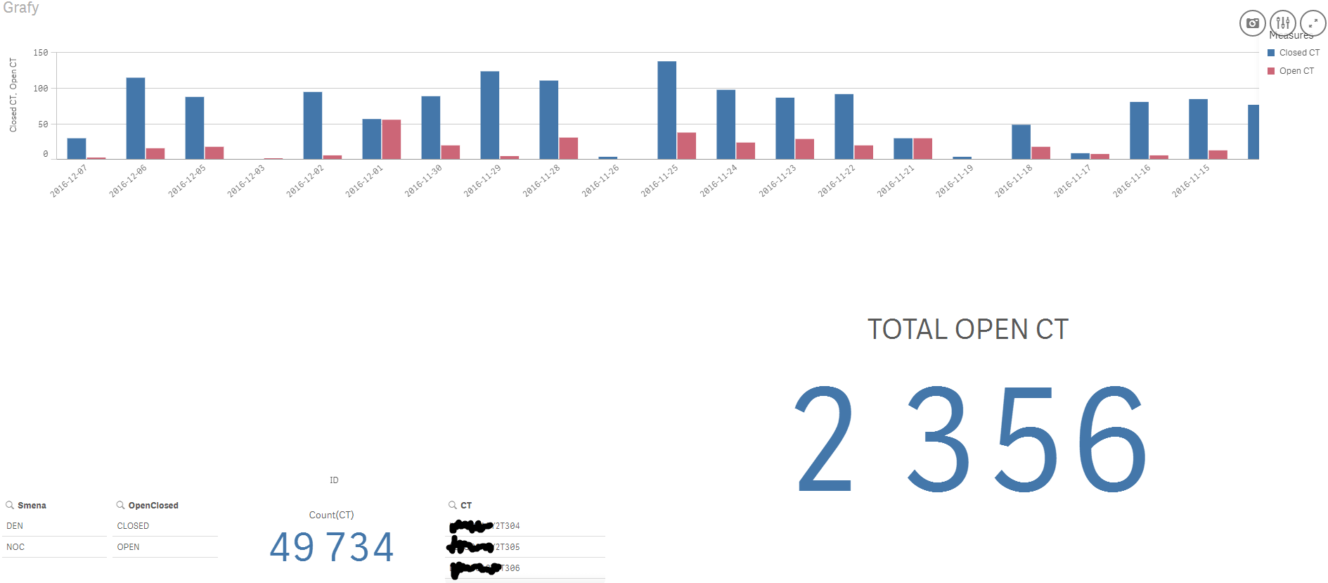
I have table with 3 important atributes: CT[string], DATE[yyyy-mm-dd] and OpenClosed[OPEN,CLOSED]. I have combo chart (on X axis is Date {2016-6-12} day by day) with two values: KPI TOTAL OPEN CT is value for last day (last reload) solved by Count( {< OpenClosed = {'OPEN'} >}Distinct CT). It is count of ALL open items in table. So I need view this value for each day in combo chart as line...
Is it possible, or I must do some special table in Excel in this case? Thanks for your answers |

- Mark as New
- Bookmark
- Subscribe
- Mute
- Subscribe to RSS Feed
- Permalink
- Report Inappropriate Content
https://help.qlik.com/en-US/sense/3.0/Subsystems/Hub/Content/Visualizations/time-aware-charts.htm
If a post helps to resolve your issue, please accept it as a Solution.
- Mark as New
- Bookmark
- Subscribe
- Mute
- Subscribe to RSS Feed
- Permalink
- Report Inappropriate Content
Hi
Not sure to well understand your requierment, but if you want to know day by day your stock of Open CT
try this for line chart
rangesum(
above(
Count( {< OpenClosed = {'OPEN'} >}Distinct CT)
)
)
my mistake the right formula is
rangesum(
above(Count( {< OpenClosed = {'OPEN'} >}Distinct CT),0,Rowno())
)
- Mark as New
- Bookmark
- Subscribe
- Mute
- Subscribe to RSS Feed
- Permalink
- Report Inappropriate Content
I need sum of count for each day...count for first day is 30, for second 20, but i would like to see 50 (30+20) for second day...etc...
- Mark as New
- Bookmark
- Subscribe
- Mute
- Subscribe to RSS Feed
- Permalink
- Report Inappropriate Content
rangesum(
above(Count( {< OpenClosed = {'OPEN'} >}Distinct CT),0,Rowno())
)
If a post helps to resolve your issue, please accept it as a Solution.
- Mark as New
- Bookmark
- Subscribe
- Mute
- Subscribe to RSS Feed
- Permalink
- Report Inappropriate Content
It is better, but I have sorting by date descending, so I need reverse it...
- Mark as New
- Bookmark
- Subscribe
- Mute
- Subscribe to RSS Feed
- Permalink
- Report Inappropriate Content
try with below :
rangesum(
below(Count( {< OpenClosed = {'OPEN'} >}Distinct CT),0,Rowno())
)
- Mark as New
- Bookmark
- Subscribe
- Mute
- Subscribe to RSS Feed
- Permalink
- Report Inappropriate Content
Neither ABOVE, neither BELOW, but BELOW has better numbers, I think. BUT: On start of chart it looks good, to middle of chart. Then line falls down to zero... It looks like some Gauss line...