Unlock a world of possibilities! Login now and discover the exclusive benefits awaiting you.
- Qlik Community
- :
- Forums
- :
- Analytics & AI
- :
- Products & Topics
- :
- Visualization and Usability
- :
- Re: Stack Bar Graph with Total
- Subscribe to RSS Feed
- Mark Topic as New
- Mark Topic as Read
- Float this Topic for Current User
- Bookmark
- Subscribe
- Mute
- Printer Friendly Page
- Mark as New
- Bookmark
- Subscribe
- Mute
- Subscribe to RSS Feed
- Permalink
- Report Inappropriate Content
Stack Bar Graph with Total
Hey guys,
I'm new in qlik sense, can anyone help me this one. Sorry if this has been answered before, I couldn't find the answer related.
I want show a stack bar graph with total workers by category, bar show full, and show in percent. Like this :

I try to create a company in one country with many braches on difference state. Total Branches in one State are diferrence, it based on which state we choose..
For example i choose State_A it will be like this:
 (1) _ App overview - Qlik Sense.png)
and if i choose State_B it will be like this :
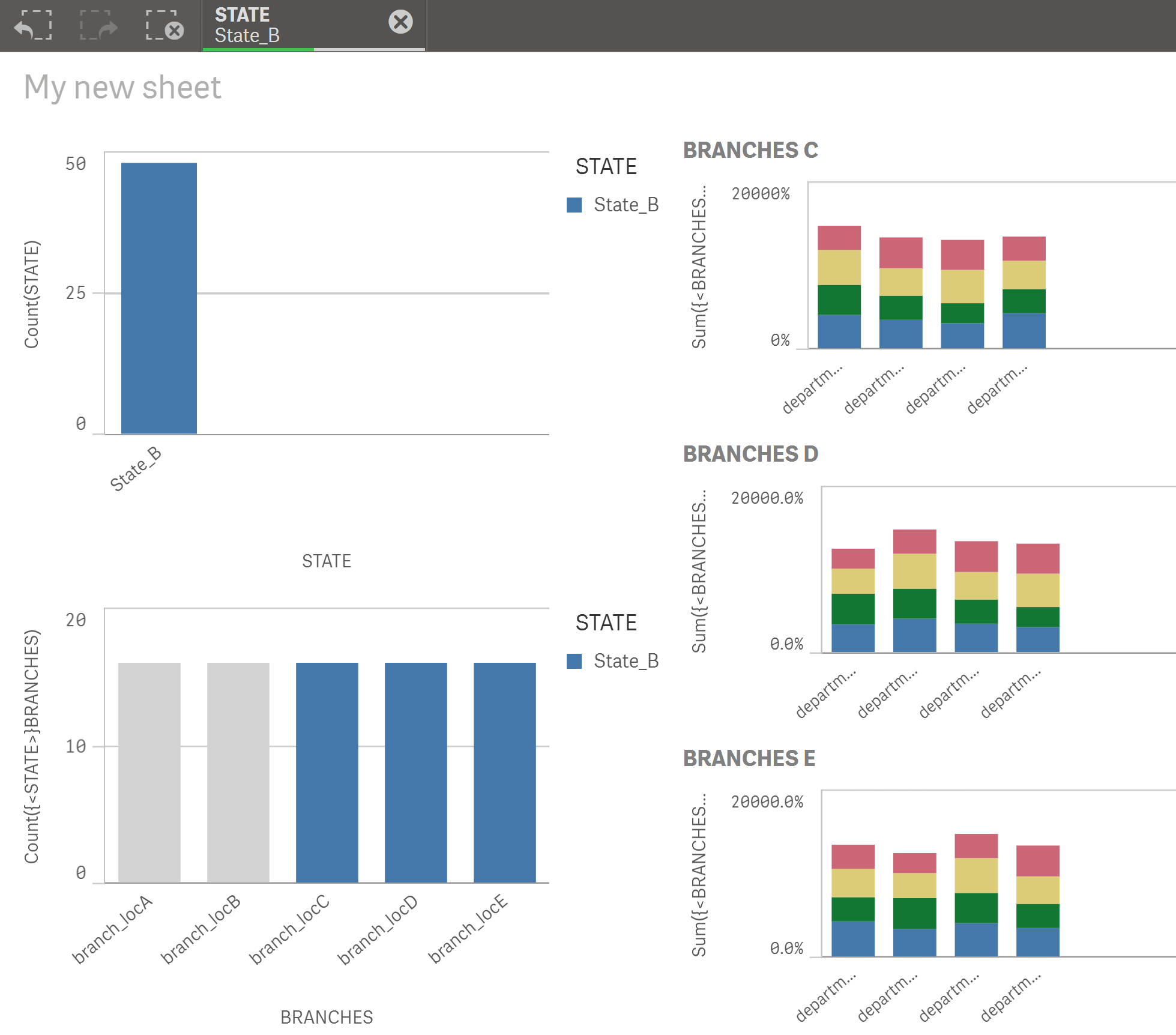
Graph will show based total branches in state which i selected. I tried using this extension, but it don't have stack bar graph.
GitHub - miclae76/trellis-chart: Qlik Sense Trellis Chart Extension
Can anybody help this one?
stalwar1 jpe mto vinieme12 reddys310
This is app that I tried to do : !
- « Previous Replies
-
- 1
- 2
- Next Replies »
- Mark as New
- Bookmark
- Subscribe
- Mute
- Subscribe to RSS Feed
- Permalink
- Report Inappropriate Content
It only shows only one value, when i rename. how to put 2 value?
AND
At top every bar chart, it show 100%, can we devide percent into every unit and show it in every unit?
- Mark as New
- Bookmark
- Subscribe
- Mute
- Subscribe to RSS Feed
- Permalink
- Report Inappropriate Content
ohh, ok.. thanks for your help..
- Mark as New
- Bookmark
- Subscribe
- Mute
- Subscribe to RSS Feed
- Permalink
- Report Inappropriate Content
- « Previous Replies
-
- 1
- 2
- Next Replies »