Unlock a world of possibilities! Login now and discover the exclusive benefits awaiting you.
- Qlik Community
- :
- Forums
- :
- Analytics & AI
- :
- Products & Topics
- :
- Visualization and Usability
- :
- Stacked bar chart with target variance
- Subscribe to RSS Feed
- Mark Topic as New
- Mark Topic as Read
- Float this Topic for Current User
- Bookmark
- Subscribe
- Mute
- Printer Friendly Page
- Mark as New
- Bookmark
- Subscribe
- Mute
- Subscribe to RSS Feed
- Permalink
- Report Inappropriate Content
Stacked bar chart with target variance
Hello Everyone,
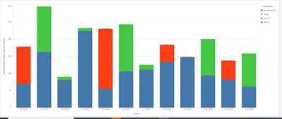
I have some sales and target data that I would like to convert into a stacked barchart as follows.
Here as you can see the red is the deficit when sales is compared to target while green is the surplus.
I was wondering how I could achieve this.Currently my sales vs target data in Qlik Sense looks like this.
for an alternate solution I found this article but it isn't what I really want - (https://www.quickintelligence.co.uk/qlik-target-bar-chart/)
Thank you
- Mark as New
- Bookmark
- Subscribe
- Mute
- Subscribe to RSS Feed
- Permalink
- Report Inappropriate Content
hi
the easiest way to achieve this will be to use combo chart
you define the measures you need
and set the ones you want to stack as bars representation
and the one you want as line as marker
- Mark as New
- Bookmark
- Subscribe
- Mute
- Subscribe to RSS Feed
- Permalink
- Report Inappropriate Content
as you can see in the original post I already am using combo chart. The challenge is to get the surplus/deficit area as colored area.
- Mark as New
- Bookmark
- Subscribe
- Mute
- Subscribe to RSS Feed
- Permalink
- Report Inappropriate Content
hi
there is no challenge you need to use 3 expressions for the bars
1. actual (up to target) - if(Sum(Actual)>sum(Target),sum(Target),sum(Actual))
2. surplus - if(Sum(Actual)>sum(Target),sum(Actual)-sum(Target),0)
3. deficit - if(Sum(Actual)>sum(Target),0,sum(Target)-sum(Actual))
that's it , it'll look like this


