Unlock a world of possibilities! Login now and discover the exclusive benefits awaiting you.
- Qlik Community
- :
- Forums
- :
- Analytics & AI
- :
- Products & Topics
- :
- Visualization and Usability
- :
- Sum a field to a variable (x axis is time)
- Subscribe to RSS Feed
- Mark Topic as New
- Mark Topic as Read
- Float this Topic for Current User
- Bookmark
- Subscribe
- Mute
- Printer Friendly Page
- Mark as New
- Bookmark
- Subscribe
- Mute
- Subscribe to RSS Feed
- Permalink
- Report Inappropriate Content
Sum a field to a variable (x axis is time)
Hello,
I have a Data file (attached to this post) which informs when (3rd and 4th field in the data file) users (1st field) have opened a software (2nd field) and thus are using a network license of that software. +1 stands for licence being in use and -1 stands for licence no longer in use (5th field). This means that between a +1 and a -1, there is a period of time when the user was using the licence of that software.
I want to create a graphic with Qlik Sense which represents the number of licences being used at each moment in time. This graphic should look something like this:

In regard to the data in the attached file, each line represents a moment in time when the software was either launched or closed (and thus the user starts using a licence or freeing a licence for network use).
Because this data is only telling me when the value is changed, and not the value at each moment given in time, I thought about creating a variable, starting at 0, which will either go up or down, when a user opens or closes the software.
How can I do so? Thank you very much for your help.
- « Previous Replies
- Next Replies »
- Mark as New
- Bookmark
- Subscribe
- Mute
- Subscribe to RSS Feed
- Permalink
- Report Inappropriate Content
try
=Count({$<Status={1}>} Status)
in time you can use month,year or date
- Mark as New
- Bookmark
- Subscribe
- Mute
- Subscribe to RSS Feed
- Permalink
- Report Inappropriate Content
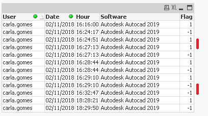
Hi friend.
I know what you want do. But the date have some problems to resolve. Do you can get a number like "Session ID" to avoid situations that share two app in same time? Just to order correctly (open and close).
Look image in this post and return.
After all the transform (doing two rown become one with time order and SessionID), you can use a extension like "Timeline", see that in: https://github.com/kai/qlik-sense-timeline or https://github.com/ralfbecher/QlikSense_Extension_Timeline
- Mark as New
- Bookmark
- Subscribe
- Mute
- Subscribe to RSS Feed
- Permalink
- Report Inappropriate Content
Hi @ritaaguiar
Do you need help with the visaulization or some exact expression?>
Regards
Pradosh
- Mark as New
- Bookmark
- Subscribe
- Mute
- Subscribe to RSS Feed
- Permalink
- Report Inappropriate Content
Hi @Channa and @lfetensini
Thank you for your help.
@pradosh_thakur I think I need help with both visualization and expression, thank you
I'm much closer now to what I need. As you can see, the bottom graphic shows the Sum of all values from the 5th field on each date. I would like to obtain instead, the Sum of all 5th field values at each given moment in time, where the max of =Sum({$<Licença={1}>} Licença) is 4. (The Sum of the 5th field values will not go over 4 because there's only four users in the Data3.xlsx.) And the x axis should look like the one from the top graphic, so that it can be zoomed in.
I have tried with different types of graphics: combo chart and line chart. The combo chart allows me to either use the 'Height of line' measure of the 'Marker' measure. The 'Height of line' measure represents time, in the x axis, correctly (top graphic). However the 'Height of marker' represents constant values for each day (bottom graphic). I would like to obtain a graphic that has the x axis from the 'Height of line', but which represents constant values in time until this value is changed (either up or down), as seen in the 'Height of Marker'.
Do you think it's possible to do that? @pradosh_thakur @lfetensini @Channa

- Mark as New
- Bookmark
- Subscribe
- Mute
- Subscribe to RSS Feed
- Permalink
- Report Inappropriate Content
Update on this post: got the time scale continous, just need to correct the measure.
I tried Sum({$<Licença={1 }>} Licença), however, this will sum all values on a day, but I wish this to represent the values at each moment in time like here:


- Mark as New
- Bookmark
- Subscribe
- Mute
- Subscribe to RSS Feed
- Permalink
- Report Inappropriate Content
@ritaaguiar as your dimension is date it will sum for the entire day. So you want the license hour wise and not day wise right ? For that we need to add timesatmp in x axis and not date. Or you want something else?
- Mark as New
- Bookmark
- Subscribe
- Mute
- Subscribe to RSS Feed
- Permalink
- Report Inappropriate Content
@pradosh_thakur Yeah, in fact, it should be at each hundredth of a second (entrances of the Data3 file ).
- Mark as New
- Bookmark
- Subscribe
- Mute
- Subscribe to RSS Feed
- Permalink
- Report Inappropriate Content
Can you briefly tell what is your business objective is with the graph and what you want to show and which fields are you using. Need not be too detailed but an overview.
- Mark as New
- Bookmark
- Subscribe
- Mute
- Subscribe to RSS Feed
- Permalink
- Report Inappropriate Content
Yeah. This is all so that we can study the use that the employees give to the softwares we need to work with, so that we can assign them an appropriate licence for the softwares they use. By acknowledging their use, we can spare on licence costs for these programs (Autodesk Autocad, Civil 3D, Revit, etc...) by choosing wisely which users have access to which network licences or standalone licences.
This graphic that I'm now trying to do will work as a record of when people were using the licences. Often times we, myself included, cannot use Autodesk Revit, for example, because there are no licences available. So we need to tackle the actual number of licences we need, so this does not happen to any of us anymore (or at least not as often).
- « Previous Replies
- Next Replies »