Unlock a world of possibilities! Login now and discover the exclusive benefits awaiting you.
- Qlik Community
- :
- Forums
- :
- Analytics & AI
- :
- Products & Topics
- :
- Visualization and Usability
- :
- Re: creating a line graph
- Subscribe to RSS Feed
- Mark Topic as New
- Mark Topic as Read
- Float this Topic for Current User
- Bookmark
- Subscribe
- Mute
- Printer Friendly Page
- Mark as New
- Bookmark
- Subscribe
- Mute
- Subscribe to RSS Feed
- Permalink
- Report Inappropriate Content
creating a line graph
Hello - I am new to Qlik Sense and trying to create a line graph measuring revenue by month. I am unable to align month on the y-axis as hoping. Is there something I am missing?
- « Previous Replies
-
- 1
- 2
- Next Replies »
- Mark as New
- Bookmark
- Subscribe
- Mute
- Subscribe to RSS Feed
- Permalink
- Report Inappropriate Content
Can you post a screeenshot of your problem?
-Rob
- Mark as New
- Bookmark
- Subscribe
- Mute
- Subscribe to RSS Feed
- Permalink
- Report Inappropriate Content
Please see attached. I selected monthly dollars as my measurement, but
want them to appear on the X-axis and my customer on the Y-axis.
- Mark as New
- Bookmark
- Subscribe
- Mute
- Subscribe to RSS Feed
- Permalink
- Report Inappropriate Content
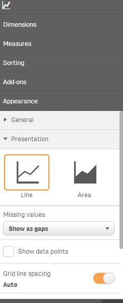
Expand the Presentation section in the chart properties and select the Horizontal orientation.
-Rob
- Mark as New
- Bookmark
- Subscribe
- Mute
- Subscribe to RSS Feed
- Permalink
- Report Inappropriate Content
Thanks for the feedback. Unfortunately, I do not have an option in the
Presentation section to choose Horizontal orientation. Please see
attached.
- Mark as New
- Bookmark
- Subscribe
- Mute
- Subscribe to RSS Feed
- Permalink
- Report Inappropriate Content
My mistake. I was looking at bar chart options. Could you use a bar chart as a workaround? A line chart isn't typically used with a categorical value list customer.
- Mark as New
- Bookmark
- Subscribe
- Mute
- Subscribe to RSS Feed
- Permalink
- Report Inappropriate Content
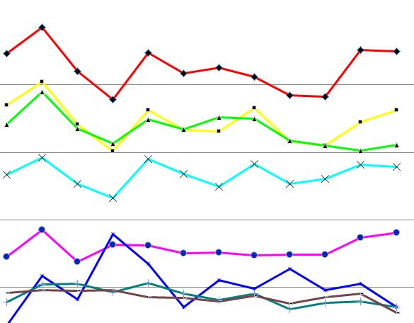
It might be helpful to show what I'm attempting to replicate. Please see
attached. Is this doable in Qlik Sense? I appreciate your time looking
into this for me.
- Mark as New
- Bookmark
- Subscribe
- Mute
- Subscribe to RSS Feed
- Permalink
- Report Inappropriate Content
Hi Matt,
What do you have for dimensions and what do you have as measures. I think you should be able to create it by having the following dimensions:
- Month
- Product
And measure
- sum(Revenue)
Or do you have the data for each month in a separate field? Like:
| Jan 2013 | Feb 2013 | Mar 2013 | |
|---|---|---|---|
| Product 0 | |||
| Product 1 | |||
| Product 2 | |||
| Product 3 |
In that case you need to change the way you load your data. This can be done using crosstable load (see http://help.qlik.com/sense/en-US/online/#../Subsystems/WorkingWith/Content/Scripting/ScriptPrefixes/...)
- Mark as New
- Bookmark
- Subscribe
- Mute
- Subscribe to RSS Feed
- Permalink
- Report Inappropriate Content
If I understand your example correctly, the Y axis is each customer, and the lines are a trend line over months? And each customer has it's own scale for the trendline?
-Rob
- Mark as New
- Bookmark
- Subscribe
- Mute
- Subscribe to RSS Feed
- Permalink
- Report Inappropriate Content
Yes, you are correct.
- « Previous Replies
-
- 1
- 2
- Next Replies »