Unlock a world of possibilities! Login now and discover the exclusive benefits awaiting you.

- Qlik Community
- :
- Forums
- :
- Analytics & AI
- :
- Products & Topics
- :
- Visualization and Usability
- :
- Re: how to create per column in graph
- Subscribe to RSS Feed
- Mark Topic as New
- Mark Topic as Read
- Float this Topic for Current User
- Bookmark
- Subscribe
- Mute
- Printer Friendly Page

- Mark as New
- Bookmark
- Subscribe
- Mute
- Subscribe to RSS Feed
- Permalink
- Report Inappropriate Content
how to create per column in graph
Hi all
The data will be like this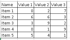
and shown in bar chart like this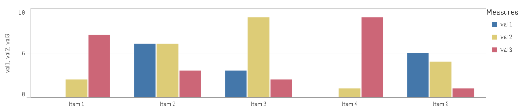
and the graph that i want is like below
To make this graph I change the table structure. But it’s not suggested
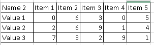
Is it possible to make 2nd graph without changing table structure?
Because I want to compare/analyse a value for each item, because the 1st chart cannot see the comparison between item.
Any suggestion to solve this?
Thanks
Accepted Solutions

 swuehl
- Mark as New
- Bookmark
- Subscribe
- Mute
- Subscribe to RSS Feed
- Permalink
- Report Inappropriate Content
Try
CROSSTABLE (ValueName, Value)
LOAD
Name,
"Value 1",
"Value 2",
"Value 3"
FROM [lib://book2/Book2.xlsx]
(ooxml, embedded labels, table is Sheet2);
Then you can easily create both charts using either
1) Name
2) ValueName
or
1) ValueName
2) Name
as your two dimensions and
=Sum(Value)
as expression.
swuehl
- Mark as New
- Bookmark
- Subscribe
- Mute
- Subscribe to RSS Feed
- Permalink
- Report Inappropriate Content
Try
CROSSTABLE (ValueName, Value)
LOAD
Name,
"Value 1",
"Value 2",
"Value 3"
FROM [lib://book2/Book2.xlsx]
(ooxml, embedded labels, table is Sheet2);
Then you can easily create both charts using either
1) Name
2) ValueName
or
1) ValueName
2) Name
as your two dimensions and
=Sum(Value)
as expression.
- Mark as New
- Bookmark
- Subscribe
- Mute
- Subscribe to RSS Feed
- Permalink
- Report Inappropriate Content
"crosstable" words, give me to next stage
thanks