Unlock a world of possibilities! Login now and discover the exclusive benefits awaiting you.
- Qlik Community
- :
- All Forums
- :
- QlikView
- :
- Colormix on Pivot table (multiple expressions)
- Subscribe to RSS Feed
- Mark Topic as New
- Mark Topic as Read
- Float this Topic for Current User
- Bookmark
- Subscribe
- Mute
- Printer Friendly Page
- Mark as New
- Bookmark
- Subscribe
- Mute
- Subscribe to RSS Feed
- Permalink
- Report Inappropriate Content
Colormix on Pivot table (multiple expressions)
Hi everyone.
I needed assistance using colormix on a pivot table where the generated heat map fills in the colors horizontally across the Year dim found at the top. I can get colormix to work on a column vertically but could not find a setting to make it switch to calculating horizontally. Do I need to manually edit the generated code or is there another way to accomplish this?
Please refer to attached images. First shows it not working and in the latter I created it in excel to mimic what I required.
If you had a sample qvw that would really help. Would appreciate your assistance.
Thank you.


- « Previous Replies
-
- 1
- 2
- Next Replies »
Accepted Solutions
- Mark as New
- Bookmark
- Subscribe
- Mute
- Subscribe to RSS Feed
- Permalink
- Report Inappropriate Content
Hi,
Please find attached file for solution. Hope it helps you.
Regards,
Jagan.
- Mark as New
- Bookmark
- Subscribe
- Mute
- Subscribe to RSS Feed
- Permalink
- Report Inappropriate Content
- Mark as New
- Bookmark
- Subscribe
- Mute
- Subscribe to RSS Feed
- Permalink
- Report Inappropriate Content
click on the dimension or expression for year and select background color.
in the definition for background color, input the expression that dictates the colors. something like:
=if(sum(Sales)<500000, rgb(255,0,0),
if(sum(Sales)>600000, rgb(0,255,0),
rgb(0,0,255)))
that should change the background color. modify the values and the expression itself to suit your logic. for colors, you can use argb() or color() or white()/red(), etc. instead of rgb().
- Mark as New
- Bookmark
- Subscribe
- Mute
- Subscribe to RSS Feed
- Permalink
- Report Inappropriate Content
Hi Amit.
Thank you for this.
I went through it but unfortunately it's similar to what I had originally done. The problem is that with these instances we are hard coding the min, intermediate and max rgb colours so it isn't mixing the colours like in a heat map for any values in between what we hard code.
Thanks.
- Mark as New
- Bookmark
- Subscribe
- Mute
- Subscribe to RSS Feed
- Permalink
- Report Inappropriate Content
Hi!
Thank you for this. Please refer to reply to Amit.
I tried this originally but it doesn't "mix" colours for values in between like in a heat map.
Thanks.
- Mark as New
- Bookmark
- Subscribe
- Mute
- Subscribe to RSS Feed
- Permalink
- Report Inappropriate Content
I hope it helps you
- Mark as New
- Bookmark
- Subscribe
- Mute
- Subscribe to RSS Feed
- Permalink
- Report Inappropriate Content
Hi Martha.
Thank you.
Please refer to attached pic. You will find a blend of colours between red, yellow and green (heat map) which I can get to work on a straight table but applying this concept on a pivot where the data runs horizontally and not vertically doesn't seem to work. What you suggested is what I first did but then you lose the mix of in-between colours.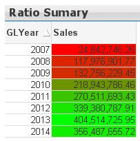
Thank you.
- Mark as New
- Bookmark
- Subscribe
- Mute
- Subscribe to RSS Feed
- Permalink
- Report Inappropriate Content
Attached is a new file. Just change the condition to use the Amount of Sales instead of the the years.
- Mark as New
- Bookmark
- Subscribe
- Mute
- Subscribe to RSS Feed
- Permalink
- Report Inappropriate Content
Hi,
Please find attached file for solution. Hope it helps you.
Regards,
Jagan.
- Mark as New
- Bookmark
- Subscribe
- Mute
- Subscribe to RSS Feed
- Permalink
- Report Inappropriate Content
Thank you Martha.
I suppose in addition to this, I can make it a bit more dynamic like what Jagan has also suggested.
Thanks once again.
- « Previous Replies
-
- 1
- 2
- Next Replies »