Unlock a world of possibilities! Login now and discover the exclusive benefits awaiting you.
- Qlik Community
- :
- All Forums
- :
- QlikView
- :
- Linear regression
- Subscribe to RSS Feed
- Mark Topic as New
- Mark Topic as Read
- Float this Topic for Current User
- Bookmark
- Subscribe
- Mute
- Printer Friendly Page
- Mark as New
- Bookmark
- Subscribe
- Mute
- Subscribe to RSS Feed
- Permalink
- Report Inappropriate Content
Linear regression
Hi,
I'm trying to explicit develop a trendline (linear regression) on a QlikView line chart.
I have one dimension called "Anz." and a single expression "ral €".
I need to graph with a "matrix style" each point with its value.
In addtion I have to trace the linear regression with +10% and -10% from this trendline (that's why I can't use the standard QlikView trendline but I have to explicit realize it with a custom expression).
I found an example on this forum and I create this one (that unfortunately doesn't work).
linest_m(TOTAL aggr(avg([ral €]),Anz.),Anz.) * Anz. + linest_b(TOTAL aggr(avg([ral €]),Anz.),Anz.)
Can anyone explain me what I can do ?
To explain better the issue I attach the QlikView application.
Thanks in advance to all.
Bye
- Mark as New
- Bookmark
- Subscribe
- Mute
- Subscribe to RSS Feed
- Permalink
- Report Inappropriate Content
All what you've done is just fine. You need to generate X-axe value for prediction (Anz. value). See attachment.
- Mark as New
- Bookmark
- Subscribe
- Mute
- Subscribe to RSS Feed
- Permalink
- Report Inappropriate Content
evil80210 wrote:I found an example on this forum and I create this one (that unfortunately doesn't work).
When you say it doesn't work, what do you mean?
If you mean that it doesn't show any predictive data, Nick addressed that.
If you mean that it isn't a line, the answer is that you aren't using a continuous X axis, and so your data points are positioned poorly. If you use a continous X axis it displays as a line.
Or did you mean something else?
Edit: Attached example with continuous X axis and +10% and -10% trend lines.
- Mark as New
- Bookmark
- Subscribe
- Mute
- Subscribe to RSS Feed
- Permalink
- Report Inappropriate Content
Hi,
thanks a lot for your answer...yes I mean that it isn't a line.
I have seen your example, but there is still one thing that I can't understand.
If you try to disable the two expressions, and you leave only the expression called "Media Ral" QlikView will graph 20 points, instead if you activate the two expressions that calculate the linear regression it will graph only 12 point...why?
Thanks again.
Bye
- Mark as New
- Bookmark
- Subscribe
- Mute
- Subscribe to RSS Feed
- Permalink
- Report Inappropriate Content
You can EITHER have multiple expressions OR have multiple dimensions. You can't do both at the same time in a line graph. So when you put in multiple expressions, it appears to simply ignore your second dimension.
As a bad solution, you could use a calculated dimension like this to replace your two dimensions:
=num(Anz.+[ral €]/1000000000,'#,##0')
The points will then be ever so slightly different, and so they'll all plot, and the numeric format will make sure it displays properly if you mouse over. An export to Excel would still give you the wrong values, though.
Hopefully there's a better solution.
- Mark as New
- Bookmark
- Subscribe
- Mute
- Subscribe to RSS Feed
- Permalink
- Report Inappropriate Content
Hi,
I think it's ok!
Thanks a lot.
- Mark as New
- Bookmark
- Subscribe
- Mute
- Subscribe to RSS Feed
- Permalink
- Report Inappropriate Content
Hi,
how can I show in the same chart the surname (field "cognome") of each point ?
I have tried to add these to the dimension, but it doesn't work.
Thanks a lot for your support
Bye
- Mark as New
- Bookmark
- Subscribe
- Mute
- Subscribe to RSS Feed
- Permalink
- Report Inappropriate Content
I was able to do it by adding another expression:
dual(only(cognome),avg([ral €]))
Basically, it plots the exact same points as Media Ral, but the pop up shows the text for that point, which we've defined as only(cognome). It seems to work. See attached.
- Mark as New
- Bookmark
- Subscribe
- Mute
- Subscribe to RSS Feed
- Permalink
- Report Inappropriate Content
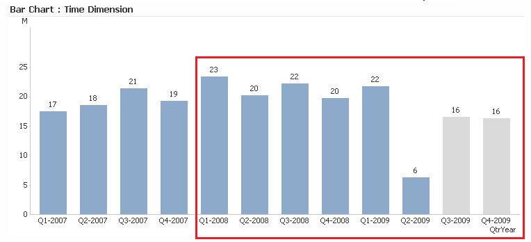
I'm trying to replicate what John produced in his testControlLimits2.qvw over QtrYear to forecast forward but based upon a constrained history (last 5 quarters) and project over current/active quarter to see where we should be in addition to future quarters. For current quarters, I want to simulate a brushing effect to show current progress against forecast based upon history. Any ideas?
I highlighted the period I'd like to constrain it with a red box.