Unlock a world of possibilities! Login now and discover the exclusive benefits awaiting you.
- Qlik Community
- :
- All Forums
- :
- QlikView
- :
- Line Chart according to latest Top 5 Position
- Subscribe to RSS Feed
- Mark Topic as New
- Mark Topic as Read
- Float this Topic for Current User
- Bookmark
- Subscribe
- Mute
- Printer Friendly Page
- Mark as New
- Bookmark
- Subscribe
- Mute
- Subscribe to RSS Feed
- Permalink
- Report Inappropriate Content
Line Chart according to latest Top 5 Position
Hi All,
I would like to draw a Line Chart according to Jun16 position's Top 5 value.
I go to the Chart properties (Dimension Limits) tab, select 'Show Only', Largest 5 values.
The result wasn't what i expected, it displayed the Top 5 value for each of the month.
How do i draw a Line Chart according to Jun16 position's Top 5 value (i.e. Line should only appreared for Type A, D, F, H, I)?
| TYPE | Jun15 | Jul15 | Aug15 | Sep15 | Oct15 | Nov15 | Dec15 | Jan16 | Feb16 | Mar16 | Apr16 | May16 | Jun16 |
| Type A | 954 | 965 | 1048 | 1097 | 1071 | 1056 | 1063 | 1020 | 1030 | 964 | 961 | 1015 | 976 |
| Type B | 426 | 432 | 467 | 518 | 516 | 521 | 526 | 520 | 521 | 498 | 497 | 870 | 848 |
| Type C | 328 | 333 | 365 | 436 | 424 | 419 | 136 | 840 | 846 | 460 | 449 | ||
| Type D | 1191 | 1192 | 3071 | 3208 | 3166 | 3114 | 3140 | 3017 | 3092 | 2976 | 2980 | 3080 | 3058 |
| Type E | 630 | 629 | 665 | 689 | 583 | 563 | 562 | 482 | 477 | 438 | 428 | 440 | 423 |
| Type F | 4185 | 4233 | 4566 | 4601 | 4494 | 4419 | 7994 | 7874 | 7904 | 7634 | 7620 | 7726 | 4799 |
| Type G | 655 | 656 | 698 | 728 | 700 | 712 | 476 | 451 | 238 | 219 | 219 | 228 | 234 |
| Type H | 603 | 605 | 657 | 679 | 670 | 215 | 214 | 200 | 197 | 189 | 192 | 324 | 1117 |
| Type I | 1451 | 1434 | 1491 | 1542 | 1463 | 1382 | 1370 | 1313 | 1233 | 1148 | 1146 | 1189 | 1150 |
Accepted Solutions
- Mark as New
- Bookmark
- Subscribe
- Mute
- Subscribe to RSS Feed
- Permalink
- Report Inappropriate Content
Hi Jin,
I think this is what you want:
The first thing to do is get your data in tabular form:
CrossData:
LOAD TYPE,
Jun15,
Jul15,
Aug15,
Sep15,
Oct15,
Nov15,
Dec15,
Jan16,
Feb16,
Mar16,
Apr16,
May16,
Jun16
FROM
[https://community.qlik.com/thread/233701]
(html, codepage is 1252, embedded labels, table is @1);
Data:
CrossTable(Month,Sales) LOAD * Resident CrossData;
Drop Table CrossData;
Now the data is in three columns, TYPE, Month and Sales,
Make your line chart with the dimension Month and a calculated dimension I've called Type:
=Aggr(if(Rank(Sum({$<Month = {'Jun16'}>}Sales)) <=5,TYPE),TYPE)
In the chart's dimension tab check the option Suppress When Value Is Null for this calculated dimension.
Add the expression Sum(Sales)
and in the Sort tab set the Month field sort order to Numeric Value Ascending.
Good luck
Andrew
- Mark as New
- Bookmark
- Subscribe
- Mute
- Subscribe to RSS Feed
- Permalink
- Report Inappropriate Content
Please post a small qlikview document with example data.
talk is cheap, supply exceeds demand
- Mark as New
- Bookmark
- Subscribe
- Mute
- Subscribe to RSS Feed
- Permalink
- Report Inappropriate Content
Hi, here is the sample data.
- Mark as New
- Bookmark
- Subscribe
- Mute
- Subscribe to RSS Feed
- Permalink
- Report Inappropriate Content
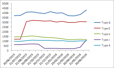
Is this what you're looking for?

See the attached file 
Best regards,
D.A. MB
- Mark as New
- Bookmark
- Subscribe
- Mute
- Subscribe to RSS Feed
- Permalink
- Report Inappropriate Content
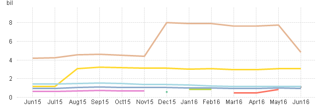
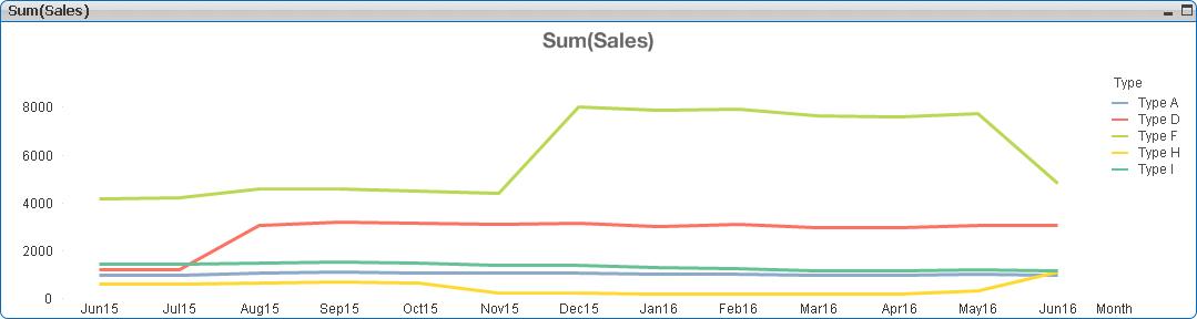
Hi, refer to attachment below. Graph A is the result i want instead of Graph B.
Graph A
Graph B

- Mark as New
- Bookmark
- Subscribe
- Mute
- Subscribe to RSS Feed
- Permalink
- Report Inappropriate Content
Hi Jin,
I think this is what you want:
The first thing to do is get your data in tabular form:
CrossData:
LOAD TYPE,
Jun15,
Jul15,
Aug15,
Sep15,
Oct15,
Nov15,
Dec15,
Jan16,
Feb16,
Mar16,
Apr16,
May16,
Jun16
FROM
[https://community.qlik.com/thread/233701]
(html, codepage is 1252, embedded labels, table is @1);
Data:
CrossTable(Month,Sales) LOAD * Resident CrossData;
Drop Table CrossData;
Now the data is in three columns, TYPE, Month and Sales,
Make your line chart with the dimension Month and a calculated dimension I've called Type:
=Aggr(if(Rank(Sum({$<Month = {'Jun16'}>}Sales)) <=5,TYPE),TYPE)
In the chart's dimension tab check the option Suppress When Value Is Null for this calculated dimension.
Add the expression Sum(Sales)
and in the Sort tab set the Month field sort order to Numeric Value Ascending.
Good luck
Andrew
- Mark as New
- Bookmark
- Subscribe
- Mute
- Subscribe to RSS Feed
- Permalink
- Report Inappropriate Content
Try this expression: Sum({<Type={"=rank(sum({<Date={'30/06/2016'}>}Amount))<=5"}>}Amount)
Or perhaps this one: Sum({<Type={"=rank(sum({<Date={'$(=Date(max(Date)))'}>}Amount))<=5"}>}Amount)
talk is cheap, supply exceeds demand