Unlock a world of possibilities! Login now and discover the exclusive benefits awaiting you.
- Qlik Community
- :
- All Forums
- :
- QlikView App Dev
- :
- using an expression(based on a dimension) as dimen...
- Subscribe to RSS Feed
- Mark Topic as New
- Mark Topic as Read
- Float this Topic for Current User
- Bookmark
- Subscribe
- Mute
- Printer Friendly Page
- Mark as New
- Bookmark
- Subscribe
- Mute
- Subscribe to RSS Feed
- Permalink
- Report Inappropriate Content
using an expression(based on a dimension) as dimension for another expression
Hello Qlik Community!
I am new to Qlik and need help for a simple problem ...
I have a table of transactions, with the fields client and object. So during a transaction a client buys a single object.
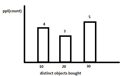
What I am trying to do is to create a bar chart showing how many people bought a number (in an interval) of distinct objects.
On the x axis I want to have the intervals, and on the y axis the amount of people for each amount of bought objects.
The closest I got to solving this was by finding the class function. The only problem is that i have to pass a dimension to this function, whereas my dimension is actually an expression based on another dimension.
To calculate how many distinct objects a person bought I need clients as a dimension. And to calculate how many clients bought 10 distinct objects I need the previous expression as a dimension.
I think that the idea of trying to see the distribution is pretty basic, but I couldn't find a way to do it ....
Thanks in advance!
Accepted Solutions
- Mark as New
- Bookmark
- Subscribe
- Mute
- Subscribe to RSS Feed
- Permalink
- Report Inappropriate Content
I would expect something like this to work:
dimension = aggr(class(count(distinct Object),10,'Objects'),Person)
expression = count(distinct Person)
If it doesn't, I'll figure it out by working up an example.
- Mark as New
- Bookmark
- Subscribe
- Mute
- Subscribe to RSS Feed
- Permalink
- Report Inappropriate Content
Thanks a lot! It is working perfectly!
- Mark as New
- Bookmark
- Subscribe
- Mute
- Subscribe to RSS Feed
- Permalink
- Report Inappropriate Content
In same scenario I am now trying to make the chart show me the bell curve for the sales.
I am taking as a dimension aggr(count(distinct Object)), without using the class function.
But for the expression I can't use the normdist function since this is not cumulative.
I have tried writing a couple of distributions by hand but the results weren't that bell-curve-looking.
Count(distinct Person) by itself looks more like a bell curve than the attempts.
Is it somehow possible just to sort the chart in such a way that it shows the bell curve, rather than changing the expression?
Thanks Again!
- Mark as New
- Bookmark
- Subscribe
- Mute
- Subscribe to RSS Feed
- Permalink
- Report Inappropriate Content
I think aggr(count(distinct Object), Person) as dimension and Count(distinct Person) as expression should do the trick to show you the distribution. Check the sort of dimension in sort tab, I think it should be numerical only.
But maybe you actually don't get a bell curve? For example, if most customer buy only one Object and the probability of a customer buying 2,3,4,5,6.. is dropping (what I would expect, but don't know in your case), you won't get a bell curve. Hm, I just want to say that not every distribution follows a bell curve distribution (gaussian).
- Mark as New
- Bookmark
- Subscribe
- Mute
- Subscribe to RSS Feed
- Permalink
- Report Inappropriate Content
I think aggr(count(distinct Object), Person) as dimension and Count(distinct Person) as expression should do the trick to show you the distribution. Check the sort of dimension in sort tab, I think it should be numerical only.
I also think that that dimension and expression should do it, but the sort tab does't give me any option other than ascending/descending.
But maybe you actually don't get a bell curve? For example, if most customer buy only one Object and the probability of a customer buying 2,3,4,5,6.. is dropping (what I would expect, but don't know in your case), you won't get a bell curve. Hm, I just want to say that not every distribution follows a bell curve distribution (gaussian).
I understand what you are saying, and indeed in the end it may not be a gaussan distribution.
But I think that for a decent amout of input it will gradually get a bell form. Already for a relatvely small sample, sorted acending (-_-) i get a nice steady curve!
- Mark as New
- Bookmark
- Subscribe
- Mute
- Subscribe to RSS Feed
- Permalink
- Report Inappropriate Content
I would assume that sorting number of object Sales in ascending order would be ok? Like having a x-Axis from 0 to max number of Sales.
How would you like it to be sorted?
- Mark as New
- Bookmark
- Subscribe
- Mute
- Subscribe to RSS Feed
- Permalink
- Report Inappropriate Content
Yes, you are right, I should leave it sorted like that. Trying to sort it some other way wouldn't bring much, other than make it confusing 
Thank you for the fast replies!