Unlock a world of possibilities! Login now and discover the exclusive benefits awaiting you.
- Qlik Community
- :
- Blogs
- :
- Technical
- :
- Design
- :
- Contextualize your KPIs
- Subscribe to RSS Feed
- Mark as New
- Mark as Read
- Bookmark
- Subscribe
- Printer Friendly Page
- Report Inappropriate Content
Raw data is useful but data with additional contextual information is better because it helps us do what we already do naturally: compare, contrast, and weigh our options as part of the bigger picture. Contextual data is the supporting information that helps the reader more fully understand the primary data.
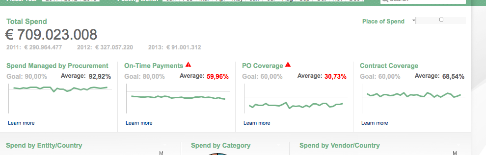
Key performance indicators (KPIs) at the top of a Dashboard page are a great way to give the general summary of how something is functioning, but the very next thought in any reader's mind is about context. Only people who are very familiar with the data can look at a number and place it in the context of the full story. The rest of us need additional information to contextualize this data. There are a variety of simple ways to give readers additional context so they can make smarter decisions.
Traffic light
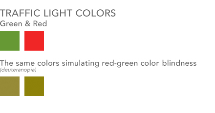
One way most people in BI are familiar with providing additional context is color coding information with traffic light colors. Green is good, yellow is a warning, red is bad. This visual metaphor is so common that most people understand it without any additional information. You might not know why a number is red, but at least you know there is a problem. Something to consider however is using an additional visual cue along with this metaphor for color blind users. Red-green color blindness is the most common form of color blindness which is where red & green colors shift to being shades of yellow and brown. You can use shapes / symbols along with your colors to improve the accessibility of this system. Perhaps you use up or down triangles in addition to coloring them green or red. Perhaps a fully colored circle can be green for good where an empty circle with just a red border can be bad. The shape is an additional indicator to users who have difficulty seeing the differences in your colors as to the context of your data.
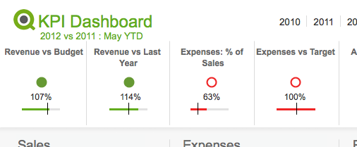
Lines & Bars
Having a simple line or bar chart below a KPI can quickly place a KPI in the context of a larger whole. These are charts with no axes or written values. They are simply there to give context - drilling into the details is done elsewhere.
- A line chart helps show the overall trend. To see a KPI number in green is useful, but more useful is to see that perhaps the overall trend in sales is going down and pretty soon that number might be red.
- A bar/bullet chart is useful for showing, among other things, the completion of goals. Show a goal/reference line and show how well you met or exceeded that goal. This is essentially a more streamlined, quieter, more aesthetically pleasing version of a gauge chart.
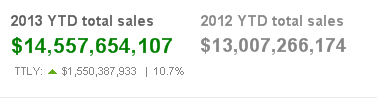
This time last …
An additional piece of context you can add is some variation of "This Time Last …" year, quarter, month etc. You communicate to the reader that at some previous point in time the value of this field was something else and you are helping them compare the two values and judge if progress is being made.
You can employ any/all of these in your designs to help bring context to the data and enable users to make smarter decisions.
You must be a registered user to add a comment. If you've already registered, sign in. Otherwise, register and sign in.