Unlock a world of possibilities! Login now and discover the exclusive benefits awaiting you.
Analytics & AI
Forums for Qlik Analytic solutions. Ask questions, join discussions, find solutions, and access documentation and resources.
Data Integration & Quality
Forums for Qlik Data Integration solutions. Ask questions, join discussions, find solutions, and access documentation and resources
Explore Qlik Gallery
Qlik Gallery is meant to encourage Qlikkies everywhere to share their progress – from a first Qlik app – to a favorite Qlik app – and everything in-between.
Qlik Community
Get started on Qlik Community, find How-To documents, and join general non-product related discussions.
Qlik Resources
Direct links to other resources within the Qlik ecosystem. We suggest you bookmark this page.
Qlik Academic Program
Qlik gives qualified university students, educators, and researchers free Qlik software and resources to prepare students for the data-driven workplace.
Recent Blog Posts
-
How Talend Routes Made the Qlik Games Live Data Playground Possible
At Qlik Connect 2026, the Qlik Games turned a conference into a live data playground. Every golf swing, bike sprint, and hockey goal fed real-time lea... Show MoreAt Qlik Connect 2026, the Qlik Games turned a conference into a live data playground. Every golf swing, bike sprint, and hockey goal fed real-time leaderboards and AI trading cards on big screens across the venue. At the heart of the solution was a deceptively simple but powerful toolkit: Qlik Talend Routes.
Routing excels in a variety of rolls like API orchestration and microservices messaging, — but one of its major transformative roles is bridging “tricky” sources that analytics platforms simply can’t reach on their own. That’s exactly what we needed here. Two very different technical headaches, one flexible routing layer, and clean, real-time data flowing into Qlik Open Lakehouse so the rest of the platform could work its magic.
The Bike Challenge: High-Velocity Telemetry Trapped in a Time-Series Database
Bike sensor data from ANT+ devices streamed straight into InfluxDB — a time-series store that no analytics application speaks natively in real time. The Talend Route listened for new events, enriched each one with rider and device context on the fly, and pushed the results forward. In milliseconds, clean, analytics-ready records were landing in Qlik Open Lakehouse via Kinesis, continually populating live leaderboards. What started as raw, high-velocity telemetry became contextualized, queryable data the moment it hit the lakehouse.
The Golf Challenge: The JSON File That Refused to Behave
The GSPro golf simulator wrote every stroke into a single .dat file — a JSON array that was completely overwritten after each swing. It was a moving target, not a clean event stream. The Talend Route watched the file for changes, intelligently split the array into individual strokes, filtered out duplicates with idempotency, and enriched each new record with golfer context. Clean JSON records then landed in dated, timestamped S3 folders for Qlik OLH to ingest. What began as a messy, stateful file became a reliable stream of enriched events the platform could trust.
Two completely different technical problems — one a high-velocity database listener, the other a file-watching, array-splitting challenge. The same routing layer handled both with ease, delivering the exact same outcome: clean, real-time, context-rich data that Qlik Open Lakehouse could immediately turn into live leaderboards, recent-attempt visuals, and AI trading cards.
The Power of Routing
By absorbing most of the source complexity, Talend Routes let the rest of the architecture shine. No custom one-off scripts. No forcing the analytics layer to become an ETL engine. Just flexible integration that made “impossible” sources behave like well-behaved, contextualized events on standard channels.
This matters more than it first appears. In a modern open lakehouse architecture — Apache Iceberg on S3, decoupled storage and compute, spot-instance economics — the routing layer becomes the quiet enabler that lets every other component do what it does best. The bike route turned a time-series database into a streaming source. The golf route turned a constantly-rewritten file into partitioned, idempotent events. Both fed the same downstream system without any special handling on the analytics side. That’s the real leverage: routing doesn’t just move data; it normalizes chaos so the platform can deliver speed, scale, and cost efficiency at the same time.
Conclusion
Key Takeaways
- When real-time sources are inaccessible or awkwardly formatted, routing is often the cleanest bridge.
- Different sources deserve different patterns — the right tool lets you choose without compromising the destination.
- Enrichment at the routing layer keeps downstream systems simple and fast.
- Small capabilities (idempotency, file streaming, dated partitioning) deliver outsized reliability and value.
The Bottom Line
Talend Routes turned sensor data that no analytics application could have consumed directly into the rhythm of Qlik Connect 2026. The same flexible approach scales far beyond conferences — it’s how modern data teams turn messy, real-world sources into governed, analytics-ready pipelines at production scale. Whether you’re dealing with device streams, legacy files, or anything else that feels just out of reach, routing could be the answer.
More about the Qlik Games:
-
Spain wins the 2026 World Cup. At least that's what the model says.
The 2026 World Cup kicks off today! A few weeks ago, I published a post on how we built Choose Your Champion 2026, a World Cup bracket app powered by ... Show MoreThe 2026 World Cup kicks off today!
A few weeks ago, I published a post on how we built Choose Your Champion 2026, a World Cup bracket app powered by Qlik. That post went into the technical details: the data model, the ML experiment in Qlik Predict, the React front end. If you haven't read it, start there.
So far, 90+ brackets have been submitted. One of them wasn't filled out by a person at all. It was generated by the machine learning model we trained with Qlik Predict, using FIFA rankings, player ratings, and head-to-head history. The model has Spain winning it all!
Here's mine, and here's Qlik Predict's.
If you haven't filled one out yet, do it here. Once you're in, use the Compare button on the leaderboard to see where your picks differ from mine, or from the model's. Brackets get scored automatically as matches are played, so the leaderboard will keep moving all the way to the final on July 19.
We also opened up a Choose Your Champion space on Qlik Community. That's where we'll be posting leaderboard updates during the tournament, and where you can share your bracket, ask questions about the app, or make your case for why the model got it wrong.
If you're interested in the broader question of when models beat human intuition (and when they don't), take a look at Model vs. Mastery.
Enjoy the tournament!!
-
In a world obsessed with AI, don’t discount HI
The relationship nobody has figured out yet We’ve been told the story so many times it starts to feel like fact: AI is coming for human judgment. I... Show MoreThe relationship nobody has figured out yet
We’ve been told the story so many times it starts to feel like fact: AI is coming for human judgment. It sees patterns we miss, processes data we can’t hold, and makes predictions faster than any expert. Hand it the keys. Trust the model.
But spend time with the people who actually work at the intersection of AI and high-stakes decisions — not the vendors, not the keynote speakers, but the real practitioners — and a different picture emerges. AI is extraordinary. It is also incomplete. And the gap between what it can do and what it claims to do is exactly where human intelligence lives.
This tension isn’t a flaw in the technology. It’s a feature of reality. The world is messy, contextual, continuous, and deeply human. No model, however powerful, was trained on all of it. The question isn’t whether to use AI. The question is whether you know when to override it.
I saw this at Qlik Connect '26: 'By 2030, £30 billion worth of mistakes will be made by AI without human intervention.' Yet everybody thinks AI is magic and it's the answer to everything. It's an amazing tool and does amazing things. But without the human intervention sense check, you'll be very cautious of it.
— Steve Palmer, Head of Data Solutions, Premier League
Steve Palmer spent 18 years playing in the Premier League, then spent 15 more building the data infrastructure that now tracks every movement of the players on the pitch today. He is, in other words, one of the few people alive who has not only taken a corner kick at Old Trafford but also written the code that measures them.
His take on the AI revolution isn’t skepticism. It’s lived-in experience from his past and his current lives. And it starts with two letters the industry keeps forgetting: HI.
HI and AI in action: What the Premier League has figured out
Football data is harder than moneyball. When people think of sports analytics, their minds go to moneyball: the Oakland A’s, Billy Beane, sabermetrics. Steve has a ready answer for why football doesn’t translate cleanly.
It's much more real time and much more continuous. It's not stop-starting. There's 22 players, 11 in each team, operating independently all the time — and really difficult to get the metrics together to work out which ones are the key ones.
— Steve Palmer, Head of Data Solutions, Premier League
Baseball gives analysts clean, discrete events. A pitch. A hit. A run. Football gives them 90 minutes of continuous, multivariate chaos — too much to fully capture and model. Without context, even the best models work with incomplete information. The smartest football minds know it.
That’s not a knock on the model. Steve uses it every day. It’s a precise diagnosis of what AI can and can’t do, and exactly where human judgment should step in.
The technology is extraordinary. So is the complexity.
The scale of what the Premier League tracks today is genuinely staggering. Steve walked us through it: 32 cameras in every stadium, operating at up to 200 frames per second, capturing 23 body points per player. The latest “mesh data” system generates 10,000 data points per player, 100 times every second — enough to reconstruct a full-body digital twin of every player in real time.
Data then (8 years ago) Data now Tracking Centre of mass: one point per player, tracked 25 times per second. Mesh data: 10,000 points, 100 times per second. Full-body digital twins in real time. That’s AI and machine learning doing something remarkable. But Steve is careful about the conclusions it invites. The model generates insights from the data. It cannot necessarily generate the wisdom to interpret it.
HI: Those two letters changing the conversation
In every AI discussion, Steve comes back to one concept: HI, human intelligence. Not as nostalgia for the pre-data era. Not as resistance to machine learning. But as the essential counterpart without which AI develops dangerous blind spots.
HI and AI go hand in hand. Don't forget human intelligence — the softer side that a machine can't give you, which is key to a lot of the decision making.
— Steve Palmer, Head of Data Solutions, Premier League
What does HI look like in practice? In football, Steve is specific: you can isolate player profiles from global databases, model their metrics, rank them against a recruitment brief. But you can’t model whether a player will thrive in your dressing room, whether they’ll adapt to a new manager’s philosophy, or whether they have the psychological make-up to perform under pressure in a new country.
The managers who get this right visit players, meet their families, look them in the eye. Data builds the shortlist. Human judgment makes the call.
This isn’t a sports-specific insight. It’s a business insight wearing a football kit.
Where Qlik fits: tools built for the tension
Steve’s relationship with Qlik in the Premier League context is specific and revealing. The Premier League uses Qlik as a validation layer for its skeletal tracking data — checking that the measurements being generated are anatomically feasible before they feed into anything downstream. Are those legs two meters long? Is that skeleton geometrically possible?
It’s a perfect metaphor for what good analytics tooling does. It doesn’t just output numbers; it validates the foundations those numbers are built on. Not generate-and-trust. Generate, interrogate, decide.
That’s exactly what Qlik’s solutions are designed for: not just surfacing predictions but surfacing the reasoning behind them so humans can do that challenging, interrogating, and ultimately, decisioning.
Qlik capabilities built for HI + AI decision-making
Qlik Analytics®
See what happened. Associative analysis and visual exploration.
Qlik Predict®
Model what will happen. ML-powered predictions and scenario simulation.
Qlik Answers®
Ask why. Agentic AI that answers natural-language questions and reasons through the evidence.
The tension: Model vs Mastery during the World Cup
This summer, Qlik is putting the HI vs AI question to the test in the most watched sporting arena on earth. Model vs Mastery is a new three-episode video podcast series launching around the 2026 World Cup, hosted by Adam Mayer, Technical Data Marketer for Qlik.
Adam moderates as Steve Palmer, Head of Data Solutions for the Premier League with a combined 33 years of football player and data engineering experience, goes head-to-head with Nick Magnuson, Qlik’s Head of AI. The World Cup is the arena. The question running through all three episodes is the one Steve has been answering his whole career:
Can AI predict the unpredictable?
Model Vs. Mastery, Watch here
01Pre-tournament · Qlik Predict + Qlik Analytics
The Model vs The Man
Predicting the Path to the Final:
Join Adam, Steve and Nick as they discuss the highs and lows of predicting group stage and play-offs outcomes from the upcoming championship and then put that to the test with the ‘Choose Your Champion app’ powered by QlikDrops at tournament kickoff June 1102Mid-tournament · Qlik Answers · Agentic AI
When the Model Is Wrong
Half-Time Dressing Room Review:
Adam, Steve and Nick retire to the dressing room to discuss the group stages so far, how have their predictions faired? What happens when the model is wrong and why HI is just as important as AI.Group stage03Post-tournament · Full suite · The verdict
The Final Reckoning
“They think it’s all over, it is now” – as the final whistle still reverberates around the stadium, we recap on the results, expect deep data discussions on models, what ifs and why AI and HI go hand in hand
After the finalThe business parallel is direct. The AI modeling World Cup tournament outcomes is the same class of technology modeling your pipeline, your churn risk, and your supply chain. Knowing when to trust it — and when to override it — is the question every leader is navigating right now. Qlik is built for that moment.
The culture, not just the tool
Steve ended our conversation with something that felt less like a soundbite and more like a manifesto — not just for football analytics, but for every organization figuring out where AI ends and human judgment begins.
The technology is there. You've just got to get the culture to embrace it.
— Steve Palmer, Head of Data Solutions, Premier League
That’s the real work. Not buying the tool. Not running the model. Getting your culture to understand what the model is for — and what it’s not. AI without HI is a number without a narrative. HI without AI is intuition without evidence. The organizations winning right now are the ones holding both.
The tension between AI and HI isn’t a problem to be solved. It’s a dynamic to be managed: in every recruitment decision, every forecast, every strategy call. The question is whether you’re equipped to manage it well.
We built this series to make that argument through the most compelling arena we know. We’re also giving you a chance to experience the action yourself — see the box below!
Model vs Mastery: Choose Your Champion
Feel the tension. Make your picks.
Test your instincts against the model. Can you out-predict the AI?
https://engage.qlik.com/model-vs-mastery?co=%7B%7BCompany.Company
Want to see more of what Qlik can do? Start a trial at qlik.com.
Qlik Insider · World Cup 2026 Series · Steve Palmer interview conducted May 2026 · Data vs Instinct: 3 episodes, June–July 2026
-
Qlik Academic Program offers complete training from data ingest to insight disco...
Qlik, the leaders in user-driven business intelligence, has developed the industry’s only end-to-end data platform combining data sourcing, data prepa... Show MoreQlik, the leaders in user-driven business intelligence, has developed the industry’s only end-to-end data platform combining data sourcing, data preparation, and data analysis tools in one robust toolset.
With support for real-time data integration, modern data management, smart data cataloging, and AI-fueled analytics, Qlik helps you bring distributed, diverse data together fast and makes it available to users in a governed environment to transform all your data into real value.
Qlik’s Data Integration layer helps you turn your raw data into analytics-ready information assets by enabling you to:
-
Move data at scale in real-time through streaming data pipelines with change data capture
-
Automate the design, deployment, and management of data warehouses and data lakes
-
Make trusted data easily accessible to users via a secure, enterprise data catalog
Qlik’s Data Analytics layer allows you to turn your data into valuable insights by empowering users with intuitive, AI-powered tools that let them explore your data without boundaries.
Source: qlik.com
Once students and professors sign up for the Qlik Academic Program, they receive training, qualifications and certifications on aspects of data including data integration, analytics, predictive analytics etc. Its a lot of value for the academic community and the best part? Its all free.
So if you are a student or professor looking to propel your career, you should check out this program and discover all the benefits of the industry's only end-to-end data platform. -
-
Advanced Sankey
Advanced Sankey AnyChart A Sankey for flows that outgrow the native chart: up to ten stages, richer selection, and extended visual context. See ... Show MoreAdvanced SankeyAnyChart A Sankey for flows that outgrow the native chart: up to ten stages, richer selection, and extended visual context. See it all in action on a global supply chain demo.
Discoveries
Trace a global supply chain through multiple stages: source regions, materials, product lines, and end markets. Each stage is a column of nodes; the bands between them scale to the size of each flow. Click a link between two stages and the chart selects both source and target dimension values at once, filtering the entire sheet to that specific flow path.
Impact
A hands-on walkthrough of all major features at work: multi-stage flows up to 10 dimensions, dual-end flow selection, gradient links, level headers, label modes, detailed tooltips, layout controls, and more.
Audience
Qlik developers and BI consultants visualizing multi-stage flows in their dashboards — budget allocation, supply chains, customer journeys, energy flows, website traffic, and conversion funnels.
Data and advanced analytics
Built with the Sankey Chart extension for Qlik Sense, released in 2026. Based on fictional global supply chain data.
-
Upcoming deprecation of Qlik Analytics charts in May 2027
Qlik constantly refines its Analytics, over time replacing old charts with new, modernized alternatives. These deprecations are announced well in adva... Show MoreQlik constantly refines its Analytics, over time replacing old charts with new, modernized alternatives. These deprecations are announced well in advance and come with instructions on how to best replace these old charts, whether that is to use a new one, several new ones, or make use of new settings.
This blog post covers the deprecation of charts in May 2027 and offers you guidance on how to replace them.
What charts are being deprecated and when?
The following seven visualization bundle charts are up for deprecation in May 2027. Most have already been removed from the asset panel and are no longer a part of recent applications.
- The Bar and Area chart
- The old Bullet chart
- The old Heatmap chart
- The Button for navigation
- The Share button
- The Show/Hide container
- The old Tabbed container
- The Multi KPI
What do I use instead?
Since these are old charts, most are no longer in use. If you happen to still have a very old application and need to replace deprecated charts, see Visualization bundle > Deprecated charts for more information on what to use instead.
How do I find out if my apps are using the deprecated charts?
Qlik recommends reviewing your apps for old charts. Depending on your platform (Qlik Cloud or Client-managed), there are different methods you can deploy.
Qlik Cloud
Qlik Cloud administrators should use the Qlik Cloud Monitoring Apps to track the usage. The App Analyzer has a sheet dedicated to where deprecated charts are being used on a tenant in Qlik Cloud. The App Analyzer is based on usage events rather than scanning every app. Use the App Analyzer to find which apps and sheets have charts that need to be updated to newer and more modern alternatives. The easiest way to install and update the Qlik Cloud Monitoring Apps is to use the automation template. If you already have the App Analyzer, just remove the automation and install a new one to get the latest version of the App Analyzer.
Client-managed
For client-managed installations, use the Monitoring apps. The Content Monitor app has a sheet for tracking deprecated charts. At reload, the Content Monitor app scans every app in the installation in order to list all applications and sheets that are using charts that are being deprecated. It also lists the installed extensions and their deprecation status. The Monitoring apps are bundled with the Qlik Analytics installation. The first version with the new sheet will be included in the May 2026 release. If you want to track usage in prior versions, the deprecated chart usage scanner will also be available on the product download page.
Thank you for choosing Qlik,
Qlik Support -
Unlocking Qlik Open Lakehouse Access from Talend Studio
Native Qlik Open Lakehouse interoperability for Talend Studio With the March release, Talend Studio introduces native support for querying Qlik Open L... Show More
Native Qlik Open Lakehouse interoperability for Talend StudioWith the March release, Talend Studio introduces native support for querying Qlik Open Lakehouse datasets through Amazon Athena — available in both Standard Data Integration jobs and Spark-based Big Data workflows.
This means developers can now connect to Qlik Open Lakehouse data, execute SQL queries, and integrate results downstream the Talend job without manual JDBC configuration or custom setup.
Connecting Talend Studio to Qlik Open Lakehouse
Talend Studio now connects natively to Qlik Open Lakehouse through Amazon Athena — a SQL query engine that runs directly on top of cloud storage, enabling access to Iceberg-managed data without data movement or duplication. Developers can:
- Access Qlik Open Lakehouse data with an out-of-the-box configuration, no manual JDBC setup required
- Execute SQL queries directly within Talend jobs (Standard and Big Data)
- Integrate Qlik Open Lakehouse data into existing Talend jobs without disrupting current workflows
Reliable by Design
Connecting to Qlik Open Lakehouse from Talend Studio is straightforward by design. The integration ships with dedicated Athena configuration and input components, eliminating manual setup. Runtime validation, improved error handling, and secure credential management ensure the connection remains stable and trustworthy in production environments.
How Data is Organized in Qlik Open Lakehouse
In Qlik Open Lakehouse, data is ingested incrementally and accumulated in Apache Iceberg tables. A logical abstraction layer — implemented as Trino views — resolves those changes into a consolidated latest-state representation, which different engines can query without handling change consolidation logic directly.
This model supports two complementary data patterns:
- Current-state access (SCD Type 1): query the latest-state view through Athena for operational and integration use cases
- Full history access (SCD Type 2): query the underlying Iceberg tables directly for time-aware and audit analysis
Both patterns are available across Standard Data Integration and Big Data jobs in Talend Studio, enabling teams to work with Qlik Open Lakehouse data in the way that best suits their use case.
Looking Ahead
This integration enables Talend Studio users to access Qlik Open Lakehouse data without changing their existing workflows — while aligning with modern, open-format architectures that support multiple query engines.
Athena is the first fully supported access path in this model, with a roadmap to extend support to additional engines over time. For organizations moving away from traditional data warehouses or adopting multi-engine strategies, this represents a concrete step toward a more flexible data architecture.
-
Data Products - take a tour
Our Data Products Storylane has been given a revamp! TAKE THE TOUR Data Products are highly trusted, re-usable, and consumable data assets. Data el... Show MoreOur Data Products Storylane has been given a revamp!
Data Products are highly trusted, re-usable, and consumable data assets. Data elements such as raw data, transformations, data quality rules, contracts, access patterns, and infrastructure have been organized into a single cohesive unit to align with specific requirements and objectives of a business to create a Data Product.
Data Products come with the Qlik Trust Score, a score given to data products based on seven factors, Validity, Completeness, Discoverability, Usage, Timeliness, Accuracy, and Diversity. The Qlik Trust Score ™ gives you confidence in the quality and health of your Data Products so you can be empowered when using them throughout your business. You can also view the Data Product Lineage, which is a flow chart that shows you the origin of the Data Product, so you can track it down to its source. Available Data Products can be found in the Data Marketplace, a collection of Data Products that are ready for use.
If you want to learn even more about Data Products, Datasets, Data Quality and Data Validation Rules check out Mike Tarallo's video series here: Data Products for Qlik Analytics
-
Upcoming Maintenance for Talend Cloud and Talend Management Console: March, Apri...
Update March 4th, 2026: added link to How to get Talend Management Console task schedules and pause and resume during a maintenance window using the A... Show MoreUpdate March 4th, 2026: added link to How to get Talend Management Console task schedules and pause and resume during a maintenance window using the API article
Updated April 24th, 2026: added impact on APIs (all down) and additional clarification on why tasks must be stopped and the impact on remote engines
Updated May 7th, 2026: added additional information on how to address Remote Engine impact
Updated May 12th, 2026: the anticipated impact for the remaining maintenance window has increased from 30 minutes to 90 minutesTalend Cloud and Talend Management Console will undergo scheduled maintenance in March, April, and May. This infrastructure modernization is a key step in unifying the Talend ecosystem with Qlik.
The alignment paves the way for a more seamless experience across both platforms. Over the coming months, you will gain access to integrated features that bridge data integration and analytics, enabling unified governance and a streamlined management experience across your entire data lifecycle.
The maintenance windows will occur per region, during off-peak hours, and are expected to have a maximum of 90 minutes of effective downtime.
What is the expected impact?
A full outage of Talend Cloud and Talend Management Console for a duration of up to 90 minutes within a preplanned 4-hour window.
The following applications will not be accessible:
- Talend Management Console (TMC)
- Talend Data Stewardship (TDS)
- Talend Data Preparation (TDP)
- Talend Data Inventory (TDC)
- Talend Pipeline Designer (TPD)
- Talend API Designer and Tester
- Talend Studio
- Talend Cloud Engines
All APIs for Talend Cloud will not be available during the outage. APIs impacted:
In detail:
- Cloud engines will not be available, and executions running on Cloud Engines will be terminated.
- Talend Studio users may be disconnected from their session, and it will not be possible to open a new Talend Studio session except in local mode.
- Executions that are already in progress during the outage will terminate correctly except on cloud engines, but all tasks or plans scheduled to start during those periods will be skipped.
- Skipped executions will not be tagged as failed, since they were never started. For this reason, check the execution status of your tasks and plans to ensure that all important ones are not skipped, or start them manually if necessary. See What do I need to do to prepare? further down in this blog post.
- Static IP addresses for Cloud Engines corresponding to Disaster Recovery regions will change during maintenance. See What follow-up actions are required? further down in this blog post.
What do I need to do to prepare?
- It is recommended to pause existing task runs during the maintenance window. Talend Remote Engines will continue processing tasks during the outage if they started before the maintenance window, but as they may have inconsistent statuses, we recommend pausing all tasks beforehand.
This concerns all jobs and plans scheduled to start or run during the maintenance window.
See Checking scheduled task runs against your maintenance timetable on how to identify these plans and jobs.Looking for information on how to identify, pause, and resume your tasks? See How to get Talend Management Console task schedules and pause and resume during a maintenance window using the API.
- If you are running Remote Engine Gen2, upgrade to the latest 2026-04. This is to prevent RE Gen2 from becoming unavailable after the maintenance. To do so:
- Upgrade your Remote Engine Gen2 to the latest 2026-04 release: Updating the Remote Engine Gen2 when installed using the execution script)
- Then re-establish the pairing: Re-establish the pairing of Remote Engine Gen2
What follow-up actions are required?
- After the maintenance window, check and monitor the execution status of tasks and plans, as well as the status of your Remote Engines.
In some instances, Remote Engines might require a restart if marked as unavailable in the Talend Management Console or if tasks cannot be executed as expected.
If restarting the Remote Engine does not resolve the complication, follow the pairing instructions in Pairing Remote Engines using a dedicated web service to reset the key and re-pair the Remote Engine.
If your Remote Engine Gen2 is unavailable or cannot execute tasks, then:
- Upgrade your Remote Engine Gen2 to the latest 2026-04 release: Updating the Remote Engine Gen2 when installed using the execution script)
- And re-establish the pairing: Re-establish the pairing of Remote Engine Gen2
- If you use a predefined static IP on Cloud Engine, you will need to allow the new Disaster Recovery Region's IP addresses, which will have changed at this point. While this does not immediately affect production, it will impact any potential Disaster Recovery process.
After the maintenance window, check your static IPs (Disaster Recovery) as documented in Using predefined static IP addresses for execution containers and update your firewalls accordingly.
No change is required for the active region's IP addresses. They will be migrated and will work as of today, ensuring no production interruption.
When will the maintenance take place?
Each region will undergo maintenance for 4 hours during off-peak hours, with a maximum of 90 minutes of effective downtime.
Region Maintenance Start Maintenance End Talend Cloud - AWS - Asia Pacific (Sydney)
au.cloud.talend.com
Wednesday 25 March 2026
22:00 AEDT (Sydney)UTC: 25/03/26 - 11:00
Thursday 26 March 2026
02:00 AEDT (Sydney)UTC: 25/03/26 - 15:00
Talend Cloud - AWS - Asia Pacific (Tokyo)
ap.cloud.talend.com
Monday 20 April 2026
22:00 JST (Tokyo)UTC: 20/04/26 - 13:00
Tuesday 21 April 2026
02:00 JST (Tokyo)UTC: 20/04/26 - 17:00
Talend Cloud - AWS - US East (N. Virginia)
us.cloud.talend.com
Monday 27 April 2026
02:00 EDTUTC: 27/04/26 - 6:00
Monday 27 April 2026
06:00 EDTUTC: 27/04/26 - 10:00
Talend Cloud - AWS - Europe (Frankfurt)
eu.cloud.talend.com
Tuesday 26 May 2026
21:00 CESTUTC: 26/05/26 - 19:00
Wednesday 27 May 2026
01:00 CESTUTC: 26/05/26 - 23:00
To identify which region your tenant is affected by, cross-reference Accessing Talend Cloud applications.
To track further updates during the scheduled Qlik Cloud Maintenance, please visit our Qlik Cloud Status page. This blog post will be updated with additional information where necessary.
Thank you for choosing Qlik,
Qlik Support -
Qlik NPrinting - New Security Patches Available Now
A security issue has been identified in Qlik NPrinting, and patches have been made available. Details can be found in the Security Bulletin High Secur... Show MoreA security issue has been identified in Qlik NPrinting, and patches have been made available. Details can be found in the Security Bulletin High Security fix for Qlik NPrinting (CVE-pending).
We've released two releases across the latest versions of Qlik NPrinting to patch the reported issues. All versions of Qlik NPrinting prior to and including these releases are impacted:
- Qlik NPrinting February 2025 SR5
No workarounds can be provided. Customers should upgrade Qlik NPrinting to a version containing fixes for these issues.- Qlik NPrinting May 2026 IR
- Qlik NPrinting February 2025 SR 6
Before applying patches or upgrading Qlik NPrinting, always review the system requirements for the new version.
This issue only impacts Qlik NPrinting. Other Qlik products are NOT impacted.
All Qlik software can be downloaded from our official Qlik Download page (customer login required). Follow best practices when upgrading Qlik Sense.
Qlik provides patches for major releases until the next Initial or Service Release is generally available. See Release Management Policy for Qlik Software. Notwithstanding, additional patches for earlier releases may be made available at Qlik’s discretion.
The information in this post and Security Bulletin High Security fix for Qlik NPrinting (CVE-pending) is disclosed in accordance with our published Security and Vulnerability Policy.
Thank you for choosing Qlik,
Qlik Support -
Not All Catalogs Are Governance. Not All Governance Is a Catalog
One question I get asked a lot is "We're evaluating Qlik alongside a standalone data governance catalog. How do you compare?" It's a reasonable questi... Show MoreOne question I get asked a lot is "We're evaluating Qlik alongside a standalone data governance catalog. How do you compare?"
It's a reasonable question. But the framing inside it, that you're choosing between Qlik and a standalone governance catalog, misses something important about what governance requires. So let me try to untangle it.
The question behind the question
Data intelligence platforms are built to balance two distinct problems, and most organizations have both. The first is context capture: building a unified metadata view to understand and optimize your data integration landscape. That means technical context, operational context, and governance context, all in one place. The second is context delivery: getting trusted context, with clear ownership and accountability, to the analytics, APIs, and AI agents that need it to produce real business outcomes.
Both problems matter. They're related. However, they aren't the same problem, and they don't call for the same solution.
Two Catalogs, One Trusted Foundation
Context capture is where most metadata catalogs live, and the focus is heavily technical: inventorying schemas, tables, and columns across the estate; harvesting metadata from cross-platform sources; tracing column-level lineage from origin to destination; and powering search and discovery so data engineers and platform teams can find the right asset and understand its dependencies. Beyond those core technical jobs, the same catalogs also support regulatory and audit needs with cross-domain lineage, enterprise-wide policy enforcement, and classification. Qlik's Talend Data Catalog is one example of such a catalog solution.
Context delivery requires a knowledge catalog that makes trusted data easy to discover, understand, and consume. In Qlik Talend Cloud, this includes a data product marketplace where users can find and request trusted data products, domain-driven ownership that enables teams to publish and manage data with clear accountability, rich business and technical context that helps both people and AI agents understand data, and usage intelligence that provides visibility into adoption and value. Together, these capabilities transform governed data into a consumable asset for analytics, AI, and business operations.
The two aren't redundant. They serve different roles in the same data organization. Having both is what moves you from "we have a governance program" to "our governance actually produces something useful."But here's where I think the market conversation often stops too early.
Where Governance Has to Run
A standalone governance catalog typically answers a question about inventory : what data do we have, where did it come from, and what rules apply to it? It documents. It organizes. It certifies. What it can't answer is the question that matters most data practitioners - which is whether the data is trustworthy or not for a business use-case?
That's where Qlik's approach is different. The knowledge catalog capabilities in Qlik Talend Cloud don't just surface what data products are available. They carry live trust signals with them. The Qlik Trust Score on a data product reflects what happened in the pipeline: accuracy, completeness, and timeliness, computed at runtime. Anomalies get flagged before bad data reaches a consumer. Trustworthiness isn't a label someone applied. It's a measurement the product makes continuously.
The full sequence looks like this. Discover and understand your data through active metadata, lineage, and semantic search. Trust and validate it with Qlik Trust Score for AI, which measures accuracy, completeness, consistency, and timeliness as a live computed signal. Govern and secure it through PII detection and classification, role-based access, and policies enforced at runtime. Steward and operationalize it through quality improvement cycles and continuous remediation. Then activate and deliver it: data products integrated with analytics and AI tools, with usage tracking so you can measure impact.
Context capture builds the foundation. Context delivery makes it useful. A standalone catalog only handles part of that sequence.
The Practical Takeaway
When someone asks whether to use Qlik's knowlege catalog capabilities alongside a standalone governance catalog, my honest answer is: it depends on whether you are solving for context capture or context delivery or both.
If you're a data engineer or architect and solving for context capture — inventorying the estate, tracing lineage across your entire organizational estate, classifying assets, supporting audit and compliance — a metadata catalog can handle that work. If you're a business data steward or business user solving for context delivery — publishing trusted data products, enforcing contracts and SLAs, routing governed inputs to analytics and AI agents — you need a solution like Qlik Talend Cloud.
And if the real question is whether governance holds when data actually moves — whether SLAs are met, whether the Trust Score reflects what just ran in the pipeline — that's delivery work. No standalone catalog can answer it, and that has to come from the underlying integration and quality substrate that Qlik Talend Cloud provides.
In summary, context capture gives you the picture of your data. Context delivery puts that picture to work so that analytics, APIs, and AI agents that depend on it. Governance should not exist as a separate layer above the data stack. It must be natively integrated into every stage of the data lifecycle. Only then can organizations move beyond governance processes to deliver governance outcomes.
Don't get capture context, deliver it to drive your AI and Agentic outcomes. Try Qlik Talend Cloud® free to see this in action.
-
Important update on SAP Data Access Restrictions and your Qlik Integration
Dear Qlik Customers, In April 2026, SAP published a series of updates that will restrict your ability to extract certain SAP data using Qlik products.... Show MoreDear Qlik Customers,
In April 2026, SAP published a series of updates that will restrict your ability to extract certain SAP data using Qlik products. We are writing to explain what is changing, what it means for your Qlik integration, what you can do next, and how Qlik is responding.SAP Announcement
SAP has recently updated SAP Note 3255746 and its API Policy, which together prevent customers from using the ODP-RFC interface to perform bulk data extractions to non-SAP systems. Here is what you need to know.
Impacted Qlik Products:
The CDC connectivity via ODP will be at most risk by the implementation of the June 9th SAP security update, as it will be blocked. The main products affected are:
- Qlik Talend Cloud SAP ODP Connector
- Qlik Replicate SAP ODP Endpoint
Other impacted products that also offer ODP functionality are:
- Qlik Analytics (Qlik Sense / QlikView) SAP ODP Connector
- Talend Studio Component tSAPODPInput
The following Qlik Products do not use the ODP-RFC interface and therefore will not be impacted by the June SAP Security update:
- Qlik Gold Client
What's Changing and When:
- June 9, 2026: SAP will release a security patch that will begin blocking “unrestricted” calls from non-SAP applications, including affected Qlik connectors, that rely on the ODP-RFC interface.
- Temporary revert option: In SAP’s Operational Data Provisioning (ODP) Update Public FAQ, it is stated that “SAP provides a time-limited option to revert to unrestricted ODP-RFC calls. This flexibility will expire on December 2026.” This implies that SAP customers may be able to temporarily roll back this restriction, but only until December.
Recommended Next Steps
- Review the SAP Notes: Independently review SAP Note 3255746 (reclassification notice) and SAP Note 3439624 (self-assessment tool) via the SAP Support Portal at support.sap.com. Address your concerns and feedback through the appropriate SAP channels.
- Contract Review: Review your customer agreement and the API Policy, updated in April, 2026, to evaluate SAP’s ability to make unilateral changes to your data access rights, and to require additional purchases and/or charge egress fees.
- Audit your environment: SAP has released a self-assessment tool (SAP Note 3439624, available April 13, 2026) to help you identify all current ODP-RFC usage across your systems.
- The Qlik SAP ODP Connector will show as “unpermitted”, which means it will be blocked by the SAP June Security patch
- The Qlik SAP OData Connector will show as “permitted”, which implies it will continue to work with the SAP June Security
patch
- Evaluate Qlik’s Alternative SAP Connectors: Qlik supports several methods for SAP connectors, including OData and SAP Extractors. We continue to enhance our connectors and are looking to release a new SAP connector due later this year, which may prove a viable alternative.
- Work with Qlik: Reach out to your Qlik representative before implementing the SAP June Security patch, so we can partner with you on alternate Qlik solutions and ways to address these SAP restrictions. Together, we can evaluate your specific environment, understand your connectivity needs, and align on the best path forward before the December 2026 deadline.
Our Commitment
You should be in control of your business-critical data, wherever it creates value. Without interoperable architectures, SAP customers like you face higher costs, performance issues, and less freedom to choose, including loss of flexibility in implementing AI.
Qlik already supports alternatives to ODP and is actively developing additional migration paths and solutions to preserve your flexibility through this transition and beyond. We will continue to work on viable alternatives to our ODP endpoints and help you navigate this change on your terms, not SAP's. To learn more about how Qlik can support your specific environment, please reach out to your Qlik representative.
Additional Resources
- SAP’s Operational Data Provisioning (ODP) Update Public FAQ
- SAP Note 3255746 (reclassification notice) - Accessible via the SAP Support Portal at support.sap.com
- SAP Note 3439624 (self-assessment tool) - Accessible via the SAP Support Portal at support.sap.com
- “Open” on Whose Terms? What SAP Sapphire Won't Say. by Matt Hayes – Qlik GM Data Business Unit
This communication reflects Qlik's current interpretation of SAP's restrictions, which are outside our control and subject to change. Customers should consult SAP's official communications and seek independent guidance on operational and legal impact. Roadmap statements are forward-looking and not commitments; disruptions arising from SAP's decisions do not constitute a defect in Qlik's products or services.
-
Qlik and Starburst: Turn Fragmented Enterprise Data Into Governed, AI-Ready Inte...
Qlik recently announced its partnership with Starburst, combining Qlik data integration, replication, and analytics with Starburst federated query, co... Show MoreQlik recently announced its partnership with Starburst, combining Qlik data integration, replication, and analytics with Starburst federated query, context, and agentic capabilities to give you more choice across hybrid data estates.
For the full press release, see Qlik and Starburst Turn Fragmented Enterprise Data Into Governed, AI-Ready Intelligence.
We've also prepared a set of five articles for you to help get you started:
- Qlik Cloud Analytics and Starburst Galaxy
- Qlik Cloud Analytics and Starburst Enterprise
- Talend Studio and Starburst
- Qlik Sense Enterprise on Windows and Starburst Galaxy
- Qlik Sense Enterprise on Windows and Starburst Enterprise
Thank you for choosing Qlik,
Qlik Support -
Upcoming changes to how CSS for custom Qlik Analytics themes is handled
Edited 2nd of June, 2026: Updated Qlik Cloud date from August 18th.Edited 3rd of June, 2026: Added ?features=CLIENT_TLV_1804_LESS_CARDS,TLV_1804_NEW_D... Show MoreEdited 2nd of June, 2026: Updated Qlik Cloud date from August 18th.
Edited 3rd of June, 2026: Added ?features=CLIENT_TLV_1804_LESS_CARDS,TLV_1804_NEW_DEFAULT_THEME URL for reviewing themes, which replaces the previous URL; clarified top level selector warning.Qlik Cloud will now see the changes on or after August 18th, 2026.
Qlik is introducing changes to how custom themes in Qlik Analytics applications are handled, which may impact your CSS-styled themes if they include unsupported CSS modifications. This also applies to other means of modifying the CSS, such as the sheet input box, the Multi KPI CSS input, or any other 3rd party extension that allows CSS input.
These changes will impact both Qlik Cloud Analytics and Qlik Sense Enterprise on Windows.
For more information about custom themes, see Uploading and managing themes.
Why are these changes being made?
These changes improve how theming works in Qlik Analytics applications, which will enable us to deliver better-looking dashboards and generally enhanced theming.
What is being changed?
We’re restructuring theme settings:
- Removal of base card CSS overrides
- A theme with the _cards:true setting gets the base styles imported as JSON into the theme
- Removal of extra title padding for objects without title in a cards theme
- Replace the following with theme JSON settings:
- padding: applied on object level; the gap between border and object
- margin: applied on sheet level; the gap between objects
And we are adding new themes:
- Foundation (default)
- New Horizon
How can I verify if my themes are affected?
- Open any app that uses your custom theme and append the following to the URL: ?features=CLIENT_TLV_1804_LESS_CARDS,TLV_1804_NEW_DEFAULT_THEME
This will enable the flag to run your themes with the changes before they are released. - Verify that everything looks as you expect it to
- Review your browser's developer tools for any eventual JavaScript errors
Future-proof your themes
We’ve compiled a list of supported styling options for you that can already replace the need for custom CSS. See Obsolete CSS modifications.
Additionally, see the table below for an overview of the new theme properties that you can use in your theme instead of CSS. You will first need to enable the /feature/CLIENT_TLV_1804_LESS_CARDS flag to see them in effect in the application.
Theme Option Path in theme JSON Example Sheet background sheet.backgroundColor
"sheet": { "backgroundColor": "#f2f2f2"
}Sheet margin sheet.margin
"sheet": { "margin": "10px"
}Object paddings object.padding
"object": { "padding": "20px" // or "10px 10px 5px 10px"
}Borders
object.borderWidth
"object": { "borderWidth": "1px"
}object.borderColor
"object": { "borderColor": "#d9d9d9"
}
object.borderRadius
"object": { "borderWidth": "3px"
}Shadows object.shadow.boxShadow
"object": {
"shadow": {
"boxShadow": "0px 4px 10px 0px", "boxShadowColor": "#d9d9d9"
}
}object.shadow.boxShadowColor
"object": {
"shadow": {
"boxShadow": "0px 4px 10px 0px", "boxShadowColor": "#d9d9d9"
}
}To give you more context: Document Object Model (DOM) selectors in custom CSS are not a supported pattern. While they can be helpful for customizing the look and feel of applications, the DOM is subject to change at any time. To provide your feedback, raise tickets on the Qlik Ideation portal when you need custom CSS customization. This helps prioritize supported customization options to add to the platform.
Do not use top-level selectors such as qv-client or qv-card. These selectors are planned for removal in future versions. See CSS best practices for Sense themes for more information.
An example theme selector could be:
.qv-client.qv-card #grid .qv-object-wrapper .qv-object to change the border of all objects on sheets. When the change is made, the top level .qv-card class will be removed fromt the <body> tag, which breaks the selector.
It would need to change to: .qv-client #grid .qv-object-wrapper .qv-object to work after the update.
However it still uses the top level .qv-client, that, while not removed in this update, will be removed in the future, and is not present in certain qlik-embed scenarios. Meaning we are left with #grid .qv-object-wrapper .qv-object.
In summary, if you absolutely still need to use custom css, remove the top level selectors.What action do I need to take and when?
Qlik Cloud will see the changes on or after August 18th, 2026, while Qlik Sense Enterprise on Windows will be aligned in the November 2026 release.
While we do not expect your themes to be affected, we recommend testing them at the earliest. See the How can I verify if my themes are affected? section.
If you have any questions, we're happy to assist. Reply to this blog post or take your queries to our Support Chat.
Thank you for choosing Qlik,
Qlik Support -
Circular Dendrogram
Circular Dendrogram AnyChart A circular dendrogram lays out a hierarchy as a radial tree of explicit parent-child connections — wide and deep, o... Show MoreCircular DendrogramAnyChartA circular dendrogram lays out a hierarchy as a radial tree of explicit parent-child connections — wide and deep, on a single sheet. See how it makes a large hospital's org structure readable at a glance.Discoveries
Take in 8 divisions, 42 departments, 84 services, and 214 staff in one view. Each top-level branch gets its own color and passes it down to its descendants, so the structure is easy to follow. Click a node to light up its path to the root, with the selection cross-filtering the whole sheet.
Impact
A hands-on walkthrough of all major features in action: click selections, chain mode, label formats, coloring, grouping options, tooltips, and more.
Audience
Qlik developers and BI consultants looking to visualize org charts, product taxonomies, file structures, and any nested-category data in their dashboards.
Data and advanced analytics
Built with the Circular Dendrogram extension for Qlik Sense, released in May 2026. Based on fictional hospital organization data.
-
From Qualifications to AI: Recent Student Learning Experiences at the University...
Preparing Students for the Qlik Business Analyst Qualification at the University of Worcester At the University of Worcester, students recently partic... Show MorePreparing Students for the Qlik Business Analyst Qualification at the University of Worcester
At the University of Worcester, students recently participated in a two-day Qlik Business Analyst Qualification Bootcamp designed to help them build confidence with analytics concepts while preparing for the Qlik Business Analyst Qualification.
The bootcamp was led by Qlik Luminary Nick Seagrave, who generously volunteered his time and expertise to support the students throughout the event. The initiative was also supported by Peter Clews, Lecturer in Web Applications at the University of Worcester, and made possible through the collaboration of Richard Wilkinson, Head of Computing, whose support helped bring the idea from concept to reality.
Throughout the two-day session, students worked through key business analytics concepts, explored data visualization best practices, and gained hands-on experience building dashboards and analyzing data with Qlik.
The highlight came on the second day, when all students who attended the bootcamp successfully passed the Qlik Business Analyst Qualification and earned their qualification badges.
Beyond earning a qualification, the students gained practical analytics skills that can help strengthen their employability and demonstrate their capabilities to future employers. As organizations continue to invest in data-driven decision-making, experience with analytics tools and recognized industry qualifications can provide students with a valuable advantage as they enter the job market.
The bootcamp also highlighted the value of collaboration between academia and industry. By combining the expertise of university educators with support from Qlik professionals and community members, students were able to gain both academic and practical perspectives on modern analytics.
Exploring Advanced Predictive Analytics and AI at AGH University of Krakow
While the Worcester bootcamp focused on business analytics foundations and qualifications, a recent session in Poland took students into some of the more advanced areas of modern analytics and artificial intelligence.
Working with AGH University of Krakow, the Qlik Academic Program delivered an advanced hands-on workshop for master's students interested in predictive analytics and AI.
The session was led by Piter Harb, Senior Technical Trainer at Qlik, and organized in collaboration with Janusz Opiła and his colleagues at AGH University of Krakow. Janusz teaches a variety of courses in business informatics, advanced analytics, and AI, including master's-level modules, and is passionate about connecting students with practical technologies and real-world applications.
During the workshop, students explored advanced analytics concepts through practical exercises and demonstrations using Qlik's latest capabilities. Topics included predictive analytics, artificial intelligence, advanced data visualization techniques, and Model Context Protocol (MCP), providing students with exposure to technologies that are increasingly shaping the future of analytics.
Rather than focusing solely on theory, the session emphasized practical application, allowing students to see how AI-driven analytics can be used to generate insights, support decision-making, and solve complex business challenges.
The feedback from both students and educators was extremely positive, highlighting the value of providing direct access to industry professionals and cutting-edge analytics technologies as part of the learning experience. The university has already expressed interest in exploring additional collaboration opportunities, demonstrating the growing importance of advanced analytics and AI skills within higher education.
Supporting Students Across the Analytics Journey
Although these two sessions focused on very different topics, they shared a common objective: helping students build skills that are relevant in today's increasingly data-driven world.
Whether supporting students preparing for an industry qualification or introducing master's students to advanced predictive analytics and AI concepts, the Qlik Academic Program remains committed to helping educators provide engaging, practical learning experiences that connect academic knowledge with real-world application.
A special thank you to Nick Seagrave, Richard Wilkinson, Peter Clews, Piter Harb, Janusz Opiła, and everyone involved in making these sessions possible.
We look forward to continuing to support educators and students across EMEA through workshops, guest lectures, qualifications, and hands-on learning opportunities throughout the year.
Interested in bringing Qlik into your classroom?
The Qlik Academic Program provides free access to Qlik Cloud Analytics, Qlik Talend Cloud, AI and Machines Learning Capabilities, learning resources, qualifications, workshops, and educator support for accredited universities worldwide.
Learn more and join the program today: qlik.com/academicprogram
-
New Qlik Analytics mobile application release: access controls and Intune integr...
An update is being deployed to Qlik Cloud tenants starting May 28th (today), offering improved governance of the Qlik Analytics mobile app. See Settin... Show MoreAn update is being deployed to Qlik Cloud tenants starting May 28th (today), offering improved governance of the Qlik Analytics mobile app. See Setting permissions for the Qlik Analytics mobile app.
What does the update include?
A new version of the Qlik Analytics mobile app is now available for download (in app stores). In addition, Tenant Administrators can now manage user access using three scopes:
- Allowed (standard mobile app access)
- Not Allowed (mobile app access denied)
- Allowed with Intune (mobile access with mandatory Intune enrollment)
In addition to access controls, these scopes strengthen the Microsoft Intune integration through a new server-side control for MAM deployment, replacing the previously user-controlled MAM toggle.
What does this mean for me?
The update takes effect once users update to the latest version of the mobile app. For most existing users, there will be no impact, as the default scope is set to Allowed, a control point not available in the previous release.
If you use Qlik Analytics and Intune
The following two things need to be taken into consideration:
- The solution now requires Microsoft Edge as the browser for the Qlik Cloud authorization flow.
- If you have deployed the Qlik Analytics app via MDM Intune, you will need to modify the scope for those users to be Allowed with Intune.
Some users may experience authentication issues after updating to the new version of the mobile app if this configuration is not completed by the Tenant Administrator.
Reference the configuration specifications for more information:
- Setting permissions for the Qlik Analytics mobile app
- Securing and configuring the Qlik Analytics mobile app with Microsoft Intune
Thank you for choosing Qlik,
Qlik Support -
Watch Q&A with Qlik: Qlik Talend Cloud Data Integration!
Don't miss our previous Q&A with Qlik! Pull up a chair and chat with our panel of experts to help you get the most out of your Qlik experience. WA... Show MoreDon't miss our previous Q&A with Qlik! Pull up a chair and chat with our panel of experts to help you get the most out of your Qlik experience.

-
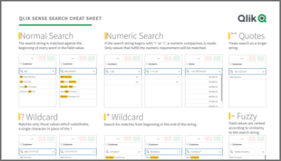
Qlik Sense Cheat Sheet version 2.0
It was back in 2015 when I first published the original Qlik Sense Search Cheat Sheet. Since then, and thanks to lots of individual contributors here ... Show MoreIt was back in 2015 when I first published the original Qlik Sense Search Cheat Sheet. Since then, and thanks to lots of individual contributors here in the Community, the Search Cheat Sheet has suffered several transformations to make it more complete and truthful.
@afurtado wrote me an email a few weeks ago because he was interested in getting the document localized for the Brazilian folks out there. In addition to thank him for his contribution and sending him the file I decided that it was about the time to get the Search Cheat Sheet an update.
Today I want to introduce a new version of the document. I added the compound search section to it (@jayanttibhe thanks for the tip), and I redesigned and rationalized the position of each element for better comprehension.
As an extra, I made the document multilanguage ready. So, if someone wants to translate the Cheat Sheet to other language (currently available in English, Spanish and Portuguese) please let me know in the comments section and I'll gladly tell you how to help us.
Hope you like it, and please share it.
Arturo
Updates:
Feb 28: French version thanks to @arychener
Feb 25: Italian added thanks to @AntonioCostantino . Russian translation updated
Feb 13, 2020: Cheat sheet includes now the ^ Wildcard to be consistent with Qlik Help. Russian language added thanks to the contribution of @martynova
Jan 29, 2020: German language added thanks to the contribution of @g_mitschke

-
Action required: Snowflake authentication migration guide for Qlik Analytics fol...
Snowflake is rolling out stronger authentication requirements as part of their platform security initiative. Starting May 2026, new connections using ... Show MoreSnowflake is rolling out stronger authentication requirements as part of their platform security initiative. Starting May 2026, new connections using only username and password will no longer be accepted, and all existing password-only connections will stop working between August and October 2026.
For the full rollout schedule, see Snowflake's authentication enforcement timeline.
If your Qlik Sense Cloud Analytics, Qlik Sense Enterprise on Windows, or QlikView environment connects to Snowflake, you will need to update those connections to use either key-pair authentication or OAuth before this change takes effect.
Who does this apply to?
This applies to any Qlik Cloud Analytics, Qlik Sense Enterprise on Windows, and QlikView connection to Snowflake, where the authentication method is set to Username and Password only. Connections that already use key-pair authentication or OAuth do not need to change.
To check your connections, review the Data connections and look for any Snowflake connections using username and password authentication.
What are my migration options?
There are two supported authentication methods you can migrate to.
Key-Pair Authentication
Key-pair authentication uses an RSA private/public key pair assigned to the Snowflake user account. It is the most straightforward migration path and does not require an identity provider. This option is recommended for most customers.
For setup steps, see Snowflake key-pair authentication documentation and the Qlik Snowflake connector guide.
OAuth
OAuth integrates with your existing identity provider (such as Okta or Azure AD) and is well-suited for organisations that want centralised access control and token-based authentication. It requires an OAuth security integration to be configured in Snowflake.
See the Qlik Snowflake connector guide and Snowflake OAuth documentation.
OAuth support for Snowflake was introduced to Qlik Sense Enterprise on Windows with our May 2026 release.
If you have any questions, we are, as always, happy to assist. Reply to this blog post or take your queries to our Support Chat.
Thank you for choosing Qlik,
Qlik Support