Unlock a world of possibilities! Login now and discover the exclusive benefits awaiting you.
- Qlik Community
- :
- Blogs
- :
- Technical
- :
- Design
- :
- Using Qlik Sense Analytics to Get in Shape
- Subscribe to RSS Feed
- Mark as New
- Mark as Read
- Bookmark
- Subscribe
- Printer Friendly Page
- Report Inappropriate Content
 Hello Qlik Community! In this post, I’d like to introduce you to today’s guest blogger and Qlik enthusiast, Jason Yeung. Jason is our North East Solution Architect Manager who has over 15 years in the BI industry…flexing his muscles in Pre-sales, product management, consulting, and support. Jason wanted to get healthy, but traditional means of health data tracking weren’t enough. Continue reading to learn more about why Jason applied Qlik Sense to his fitness plan and how it was a better alternative to traditional fitness tracking methods.
This past year, I decided to get in shape. Over the years, I went from being an avid runner to a car service, driving my children to hockey rinks on the weekends. This year, things were going to change. I had a strong plan, motivation, and allocated the right amount of time to be successful. However, I needed an analytical tool to track my progress and keep me honest.
The Analytics Problem with Fitness Apps
Today, we have access to data around our personal well-being and there are data collection tools everywhere. We wear them on our wrists, have them in our pockets, and have them built into our treadmills. While these tools serve as great motivators, they all seem to fall short in 3 key analytical areas:
- Data in, not data out. These tools do an excellent job collecting large amounts of data, but tend to fall short when it comes to analytics. They often provide summary level dashboards that just show fitness activity over time, but with limited abilities to explore the data further.
- Lack of self-service. My fitness “dashboards” are never quite the way I want them. Everybody uses slightly different metrics and different ways to visualize their fitness activity and it seems we are limited to static dashboards that can’t be modified easily.
- I want “other” data. No one fitness tracker really tells the whole story because they’re all used for specific purposes. Additionally, these “apps” are all isolated from one another with no unified way to bring the data together, especially data from other sources. This is important because when it comes to physical fitness, we tend to only see the data relationships and associations that we want to see.
Enter Qlik Sense
At Qlik, I’m constantly working with customers and prospects to build and develop innovative analytical solutions to solve their real-life complex information needs. Qlik Sense provides these organizations with an analytical tool that enables them to build dynamic and interactive dashboards from many different sources of data. As you can see, this is the same problem that I’m trying to solve, so I put Qlik Sense to the test.
What I did
Here’s a two view dashboard that I built to track my fitness activity.
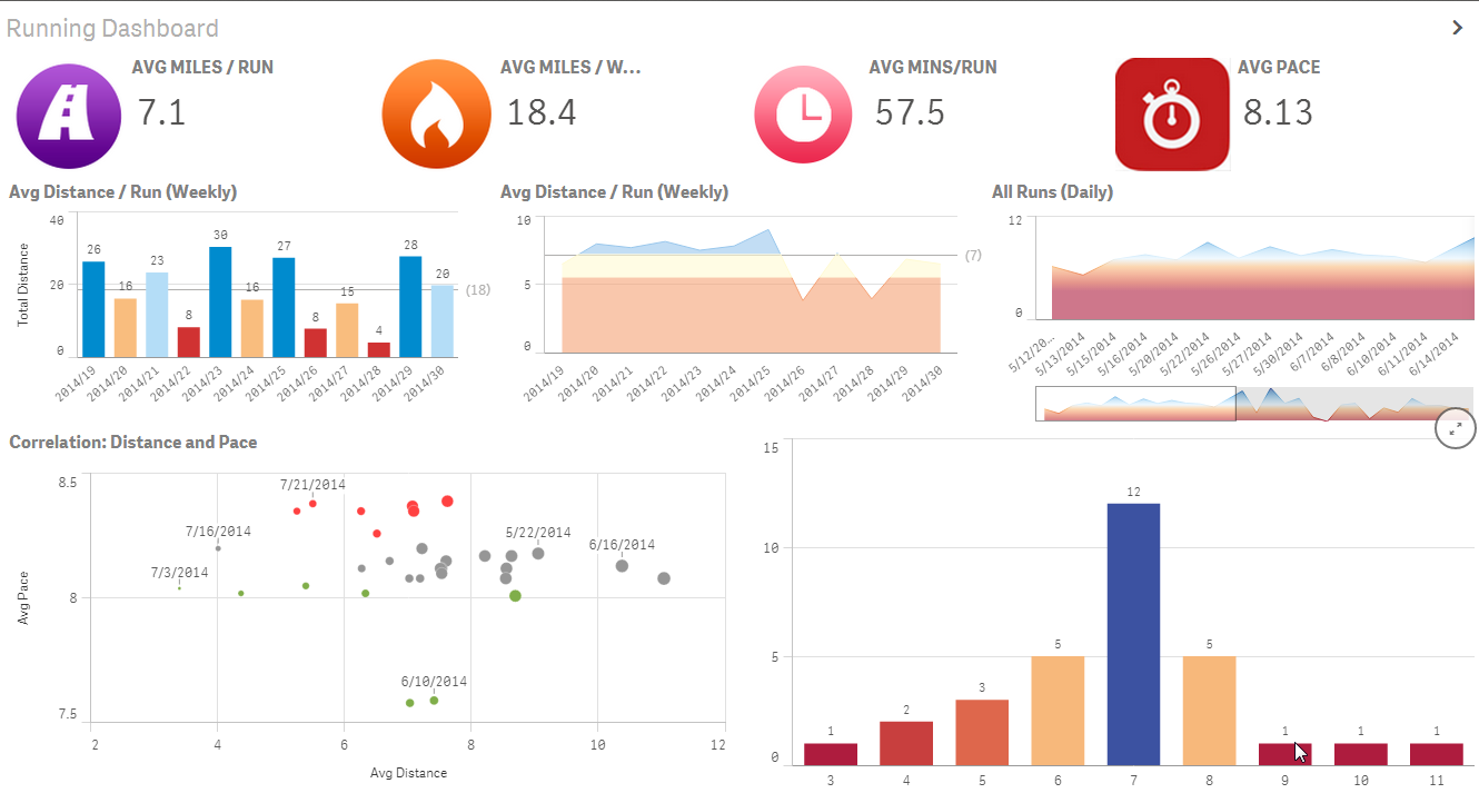
At first glance this may not seem to be any different than other fitness dashboards, but the fundamental differences are as follows:
- Data from four different data sources. RunKeeper, Fitbit, Weatherbug, and my personal data entry spreadsheet. Therefore, no more isolated views of data.
- No modifications or “massaging” of data needed. I was able to use the applications’ “out-of-the-box” functionality to export the data as-is and combine them together.
- Personalization. I was then able to build my own custom visualizations tailored to how I wanted to see them.
- Speedy. Based on my knowledge of Qlik Sense, I was able to easily load the data and build the visuals very quickly, while gaining additional insight from the data of the various tracking devices.
The Biggest Insights Can be Simple to Discover
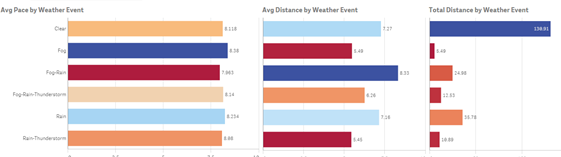
The previous dashboard view was extremely effective in tracking my fitness activity. But the dashboard itself really didn’t shed any new insights. However, the additional data from Weatherbug did! For runners, weather can be the single biggest motivational driver. In the visuals below, there are two main discoveries.
The weather varies from week-to-week, but my weekly running activity remained relatively constant:
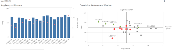
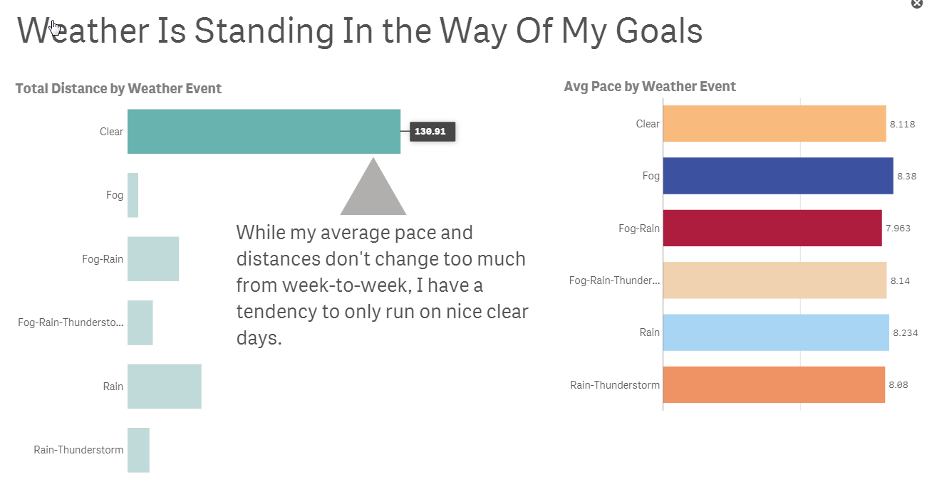
But the “type” of day played the biggest role. I noticed that while my pace and distance doesn’t significantly change based on temperature, the outliers on the right suggests that I typically only run on “Clear” days.
Telling the Story
After analyzing all this data, I needed to build a story to communicate the meaning behind the numbers. Using Data Storytelling, Qlik Sense allowed me to build a dynamic presentation with a narrative to highlight my overall activity. I wanted to share this information with my support structure, my family.
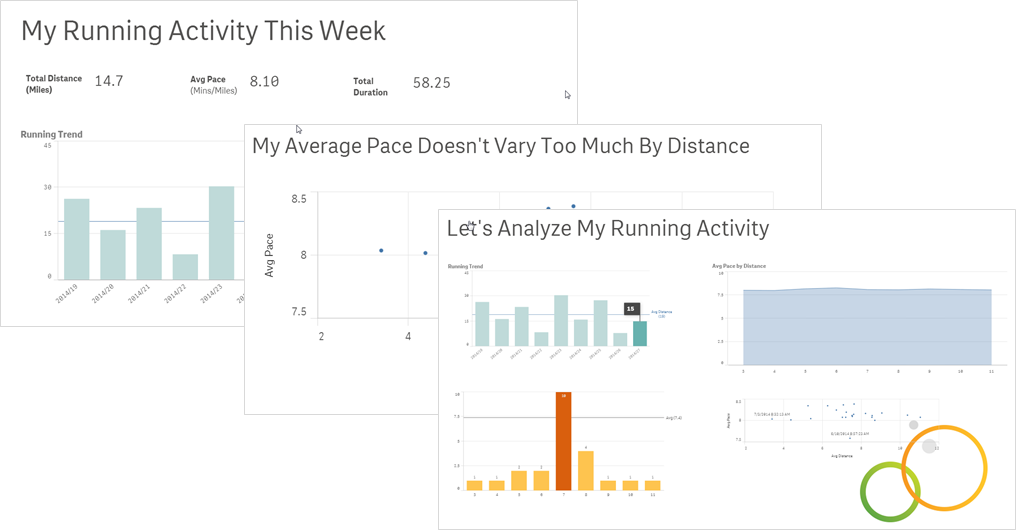
And the main point to communicate was:
The Result
What was the outcome of all this? My wife bought me a windbreaker! 
In summary, as you can see, analytics is all around us. In addition to being a top priority across all organizations, it should be a top priority for individuals to better manage their health. Using data to gather and build new insights allows us to be more productive, make better and more informed decisions, and hopefully live healthier lives. Being able to communicate your findings effectively increases your chances of getting the message heard and understood. I used Qlik Sense to unleash my intuition and so should you. Download Qlik Sense today for free.
Jason Yeung
Qlik
- « Previous
-
- 1
- 2
- Next »
You must be a registered user to add a comment. If you've already registered, sign in. Otherwise, register and sign in.