Unlock a world of possibilities! Login now and discover the exclusive benefits awaiting you.
- Qlik Community
- :
- Forums
- :
- Analytics & AI
- :
- Products & Topics
- :
- App Development
- :
- Continuous Accumulation by Month
- Subscribe to RSS Feed
- Mark Topic as New
- Mark Topic as Read
- Float this Topic for Current User
- Bookmark
- Subscribe
- Mute
- Printer Friendly Page
- Mark as New
- Bookmark
- Subscribe
- Mute
- Subscribe to RSS Feed
- Permalink
- Report Inappropriate Content
Continuous Accumulation by Month
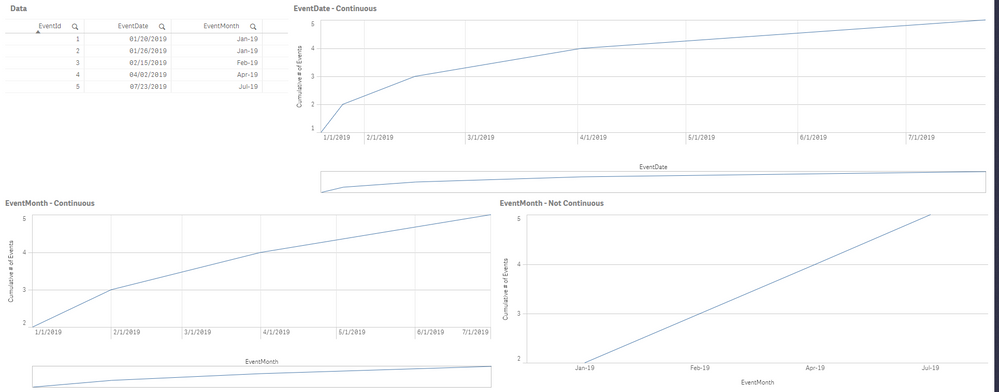
Hello, I am currently trying to set up a line chart that will show the accumulated number of events from one month to the next. I have attached an example app to demonstrate what I am trying to accomplish. In my sample data I have 5 events that occur over 7 months.
On the top chart, I show EventDate with a continuous Axis. This looks good, but I want to also show the accumulation by month.
In the chart on the bottom left, I have EventMonth as my dimension with a continuous X-axis. The issue is that the X-Axis is showing the date value rather than the year.
In the chart on the bottom right, I have EventMonth as my dimension without a continuous X-axis. The issue here is that the chart is no longer continuous. I can't see the months in the middle.
What I am hoping to get is a mix of the bottom two charts where my X-Axis is my month, but it shows all of the months in between. And for those months, I would like it to show as a flat line rather than a slope to the next month with a data point. I would also like to do this without modifying the data.
Is this possible?
- Tags:
- line chart
- Subscribe by Topic:
-
function
-
General Question
-
Script and Expressions
-
Visualization
